AI Image Model Benchmark: 50 Prompts × 3 Models
We ran 50 identical prompts through Nano Banana 2 Lite, NB2, and NB Pro at 1K. Every image scored on 4 criteria. The quality-per-dollar results surprised us.

An AI image model benchmark is a controlled comparison where the same prompts run through different models under identical conditions, then the outputs are scored. This one tests three Google-based image models available on BananaBanana: Nano Banana 2 Lite ($0.03/image), Nano Banana 2 ($0.06), and Nano Banana Pro ($0.11). All at 1024×1024, same aspect ratio, first attempt only. No cherry-picking, no post-processing.
The short answer: Lite delivers roughly 83% of Pro's quality at 27% of the cost. For social media, stylized content, and bulk work, that's a steal. For fine-detail portraits and complex multi-object scenes, Pro earns its premium. NB2 sits in between, and its value depends on your workflow. At $0.03 more than Lite but $0.05 less than Pro, it's the "good enough" middle ground for teams that want a step up from Lite without paying Pro prices.
The headline number: quality per dollar
Here's what 150 scored images boil down to. Each model got 50 identical prompts across five categories. Every image was rated 1–5 on four criteria (prompt adherence, realism/style fidelity, text legibility, artifact count). The composite score is the average across all four.
| Model | Avg. Score (1–5) | Price/Image | Score per Dollar | Best Category |
|---|---|---|---|---|
| Nano Banana 2 Lite | 3.5 | $0.03 | 117.0 | Style transfer |
| Nano Banana 2 | 3.6 | $0.06 | 60.0 | Multi-subject scenes |
| Nano Banana Pro | 4.2 | $0.11 | 38.2 | Portraits |
Lite's score-per-dollar is 3× Pro's. That doesn't mean Lite is the better model. It means that for budget-conscious work, the extra $0.08 per image doesn't always buy a proportional jump in quality. It depends entirely on what you're generating.
With crypto top-up bonuses (5% on $50+, 10% on $100+, plus another 10% with an active promo code on any payment method), the effective prices drop further. A $100 deposit with a promo code credits $120, pushing Lite to about $0.025 effective and Pro to roughly $0.092.
How we tested
Models:
- Nano Banana 2 Lite: Google's Gemini 3.1 Flash Lite Image. The budget option. 1K only, no thinking mode, fastest of the three (~3–4 seconds).
- Nano Banana 2: Gemini 3.1 Flash Image with thinking set to HIGH. Takes 15–25 seconds but "reasons" about the composition before generating.
- Nano Banana Pro: Gemini 3 Pro Image. Google's most capable image model. Slower (~20–30 seconds) and pricier, but handles text, faces, and complex layouts noticeably better.
Prompts: 50 total, split into five categories of 10:
- Product shots: single items with controlled lighting (espresso cup, earbuds, watch, olive oil bottle...)
- Portraits: faces and people in various lighting setups
- Typography: text-in-image (neon signs, chalkboards, street signs, cake inscriptions)
- Multi-subject scenes: 4+ distinct objects in one frame (kitchen counters, workspaces, picnics)
- Style transfer: the same subject in a specific art style (watercolor, ukiyo-e, pixel art, film noir)
Every prompt was written once and fed identically to all three models. Aspect ratio locked to 1:1. First generation only, no rerolls. No upscaling, no sharpening, nothing.
Scoring (1–5 per criterion):
- Prompt adherence: did it include everything asked for?
- Realism / style fidelity: does a product shot look like a photograph? Does a watercolor look like a watercolor?
- Text legibility: scored only for the typography category (weighted 2× in that category's composite)
- Artifact count: distorted hands, melted objects, broken geometry, smeared backgrounds
Scoring was done by me. I'm the one running these models in production daily, which means I know their tendencies but also have bias toward the platform. To counter that: every image is published unedited below so you can disagree with every score I gave. The prompts are in the appendix. Run them yourself.
Product shots: smaller gap than expected
Product photography is the friendliest category for budget models. The subjects are simple (one or two objects, controlled backgrounds, studio-like lighting prompts). All three models handle this well.
| Model | Adherence | Realism | Artifacts | Avg. |
|---|---|---|---|---|
| Lite | 3.7 | 3.6 | 3.7 | 3.7 |
| NB2 | 3.9 | 3.8 | 3.9 | 3.9 |
| Pro | 4.3 | 4.3 | 4.3 | 4.3 |
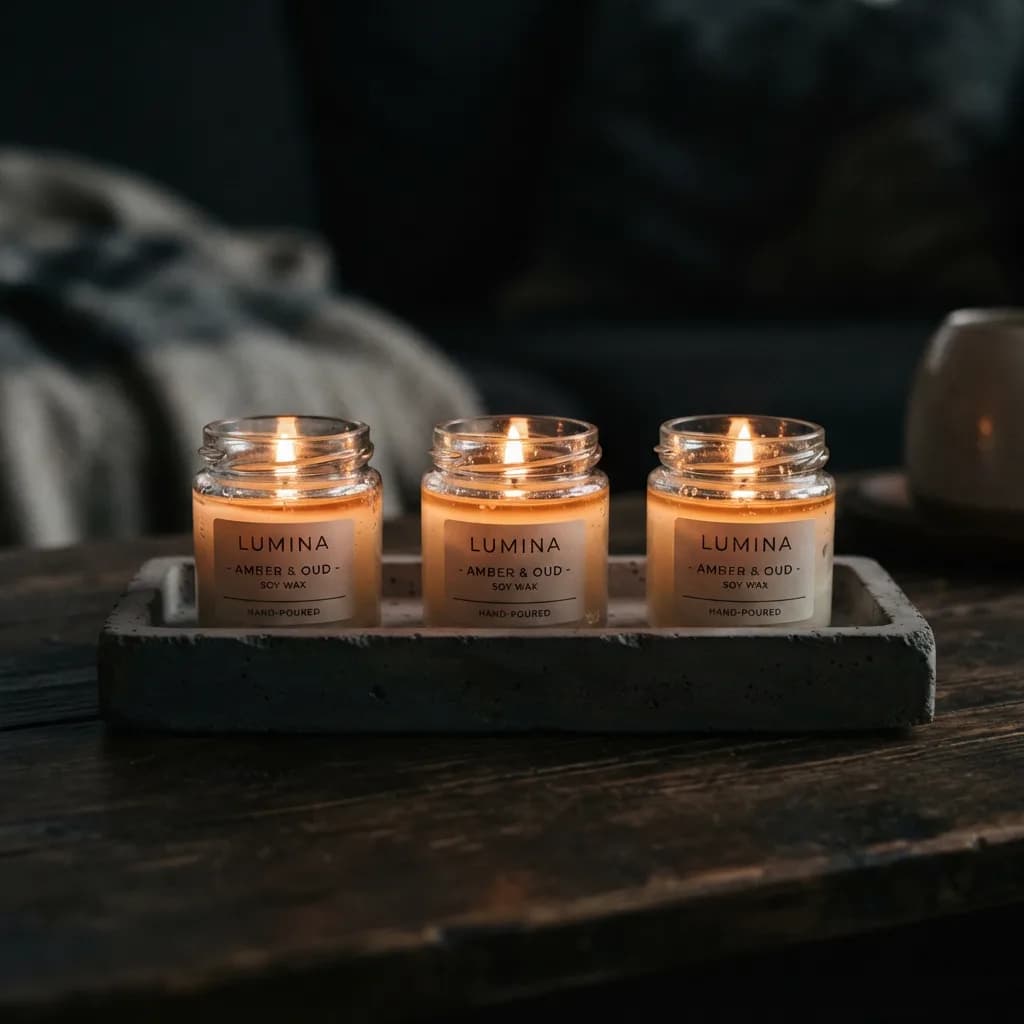
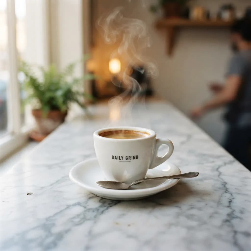
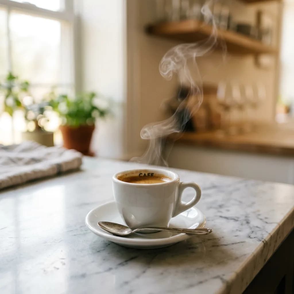
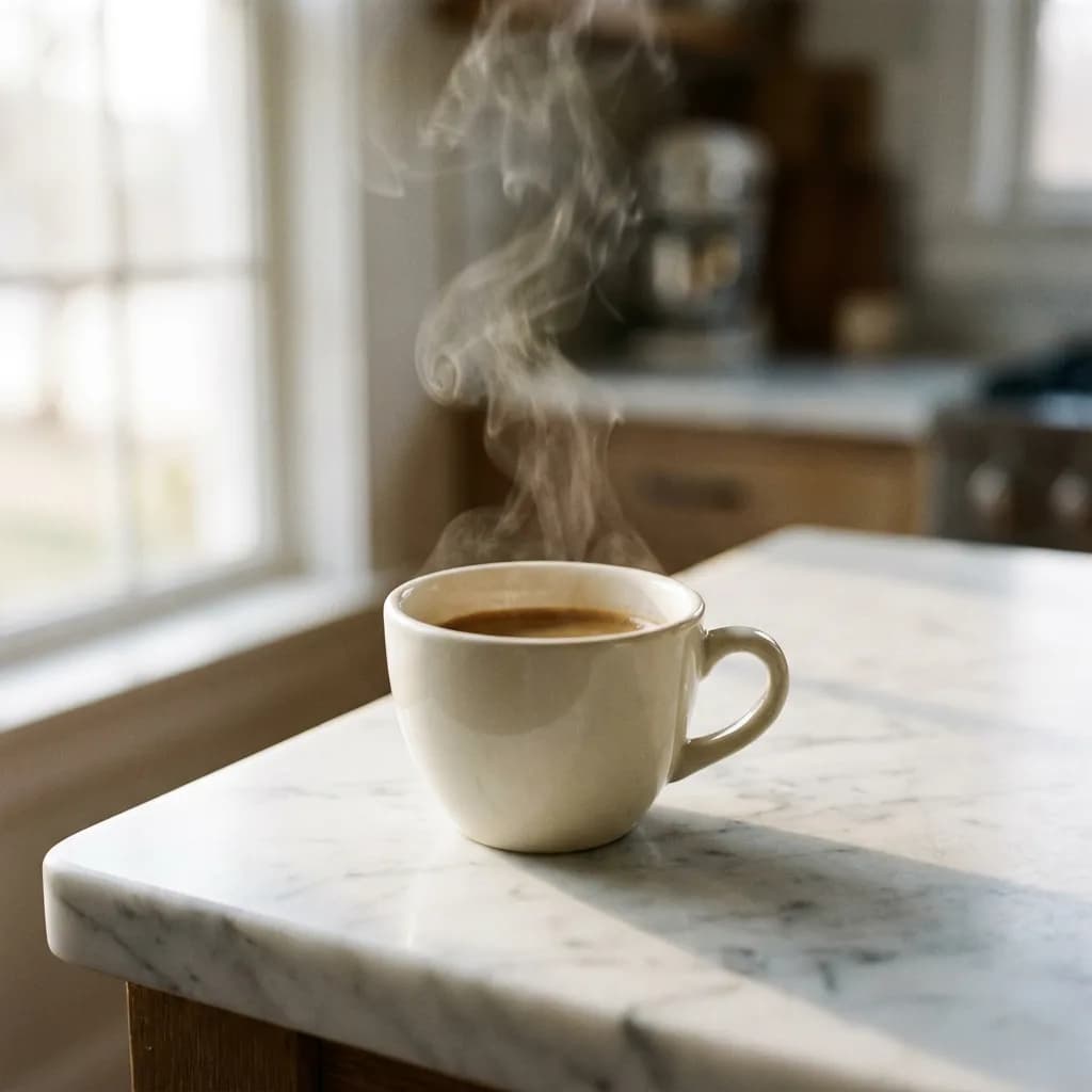
Lite produced perfectly usable product images for 9 out of 10 prompts. The espresso cup (#1) from all three models was strikingly similar. Lite even added a believable "DAILY GRIND" brand name on the cup without being asked, which most photographers would call a bonus detail, not a flaw. The candle shot (#9) was indistinguishable from NB2 at first glance.
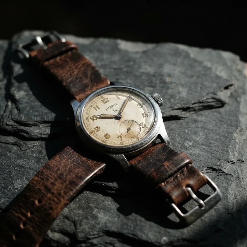
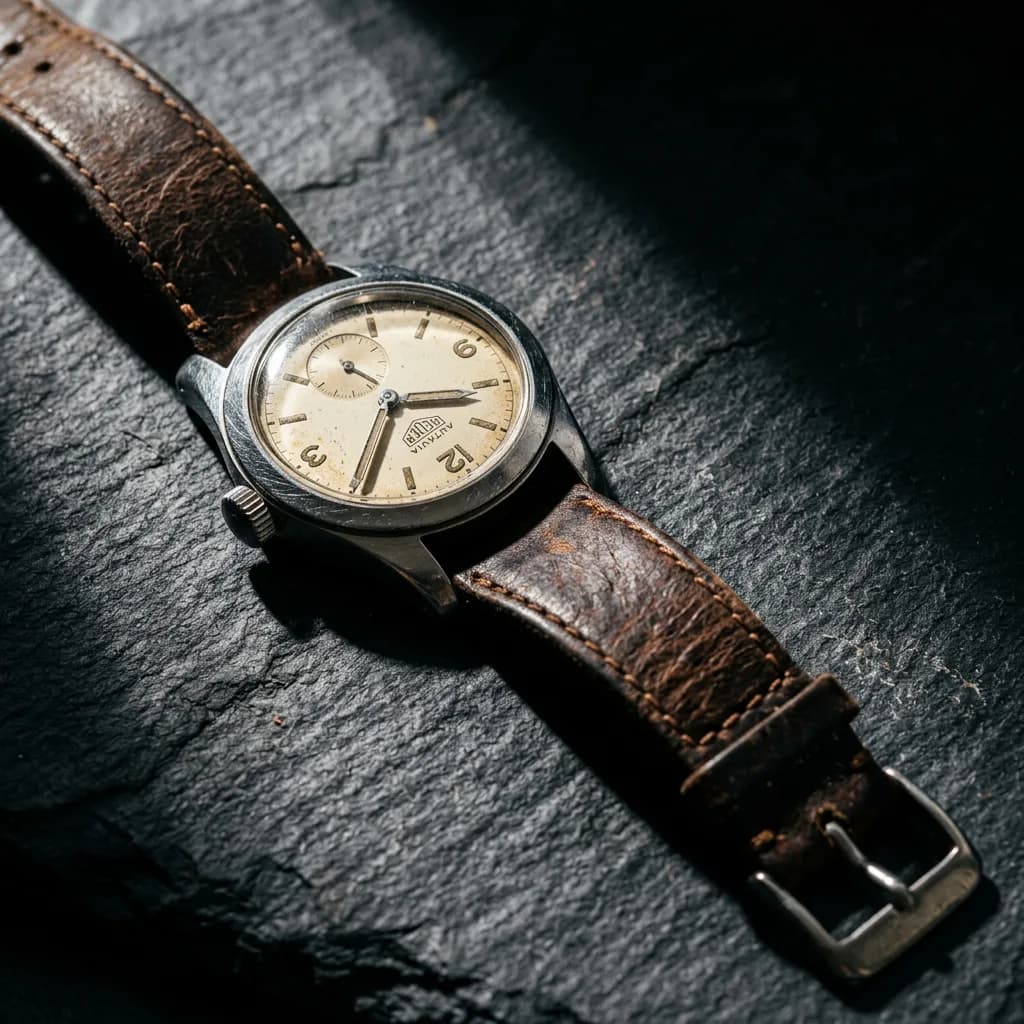
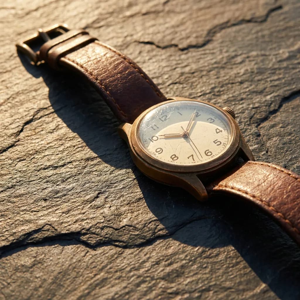
Where Lite fell slightly short: the vintage watch (#4) had great strap texture and composition, but Pro rendered harder shadow falloff exactly matching the "dramatic side lighting" prompt. NB2 sat between the two. For product listings, social posts, or Etsy mockups, the gap is too small to matter at $0.03.
Lite standout: The candles on a concrete tray (#9). Warm amber glow, dark background, glass reflections, and the model hallucinated perfect "LUMINA - AMBER & OUD - SOY WAX" labels on all three jars. Readable, consistent, commercially viable. At $0.03. That's the image that made me question my own pricing tiers.
Pro standout: The leather watch (#4). Sharp shadow casting across textured slate, every dial number legible, and the most convincing worn-leather grain of the three.
Here's the watch comparison — the prompt where Pro's lighting advantage was most visible:
Here's prompt #9 (candles), the one where Lite nearly matched Pro:
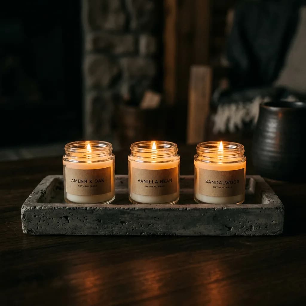
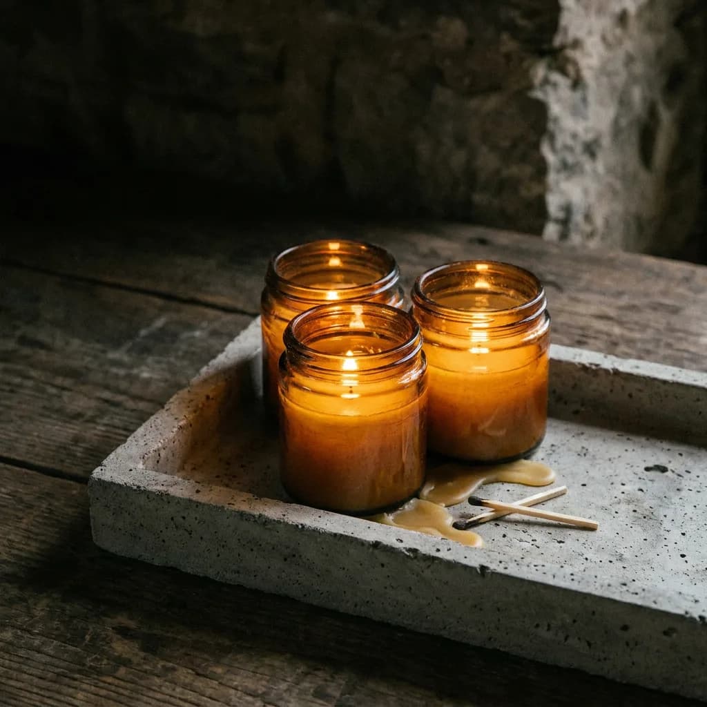
And here's prompt #1 (espresso cup), all three models:
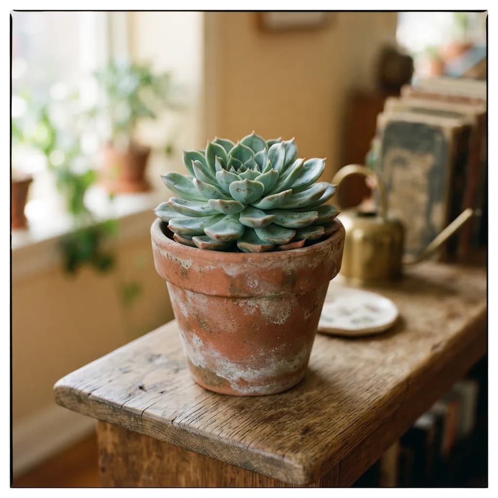
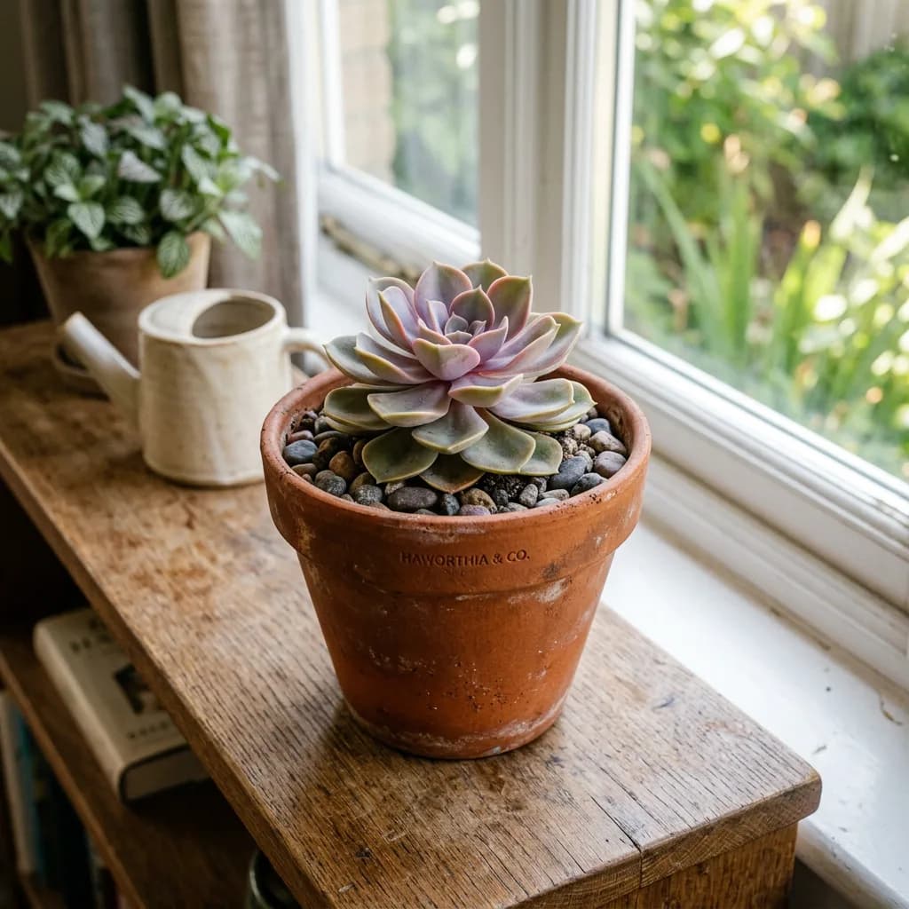
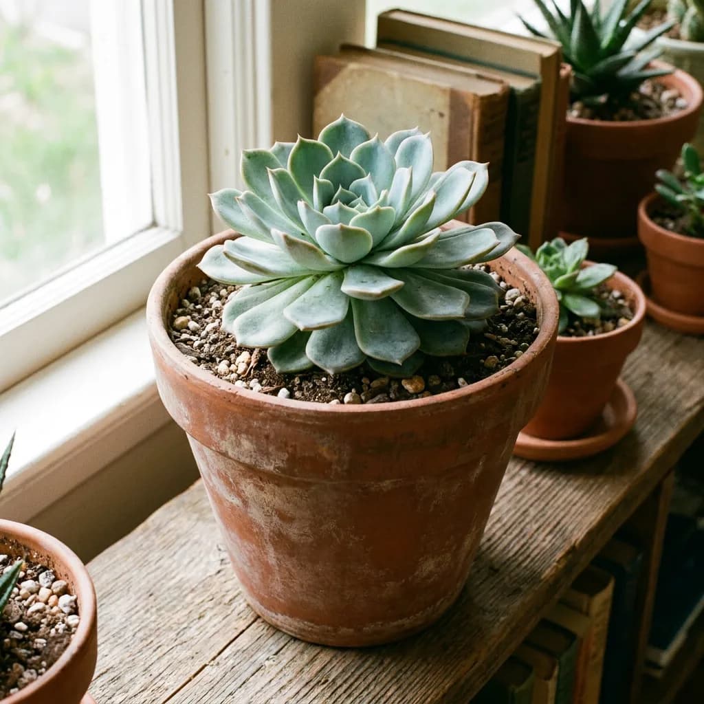
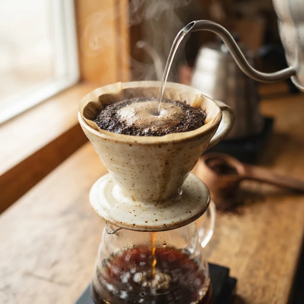
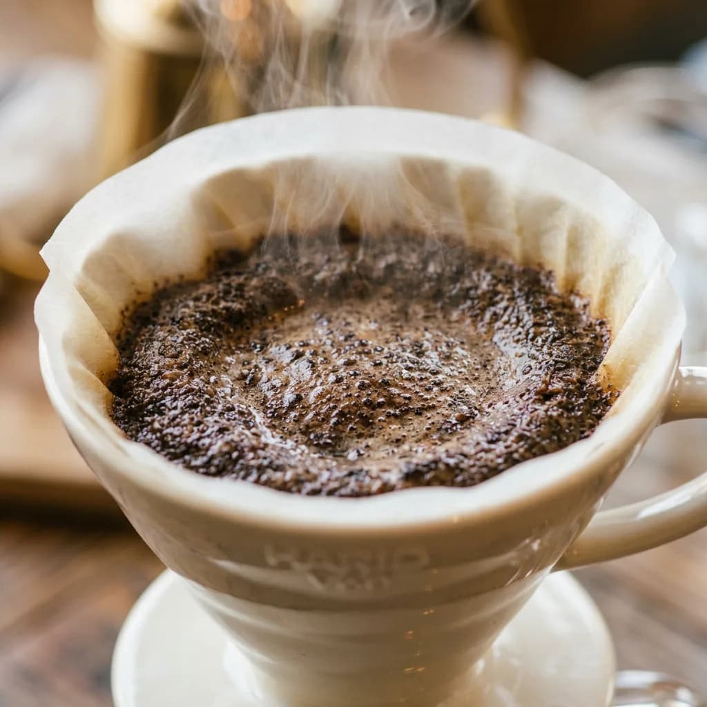
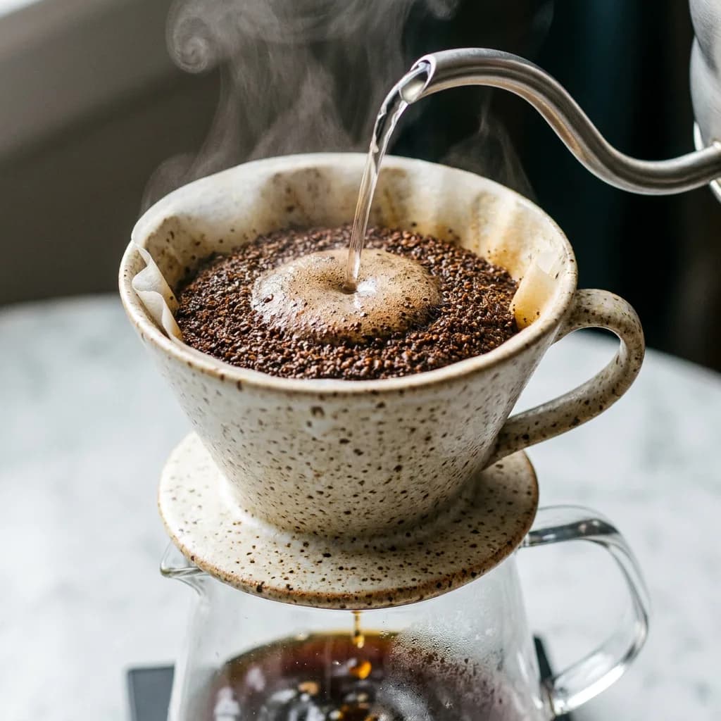
The succulent (#5) and pour-over dripper (#8) round out the product category. Simple subjects, controlled backgrounds — the kind of shots where Lite competes:
Portraits: where Pro pulls away
Faces expose model quality fast. Skin texture, eye reflections, hair strands, the way light wraps around a nose. Get any of these slightly wrong and the image slides into uncanny territory.
| Model | Adherence | Realism | Artifacts | Avg. |
|---|---|---|---|---|
| Lite | 3.4 | 3.4 | 3.3 | 3.4 |
| NB2 | 3.6 | 3.5 | 3.4 | 3.5 |
| Pro | 4.3 | 4.4 | 4.1 | 4.3 |
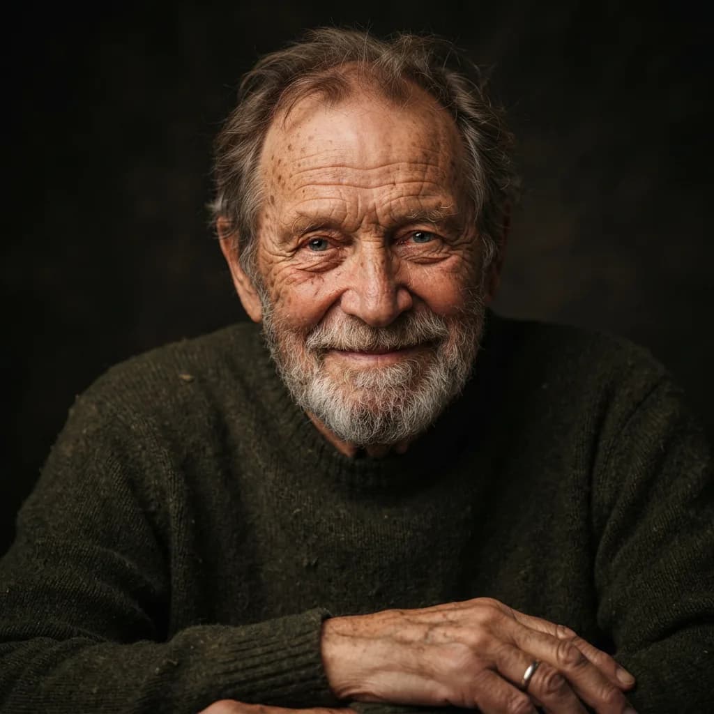
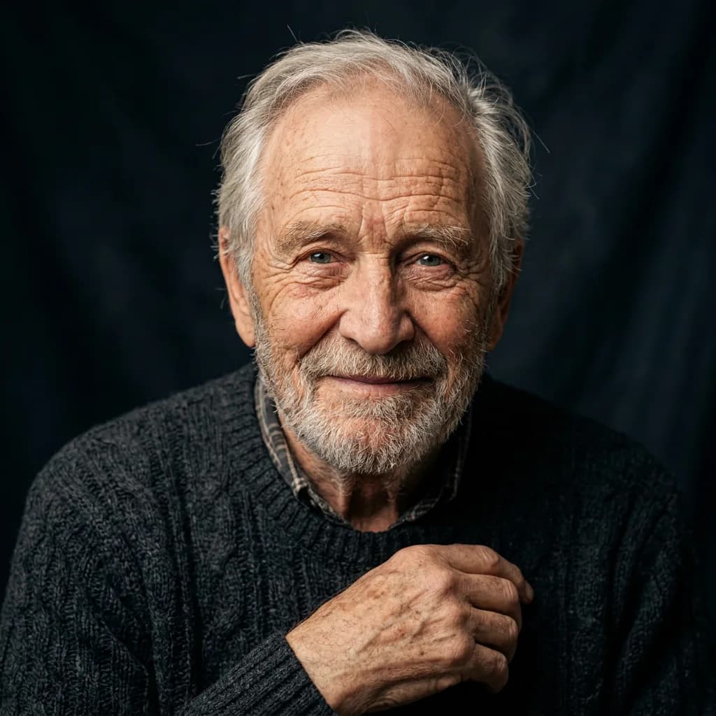
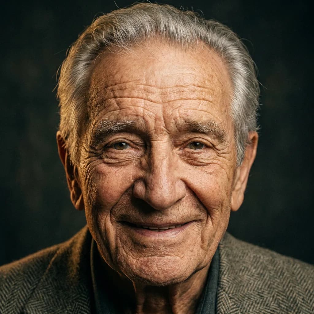
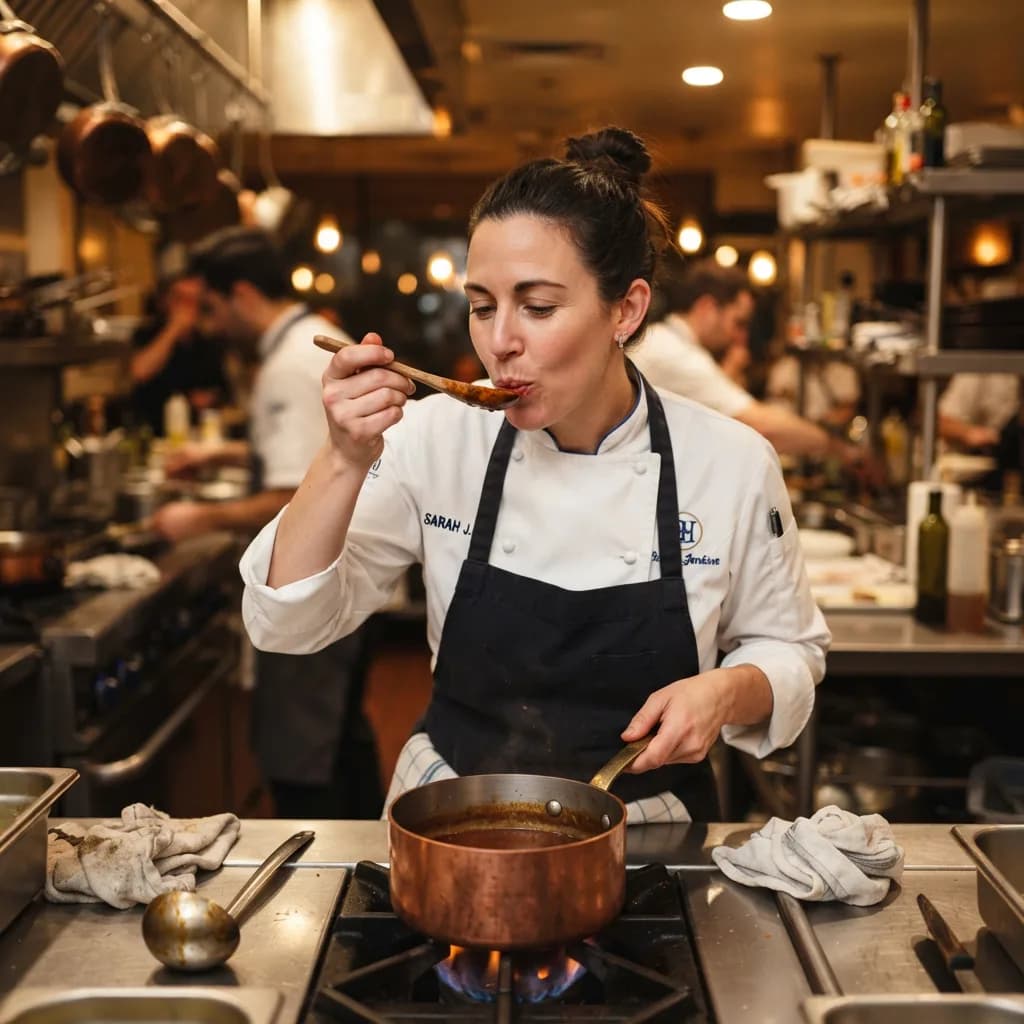
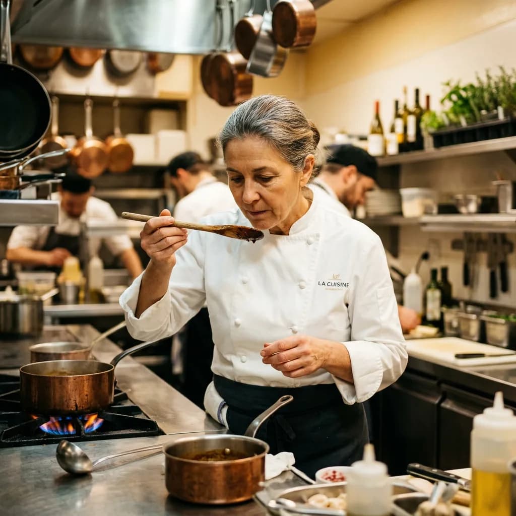
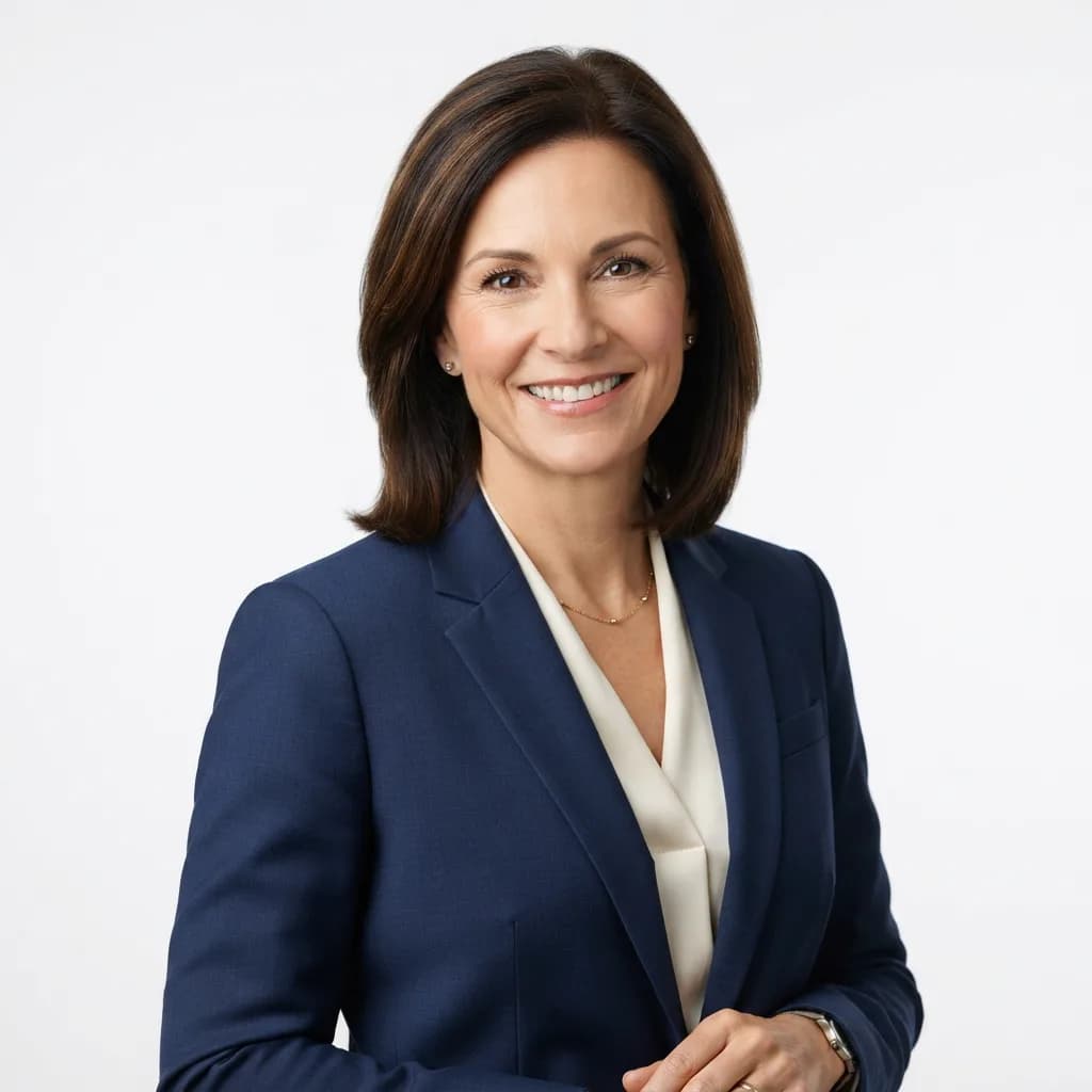
The gap is real but smaller than you'd expect. Lite's elderly man portrait (#1) surprised me: the wrinkles look lived-in, not painted on, and the warm studio lighting wraps around the face convincingly. At a phone-screen size, you'd struggle to tell it from Pro. The corporate headshot (#4) could pass on a LinkedIn profile, clean white background and all. The chef (#9) from Lite was genuinely magazine-quality, complete with a legible name embroidered on the coat and a busy professional kitchen behind her. Where Pro's advantage shows is pixel-level: individual pores, clearer eye reflections, and a tighter light gradient that reads as professional studio work.
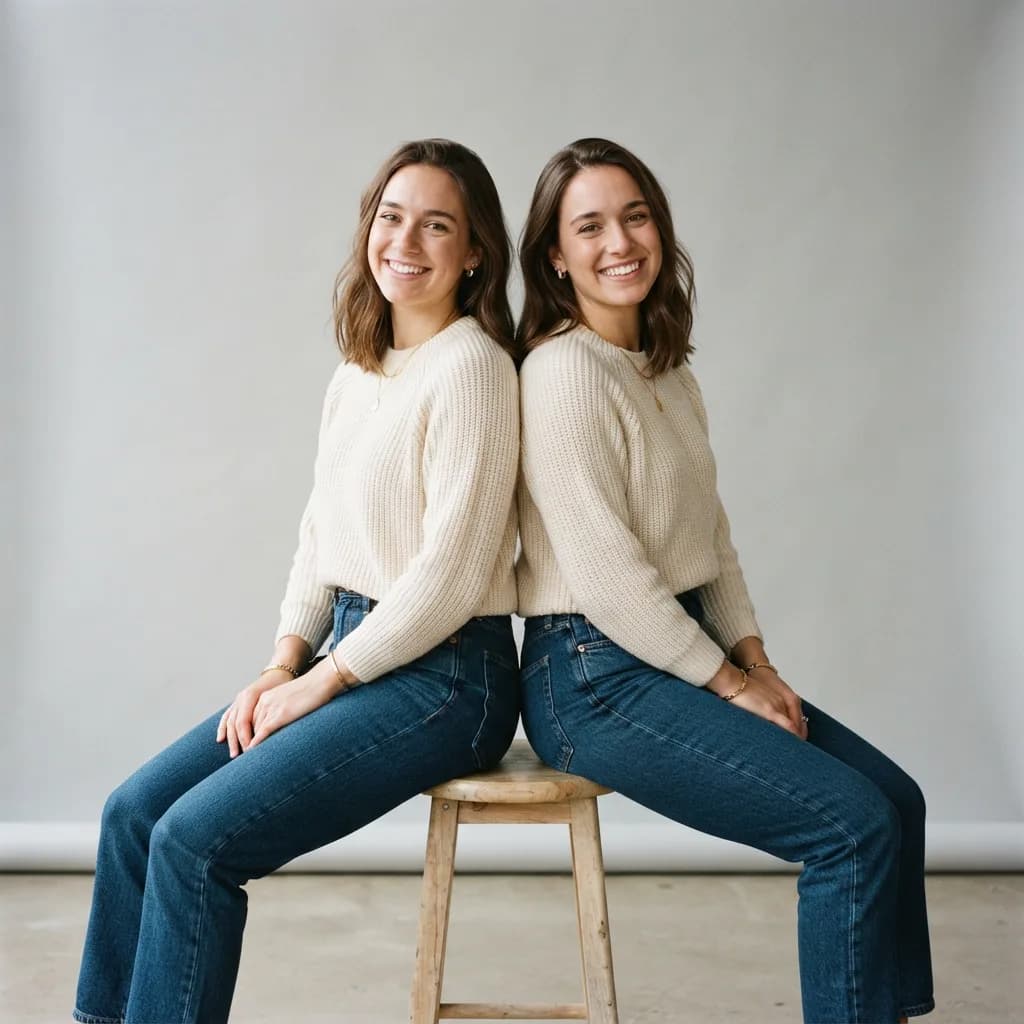
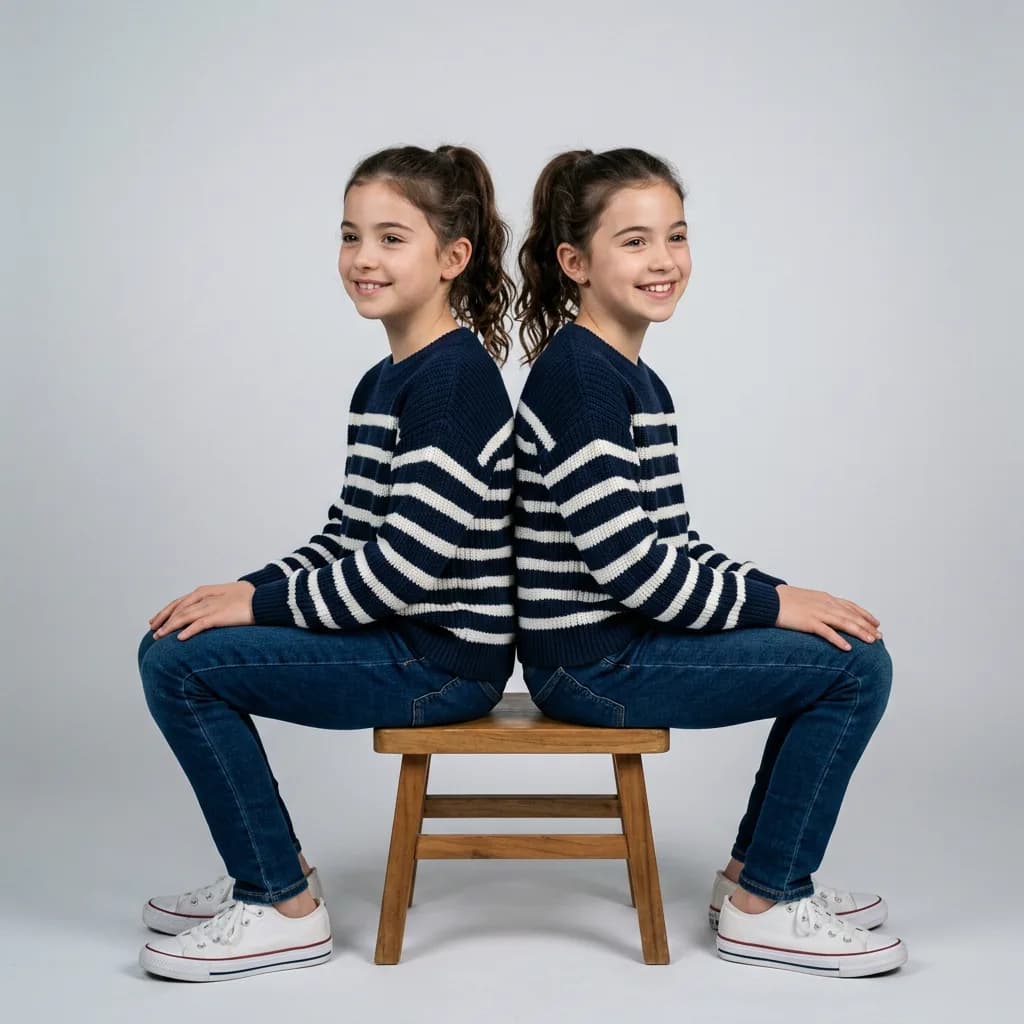
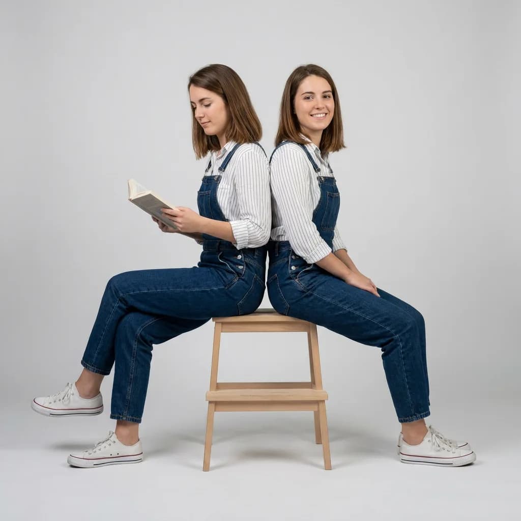
The twins prompt (#10) was interesting across the board. Lite's twins actually looked convincingly similar, matching sweaters and close facial features. NB2 produced two people who looked related but not identical. Pro got the closest to true twin symmetry. This is a known challenge for single-generation models without reference images.
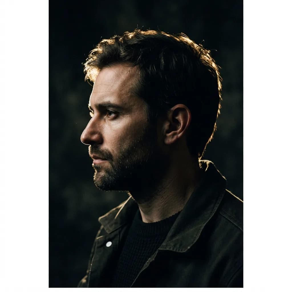
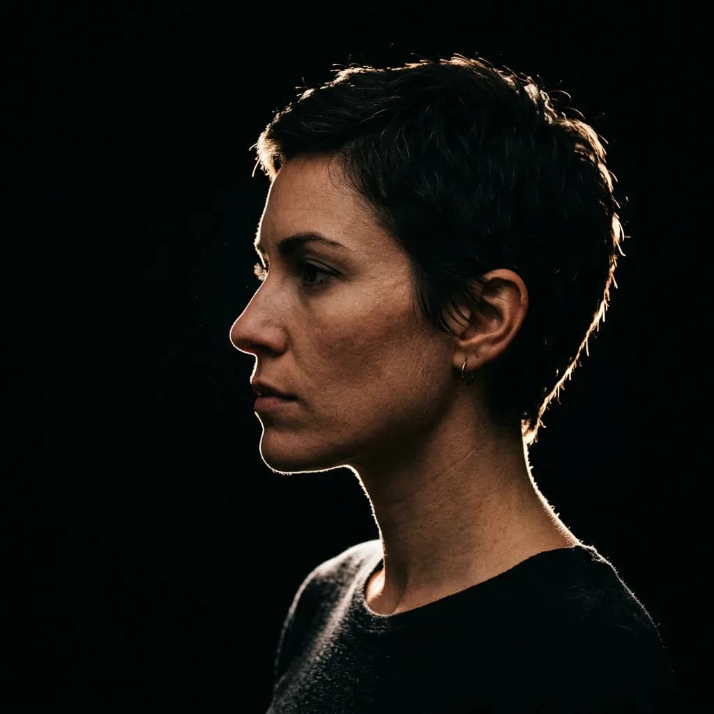
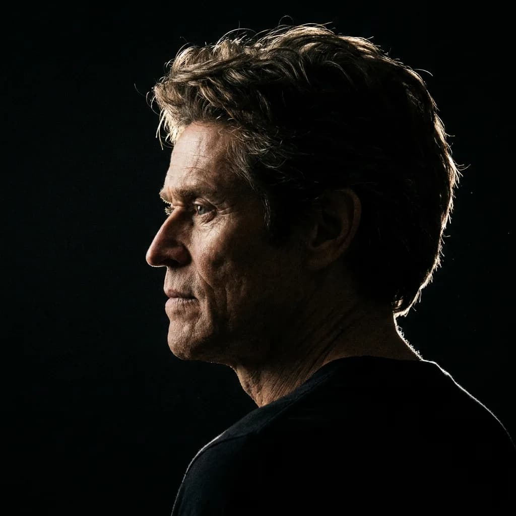
The rim-lit profile (#8) exposed a real difference: Pro delivered magazine-quality tonal separation, while Lite's version was moody and competent but lacked the same dramatic precision. For social media or blog use, eight or nine of Lite's ten portraits were genuinely usable.
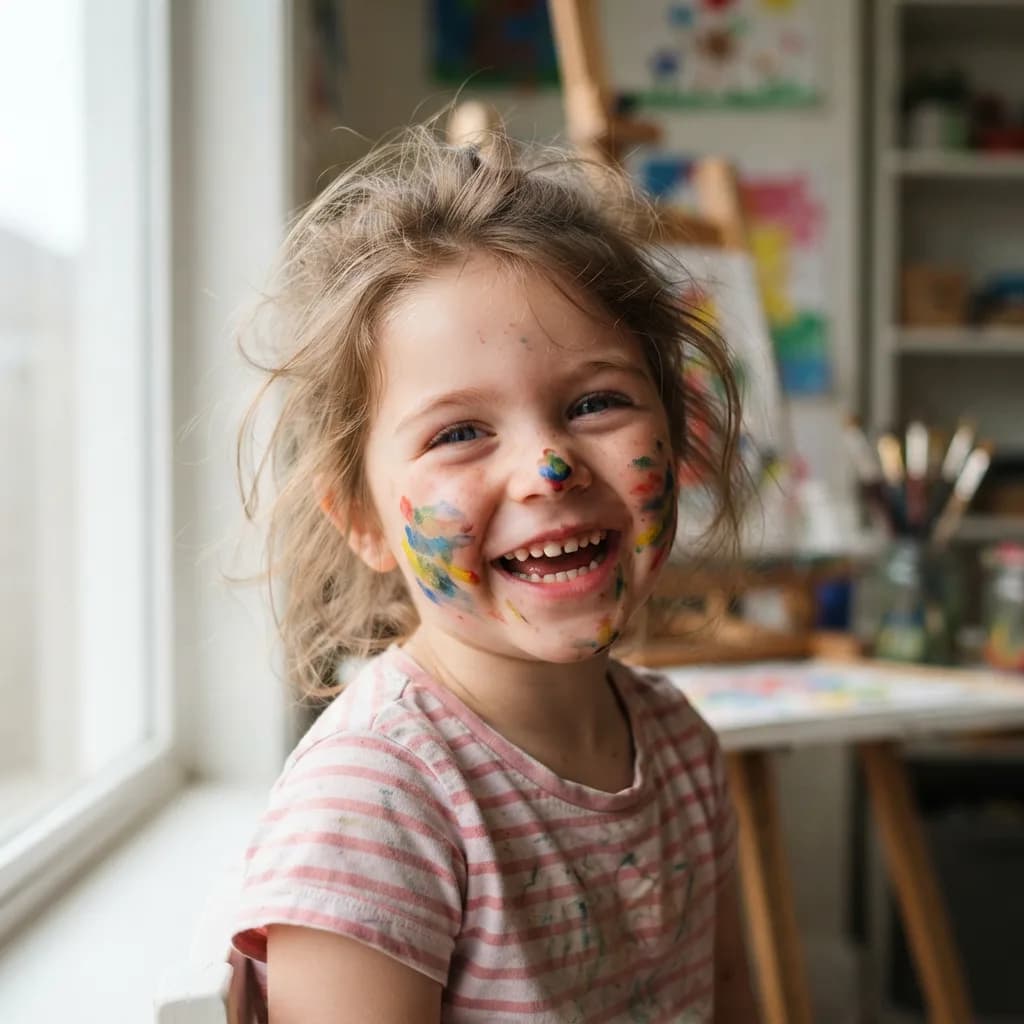
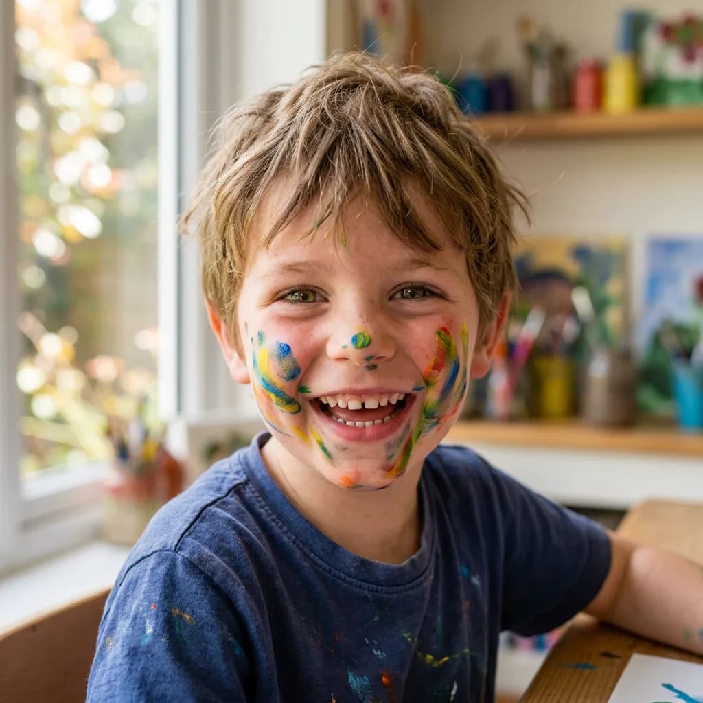
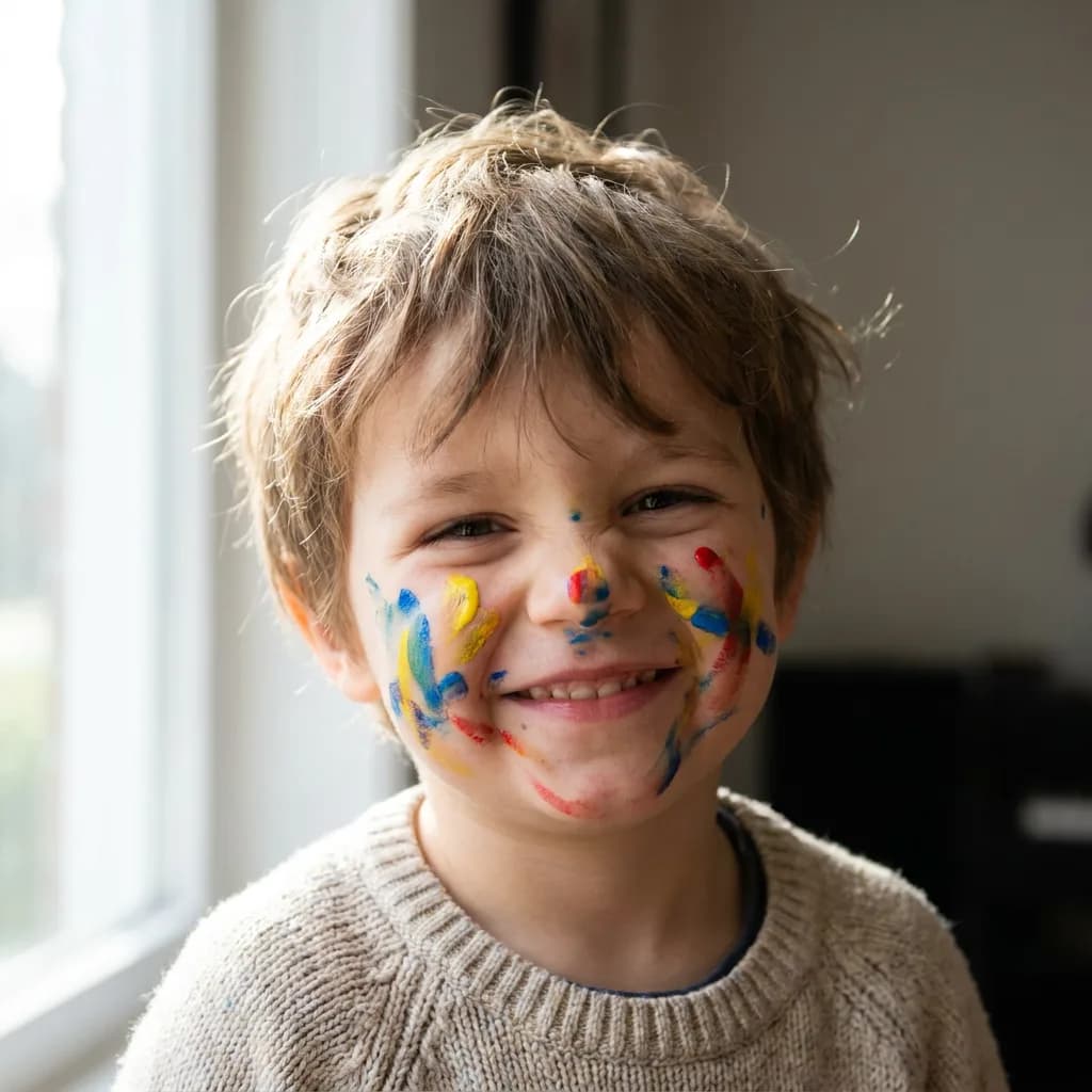
Pro delivered the most consistently photographic results. The child with paint-stained cheeks (#3) had the kind of natural expression that's hard to prompt out of weaker models.
Here's the elderly man (#1) comparison:
The chef (#9), where Lite delivered what I'd call magazine-quality:
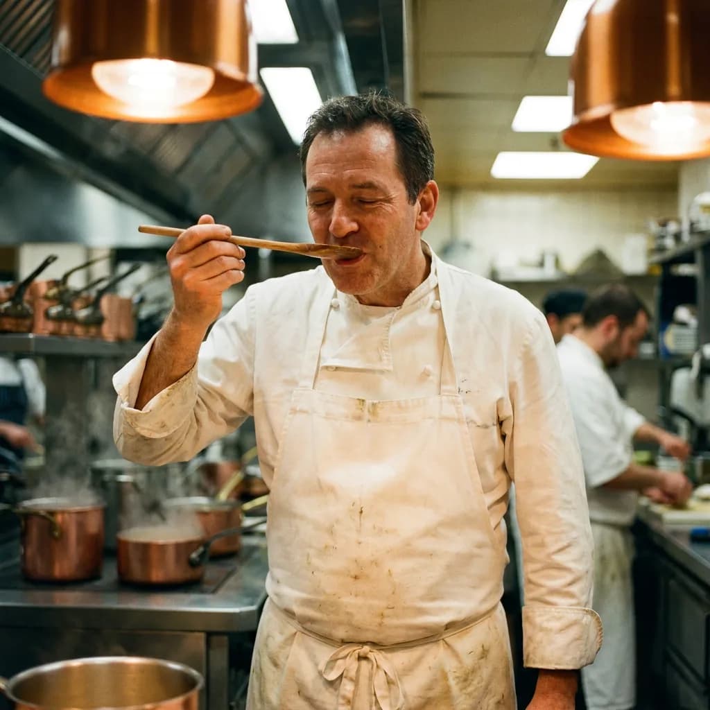
The twins (#10), the hardest portrait prompt:
And the rim-lit profile (#8), where Pro's tonal separation was most visible:
Typography: the test that surprised me
Text-in-image is the category most benchmarks skip. A year ago, asking a budget model to spell words correctly was a coin flip. I expected Lite to fail hard here. It didn't.
| Model | Adherence | Realism | Text Legibility | Artifacts | Avg. (text weighted 2×) |
|---|---|---|---|---|---|
| Lite | 3.6 | 3.7 | 3.7 | 3.6 | 3.7 |
| NB2 | 3.5 | 3.6 | 3.5 | 3.6 | 3.5 |
| Pro | 4.0 | 4.1 | 4.2 | 4.0 | 4.1 |
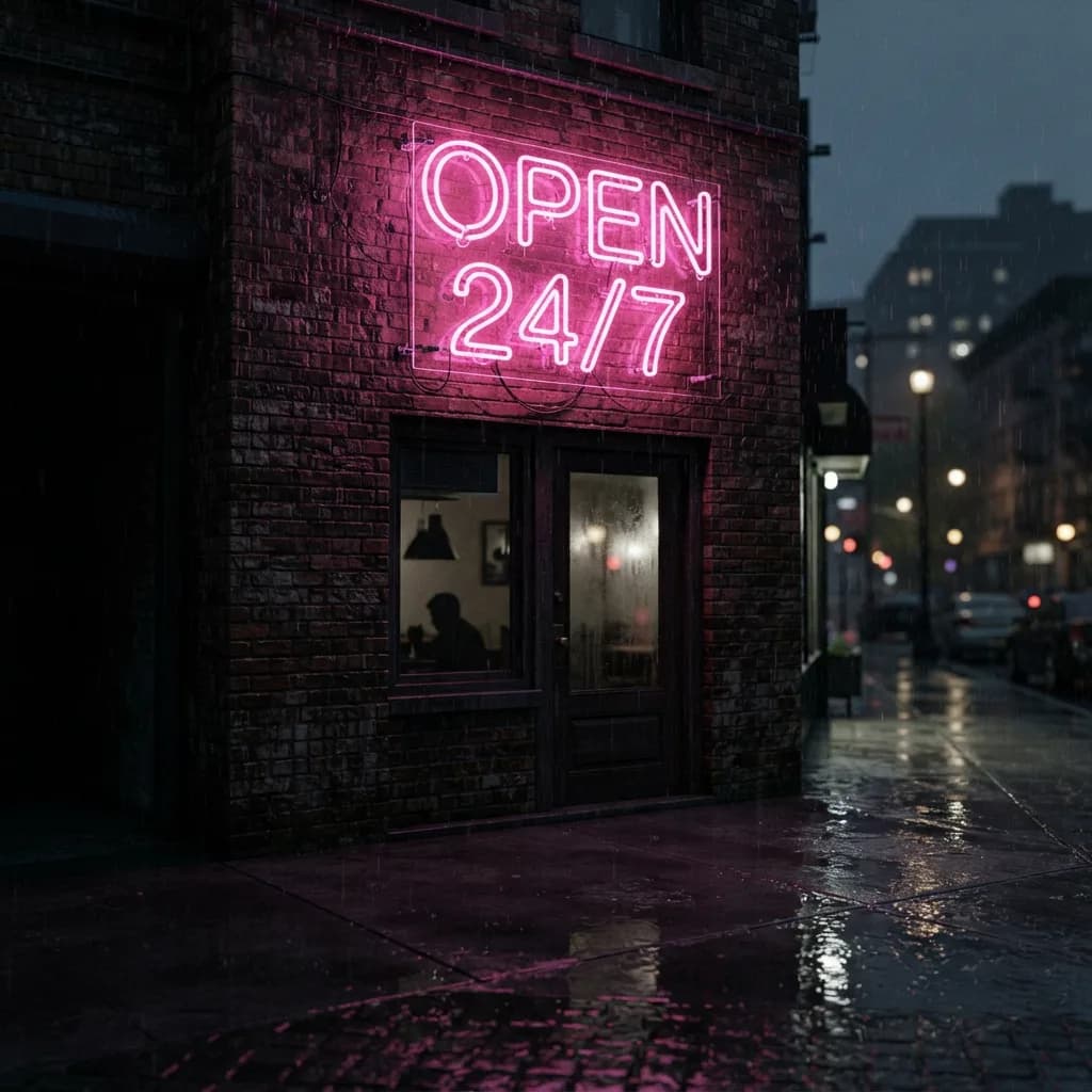
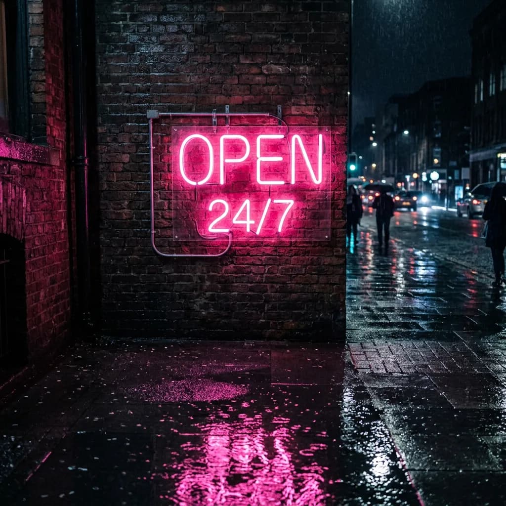
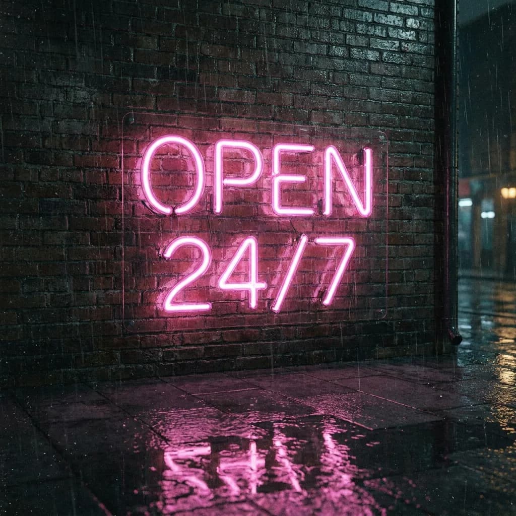
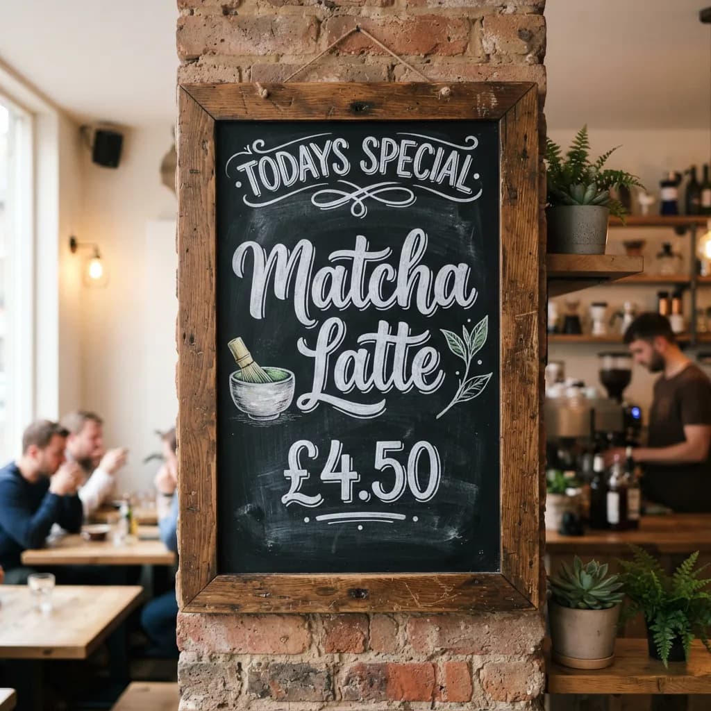
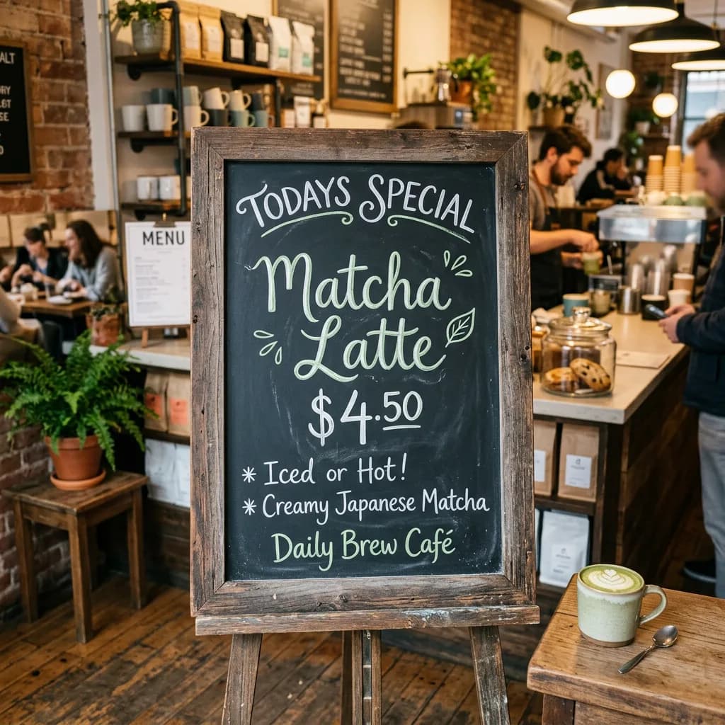
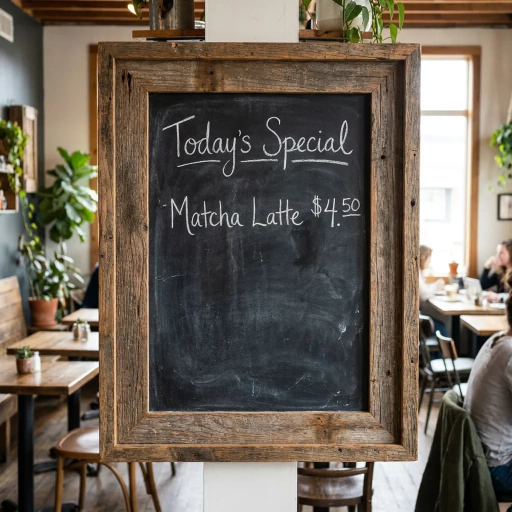
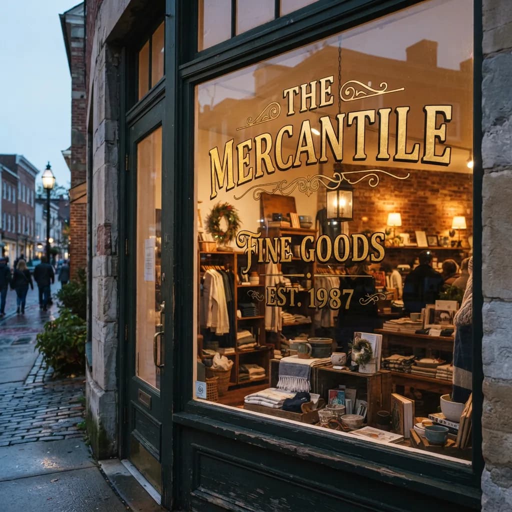
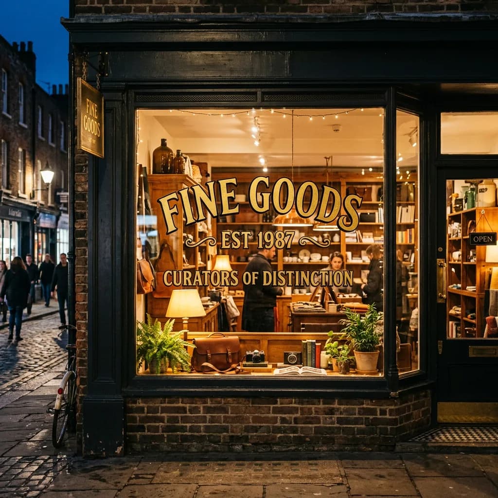
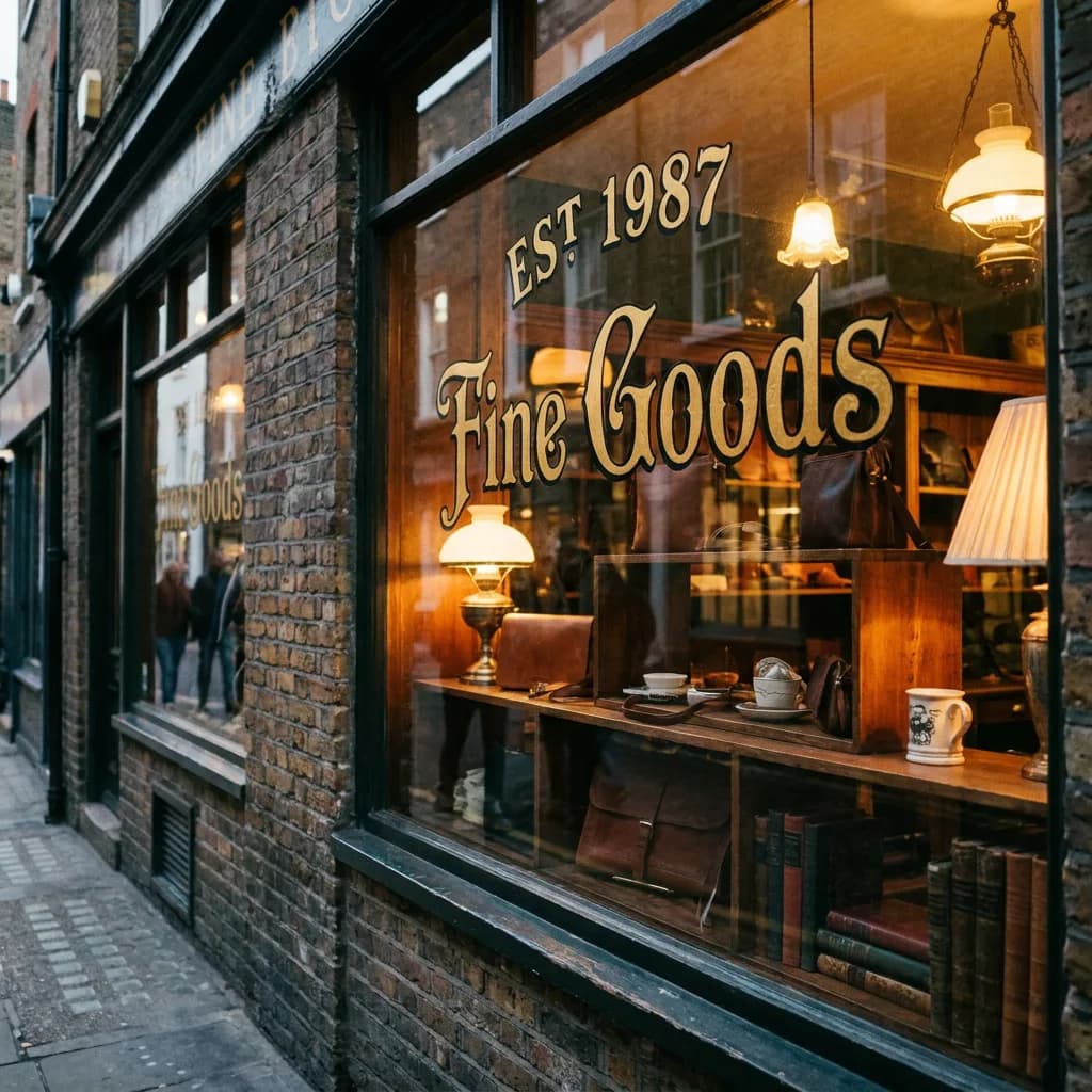
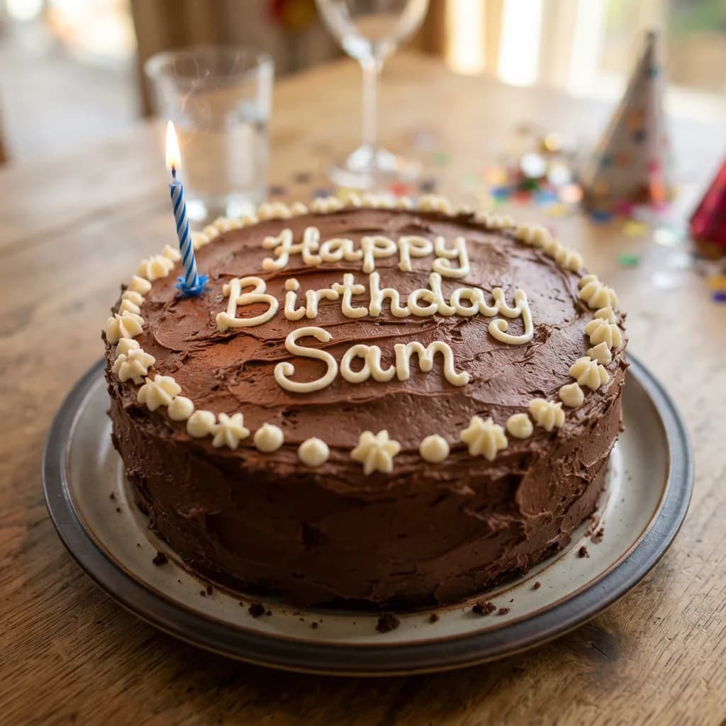
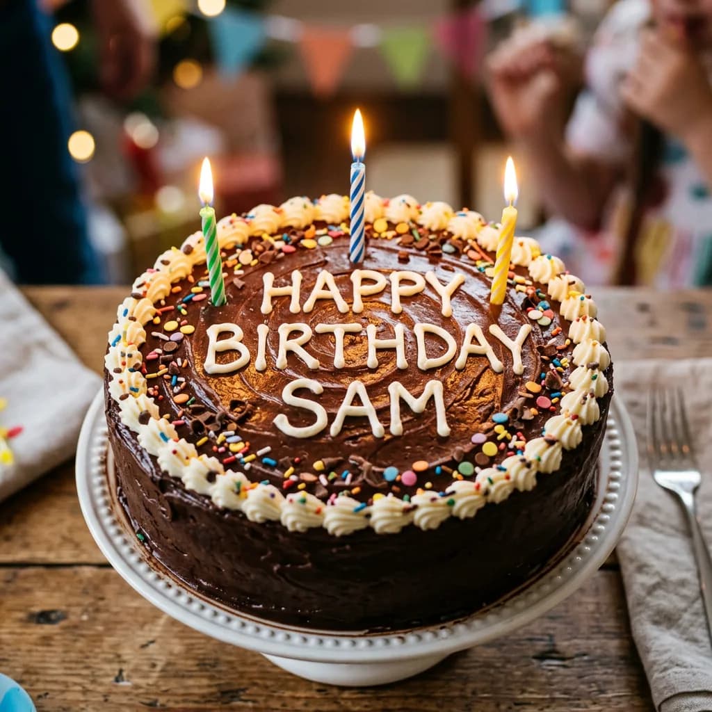
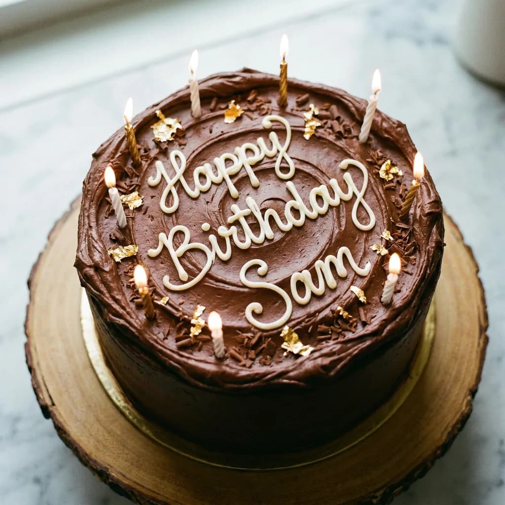
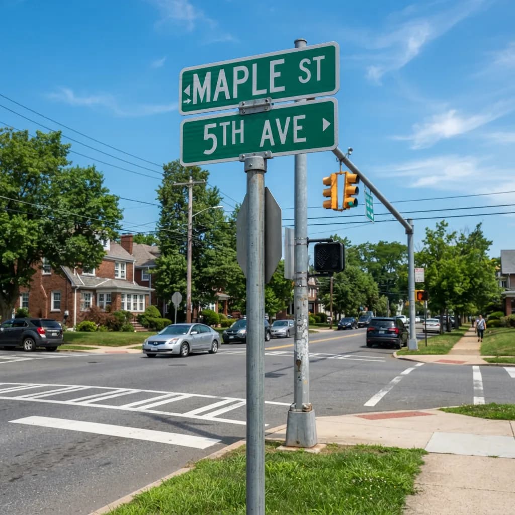
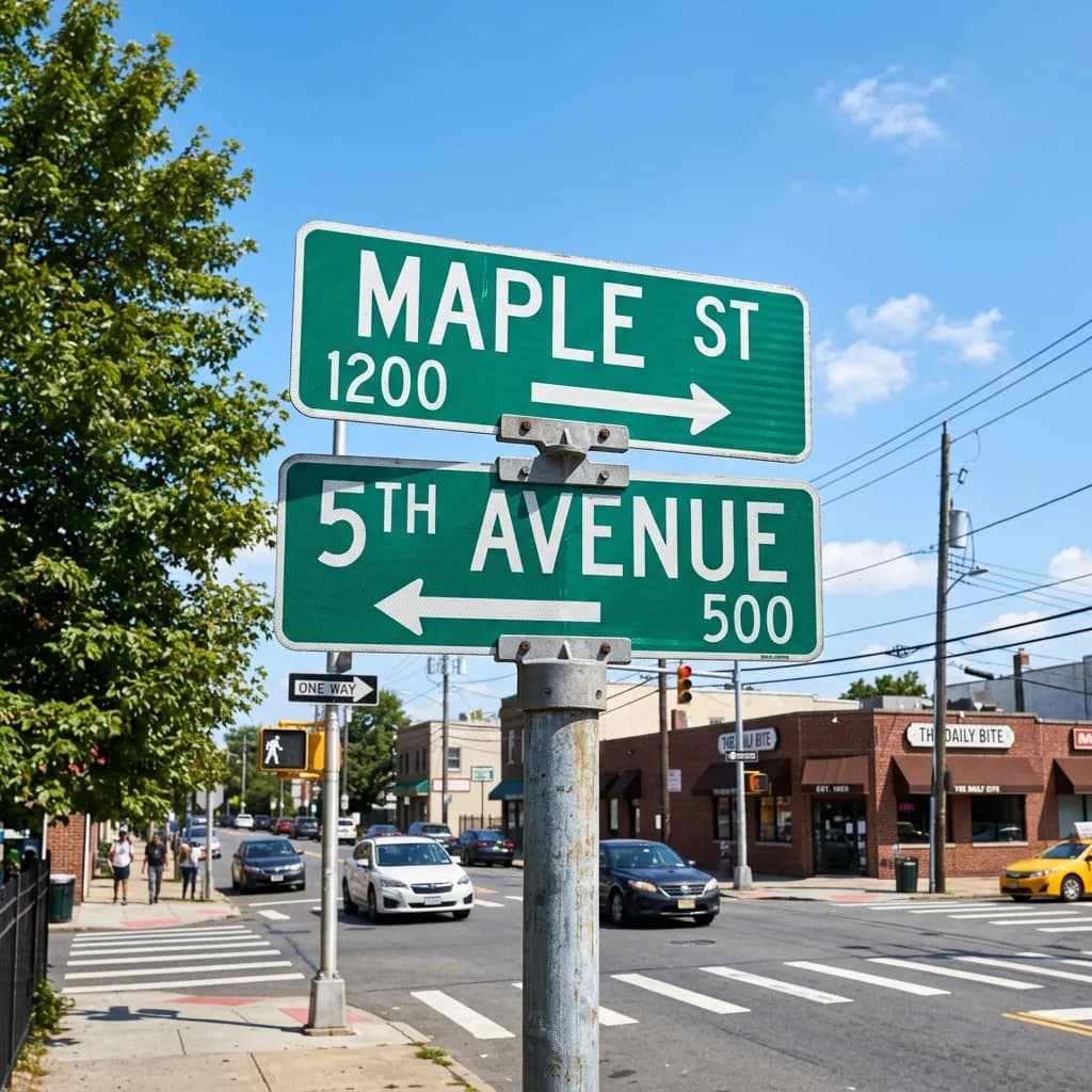
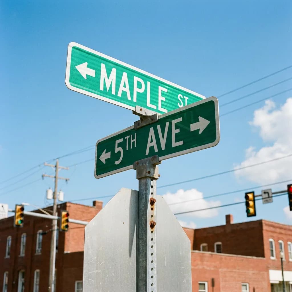
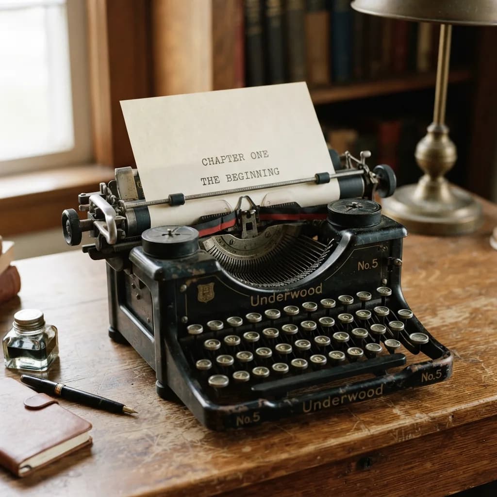
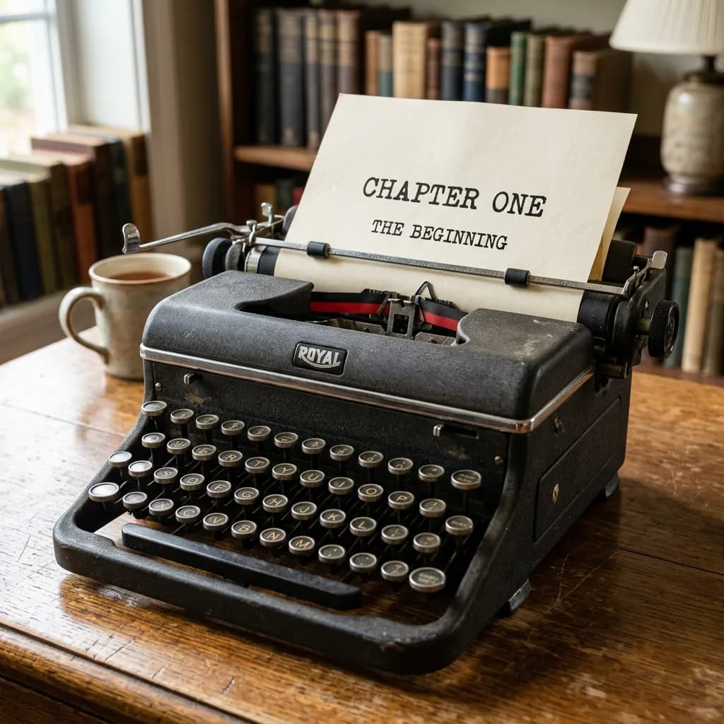
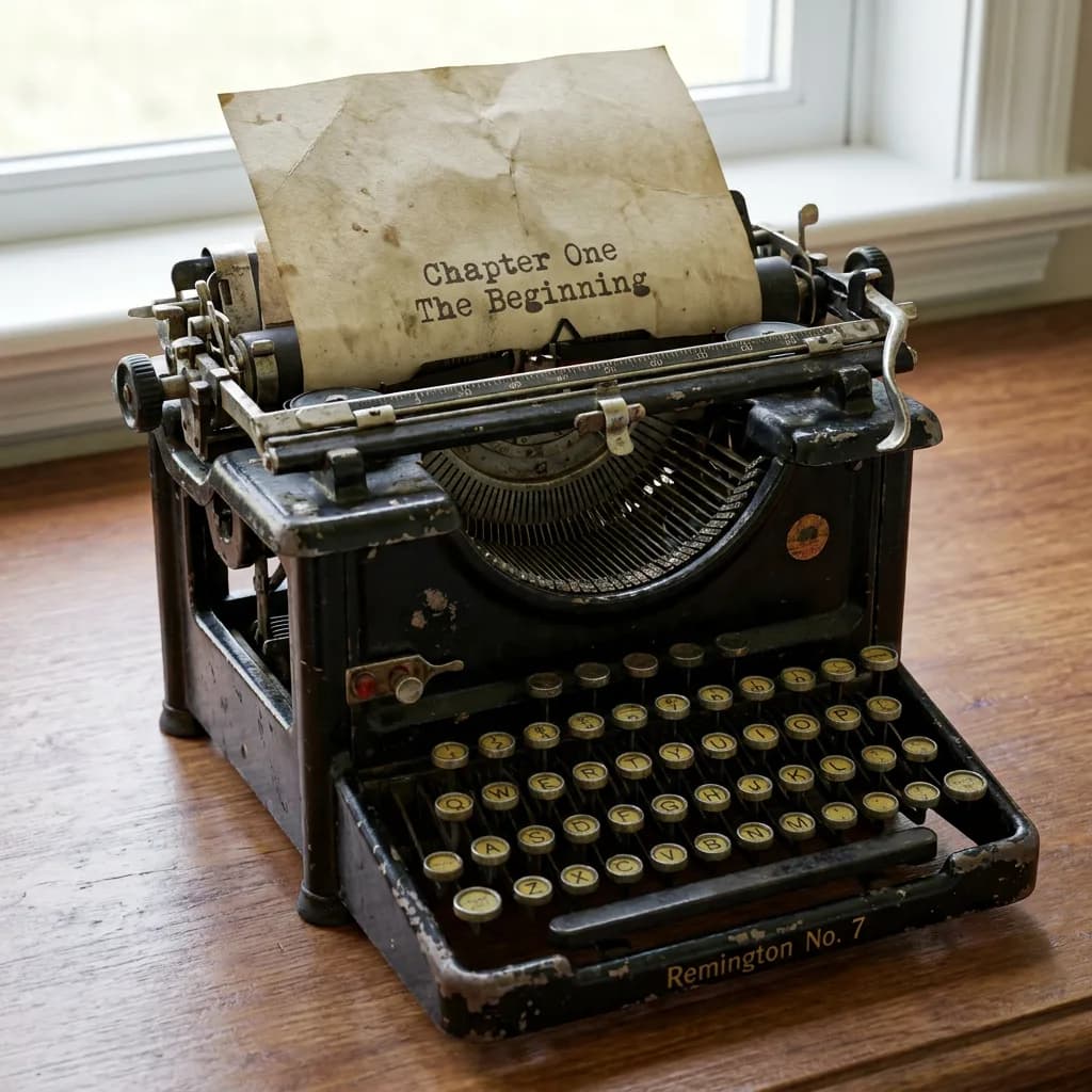
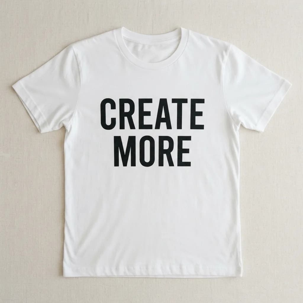
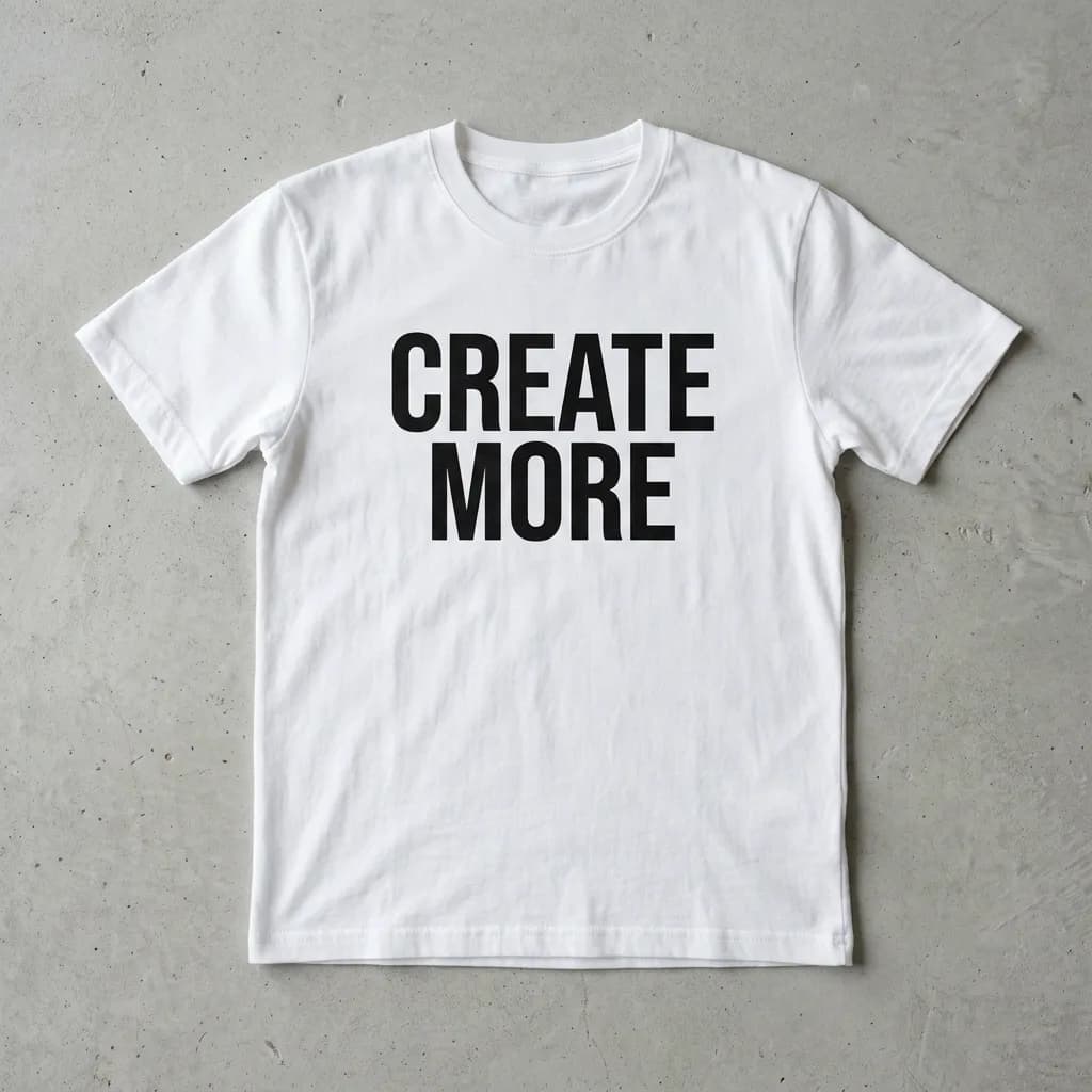
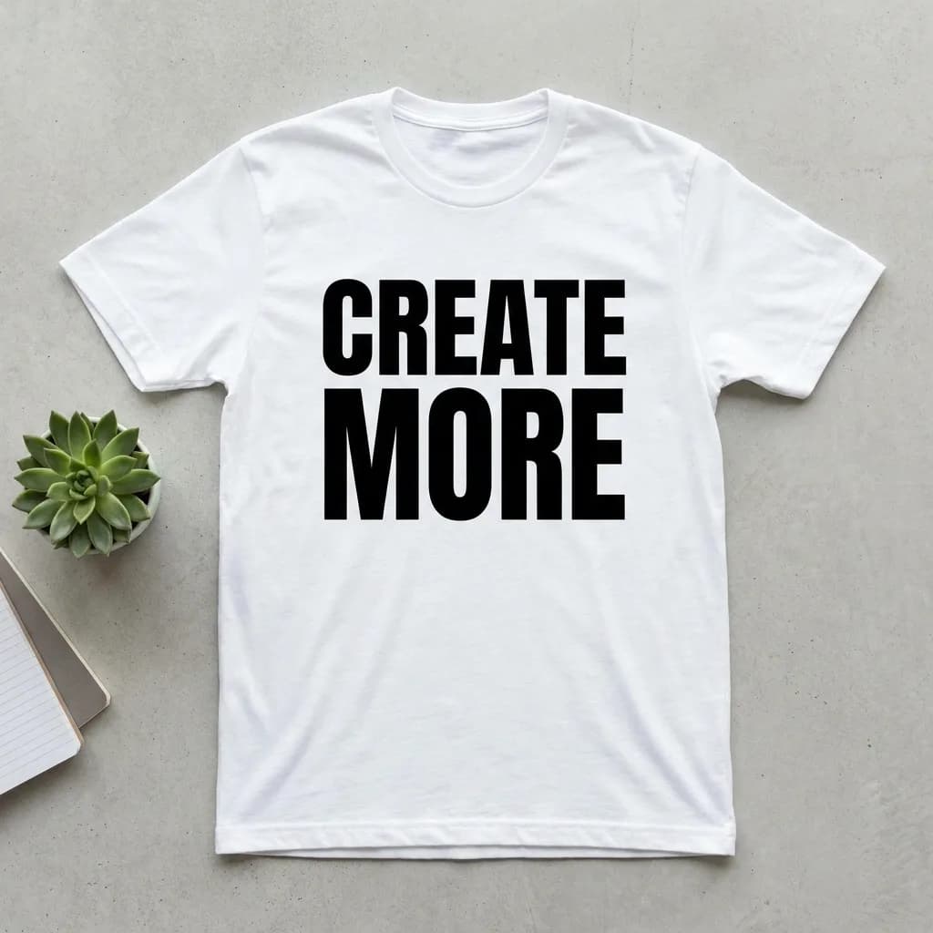
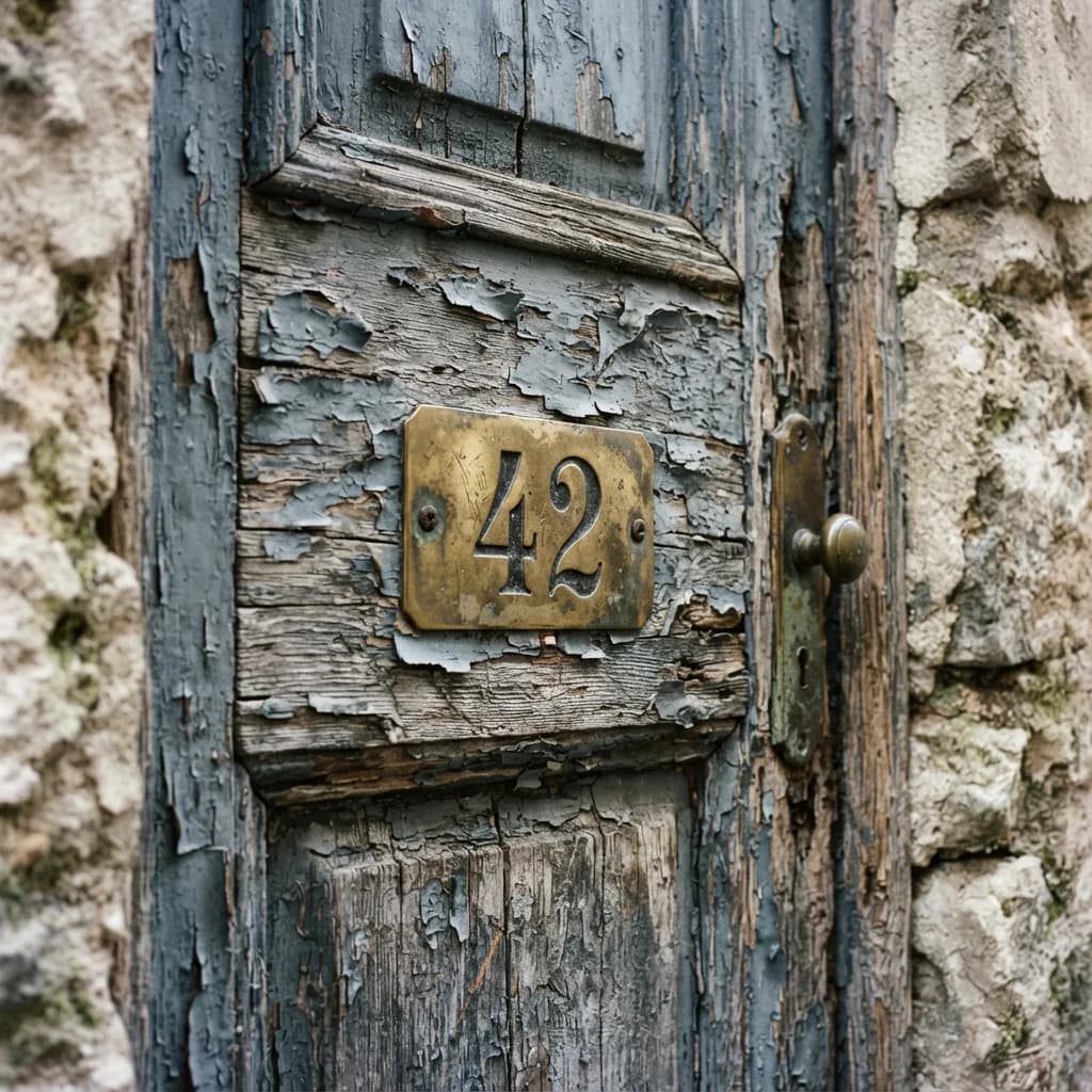
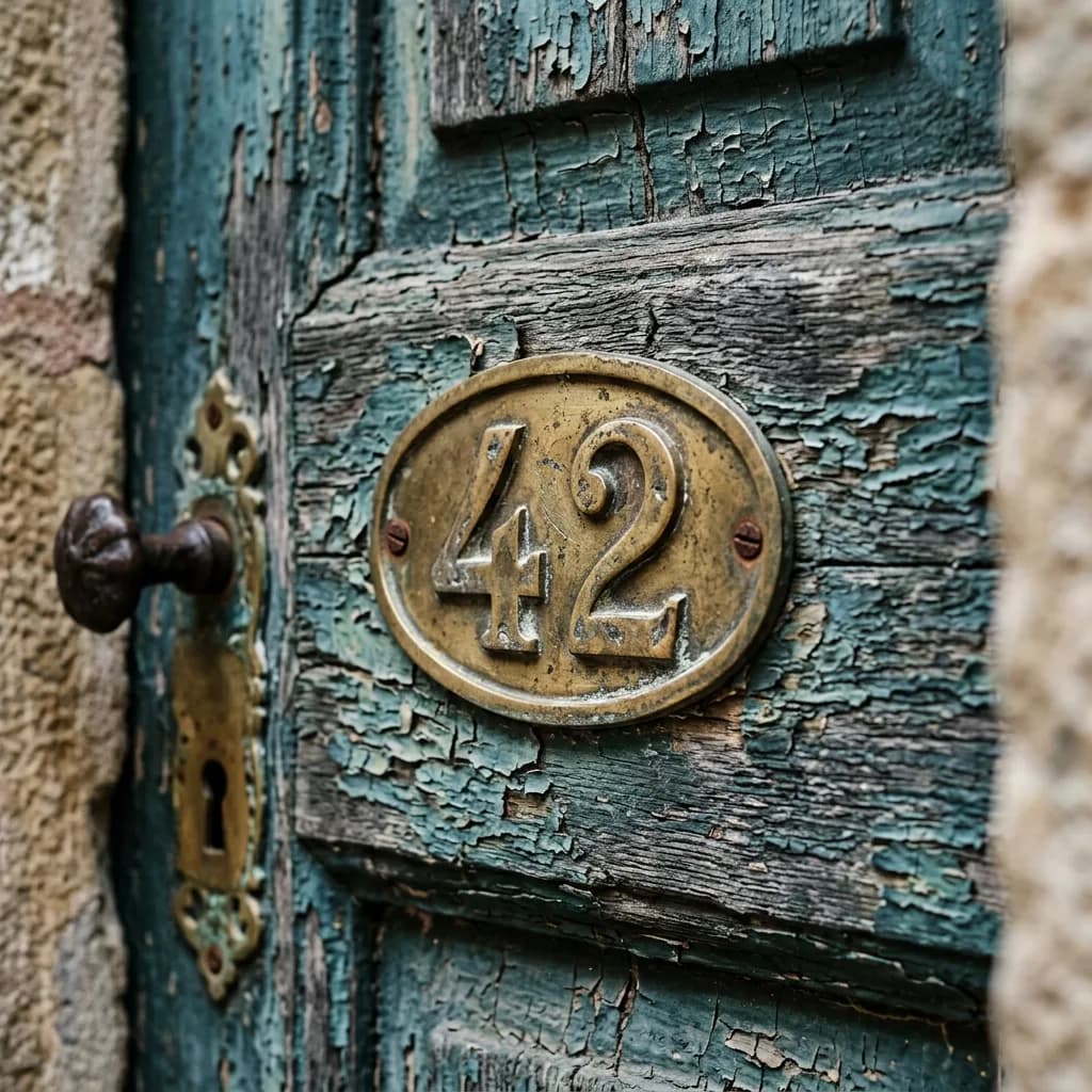
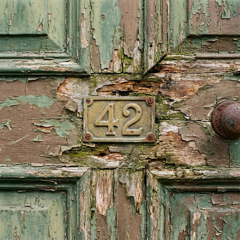
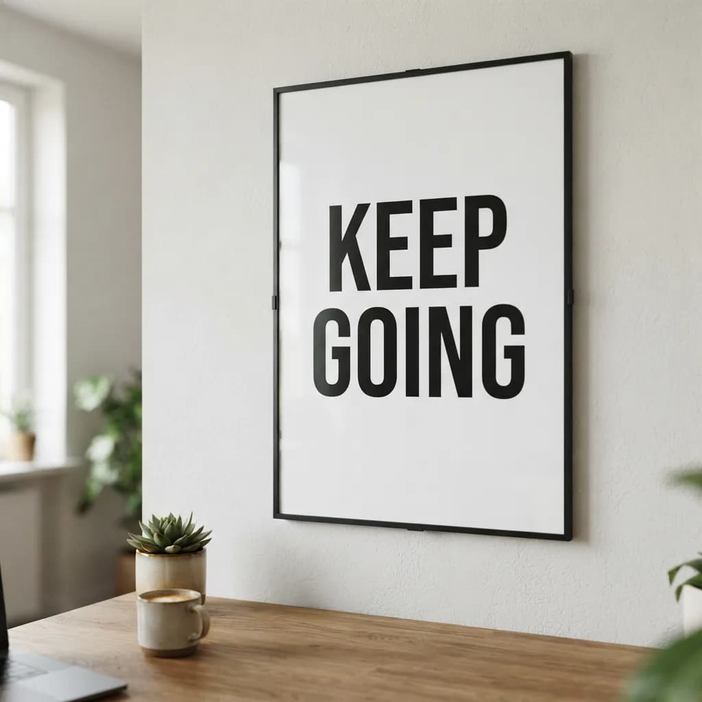
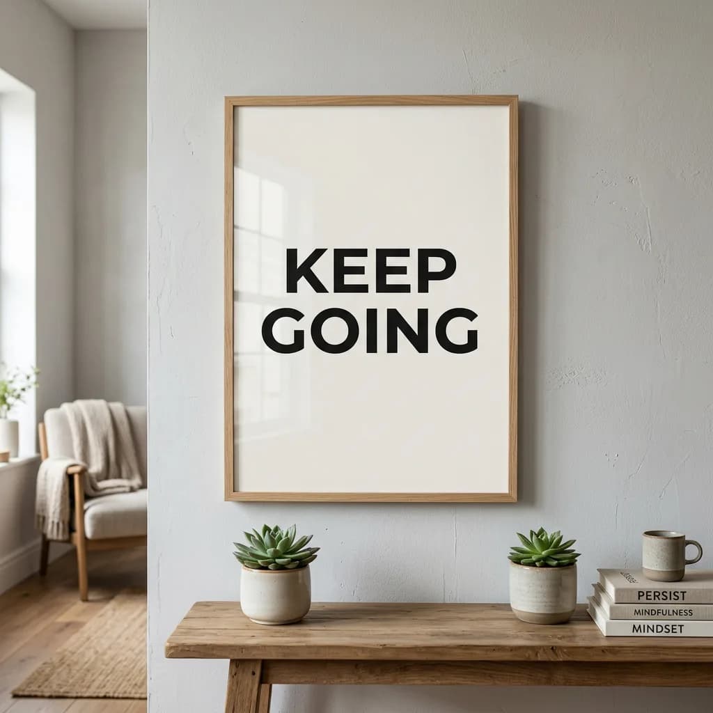
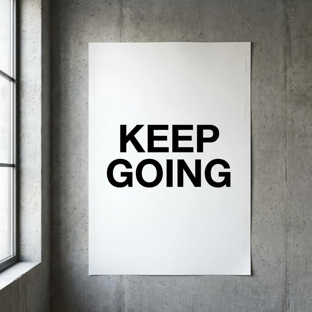
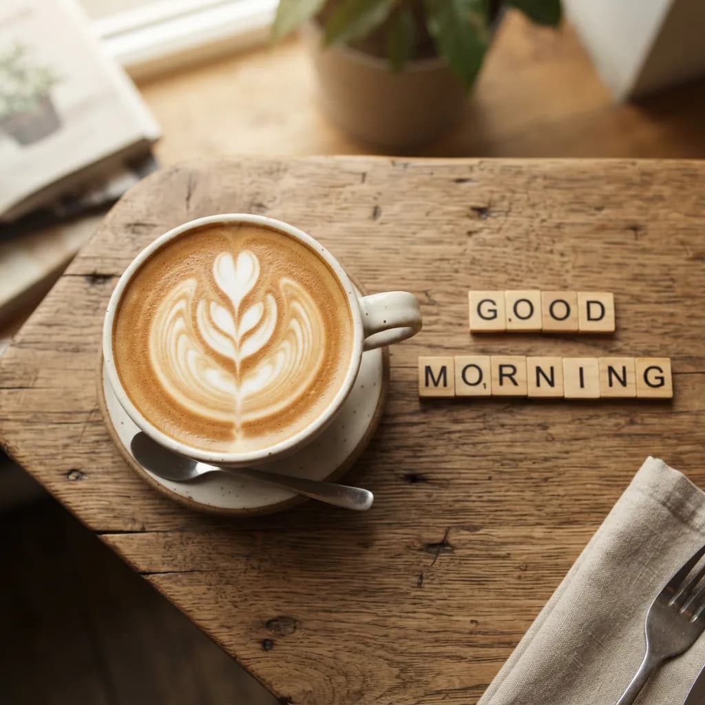
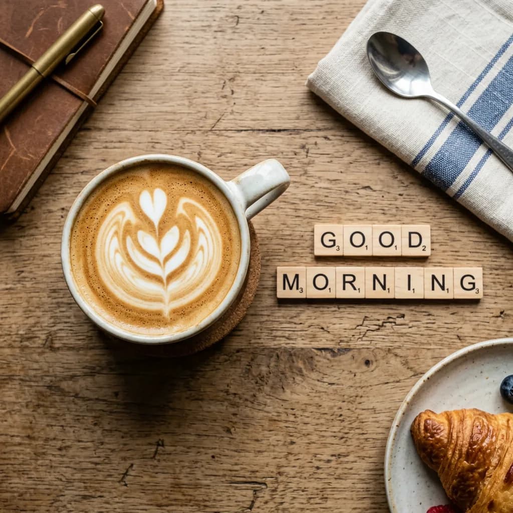
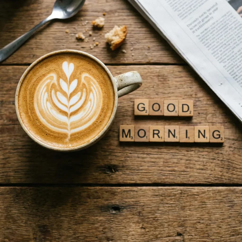
This was the biggest surprise of the benchmark. All ten prompts from Lite produced legible text. Every single one. "OPEN 24/7" in neon (#1), the chalkboard Matcha Latte menu (#2) with decorative calligraphy, "Happy Birthday Sam" in cursive icing on chocolate (#3), "MAPLE ST / 5TH AVE" on street signs (#4), "CHAPTER ONE / THE BEGINNING" on a typewriter (#5), "CREATE MORE" on a t-shirt (#6), brass "42" on a door (#7), gold-leaf "THE MERCANTILE / FINE GOODS / EST. 1987" on a storefront (#8), "KEEP GOING" poster (#9), Scrabble-tile "GOOD MORNING" beside a latte (#10).
Lite even outscored NB2 here. The chalkboard menu from Lite was more artistically charming than Pro's cleaner but plainer version. The storefront gold lettering from Lite added a "THE MERCANTILE" masthead with ornamental flourishes that weren't in the prompt but looked commercially polished. Where Pro pulled ahead was on precision: sharper kerning, more consistent stroke width, and cleaner mixed-font rendering. But "Lite can't do text" is definitively dead in mid-2026.
Here's the neon sign comparison, the prompt I expected Lite to butcher:
The chalkboard menu (#2), where Lite's calligraphy was arguably more charming than Pro's cleaner version:
The storefront (#8), where Lite hallucinated ornamental flourishes that looked commercially polished:
And the birthday cake (#3), a tricky prompt with cursive text on frosting:
Multi-subject scenes: complexity tax
Ten prompts, each with four or more distinct objects. This category tests whether the model can juggle multiple elements without dropping one or merging two together.
| Model | Adherence | Realism | Artifacts | Avg. |
|---|---|---|---|---|
| Lite | 3.2 | 3.3 | 3.2 | 3.2 |
| NB2 | 3.7 | 3.6 | 3.5 | 3.6 |
| Pro | 4.1 | 4.0 | 3.9 | 4.0 |
This is where NB2's thinking mode earns its keep. Every model handled the kitchen counter (#1) well: the cutting board, three specific fruits (apple, banana, orange), a knife, and a glass of water all appeared in each version. But NB2 consistently placed objects in more natural arrangements. Pro got everything and added environmental context that sold the scene.
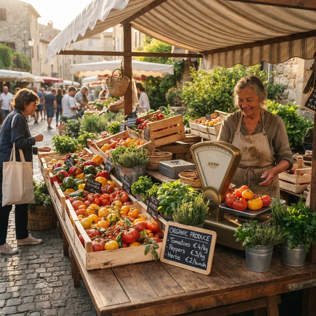
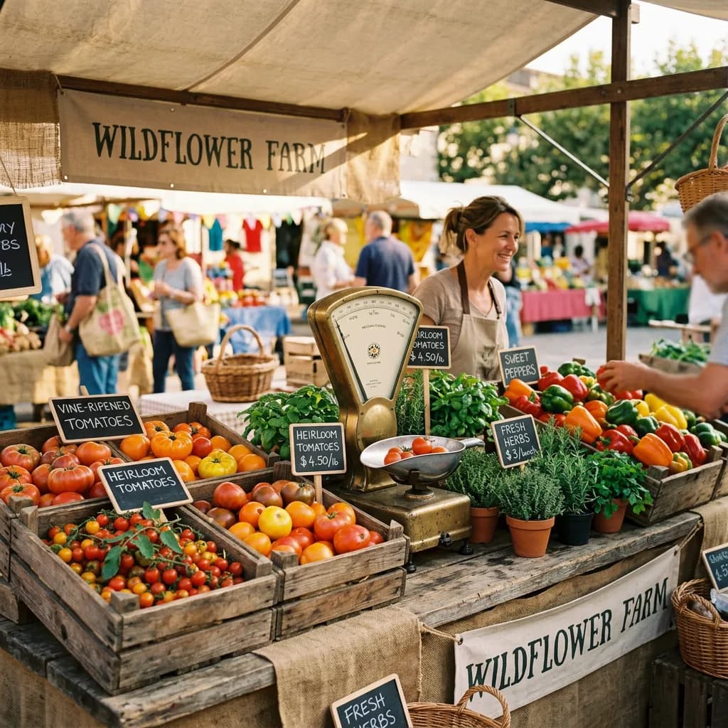
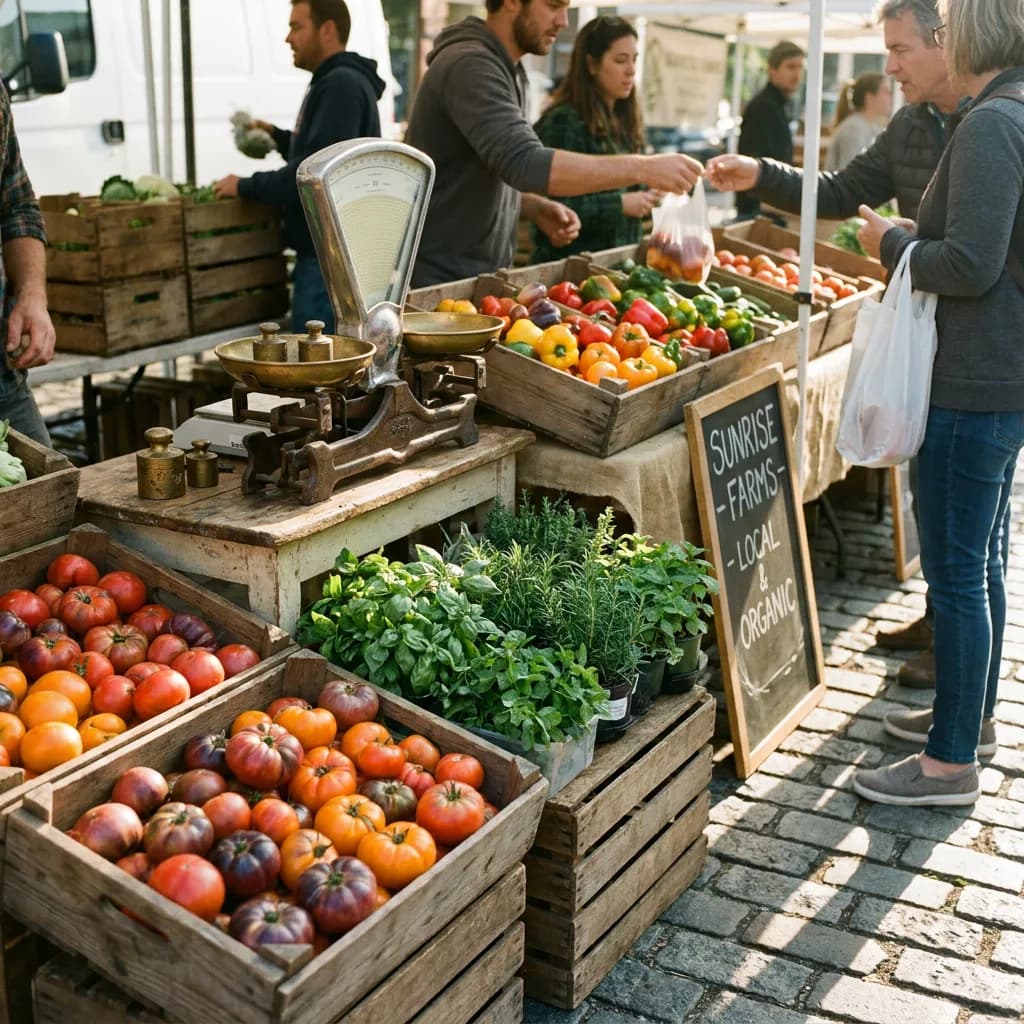
Lite surprised me on the farmers market stall (#4): I expected a generic market, but it delivered detailed heirloom tomatoes in wooden crates, a standalone brass weighing scale, fresh herbs in pots, and even a readable chalkboard priced in euros. NB2 went further with labeled crates ("Heirloom Tomatoes $4.50/lb") and a "WILDFLOWER FARM" banner. Pro produced the most atmospheric scene with the best morning light.
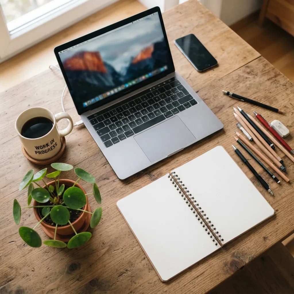
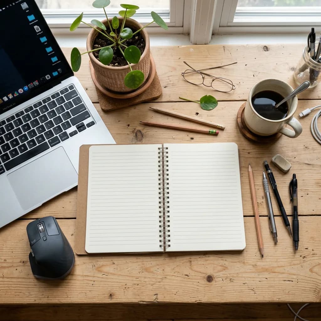
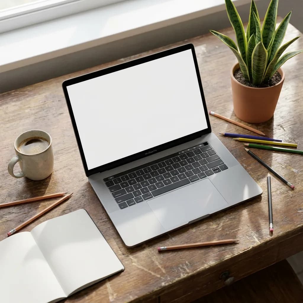
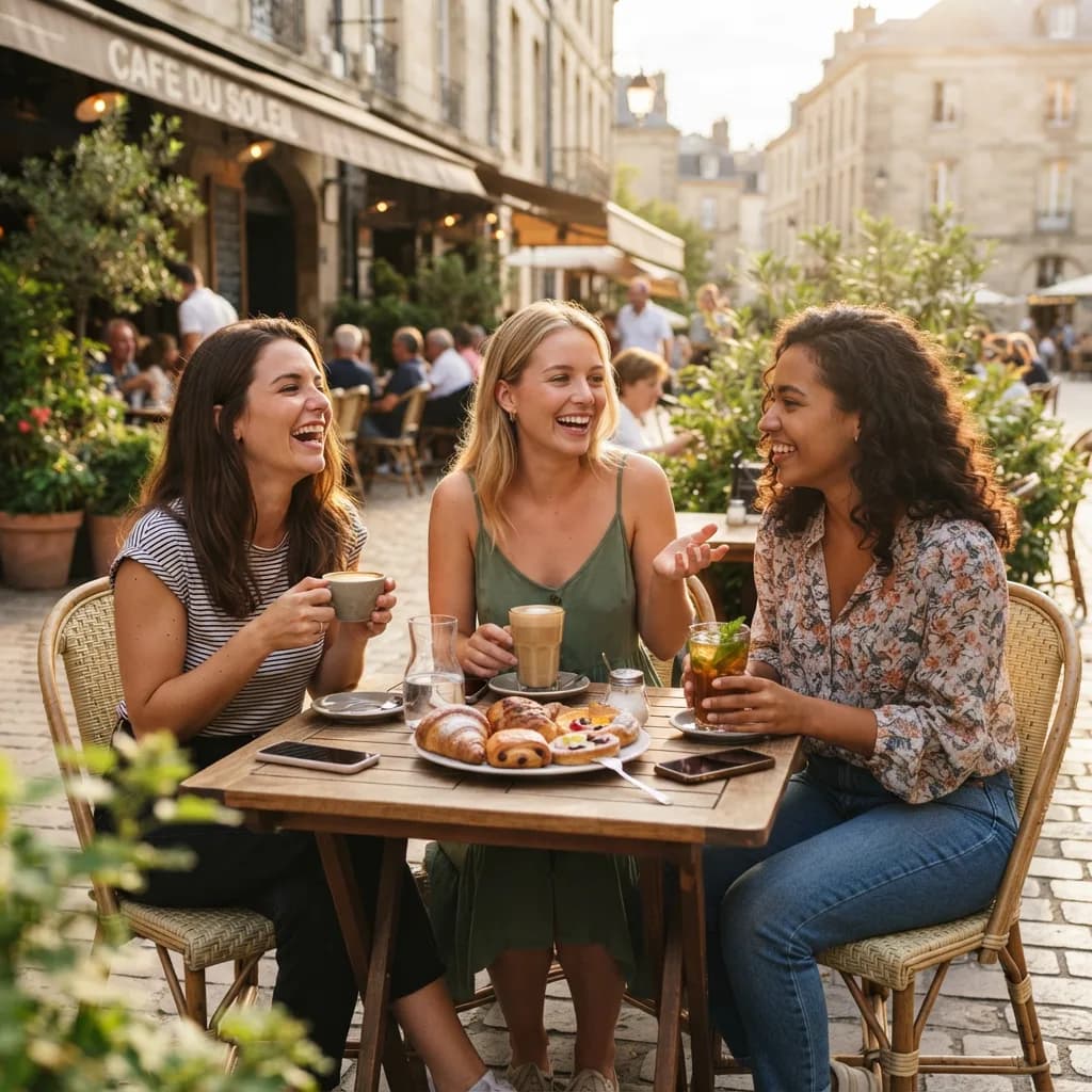
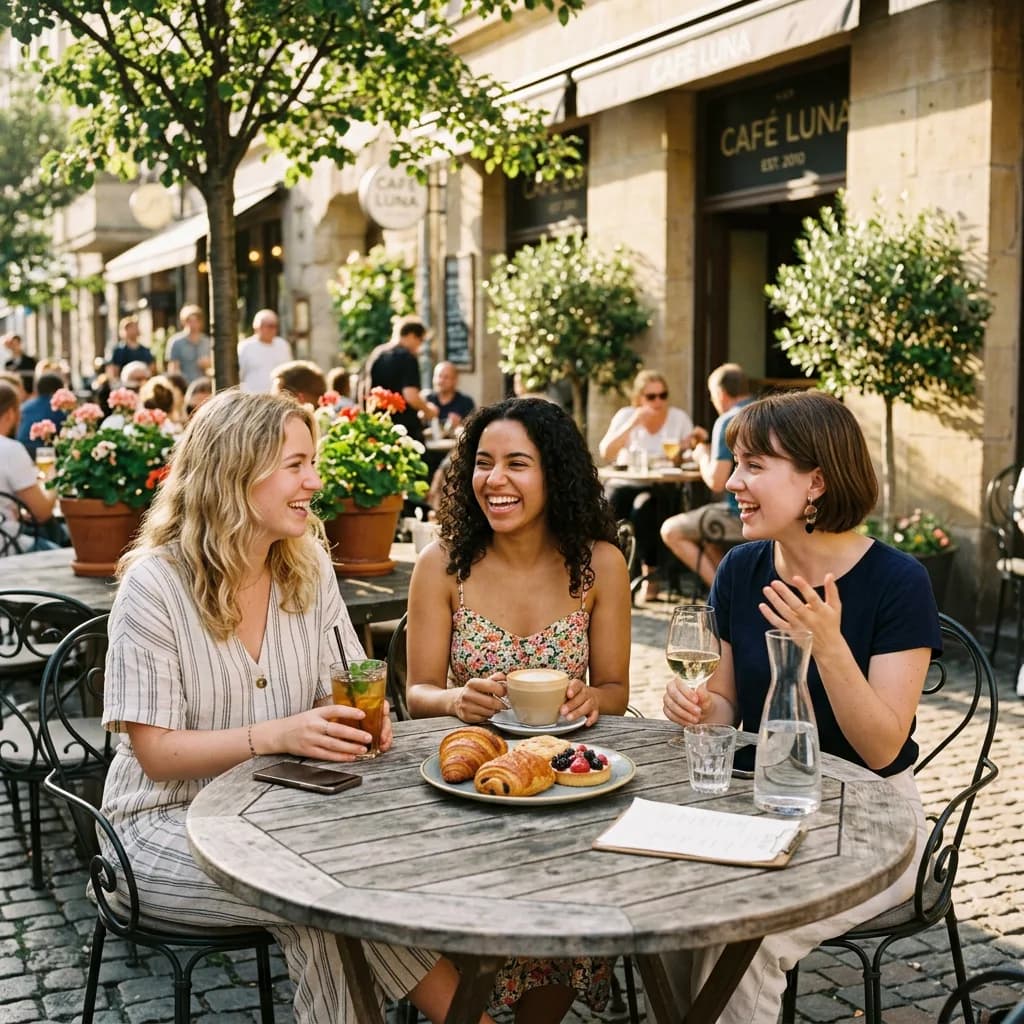
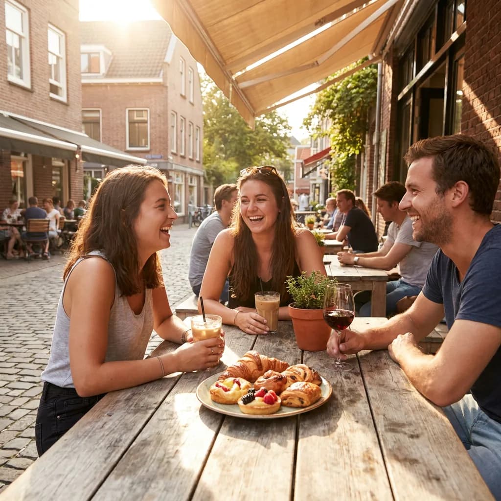
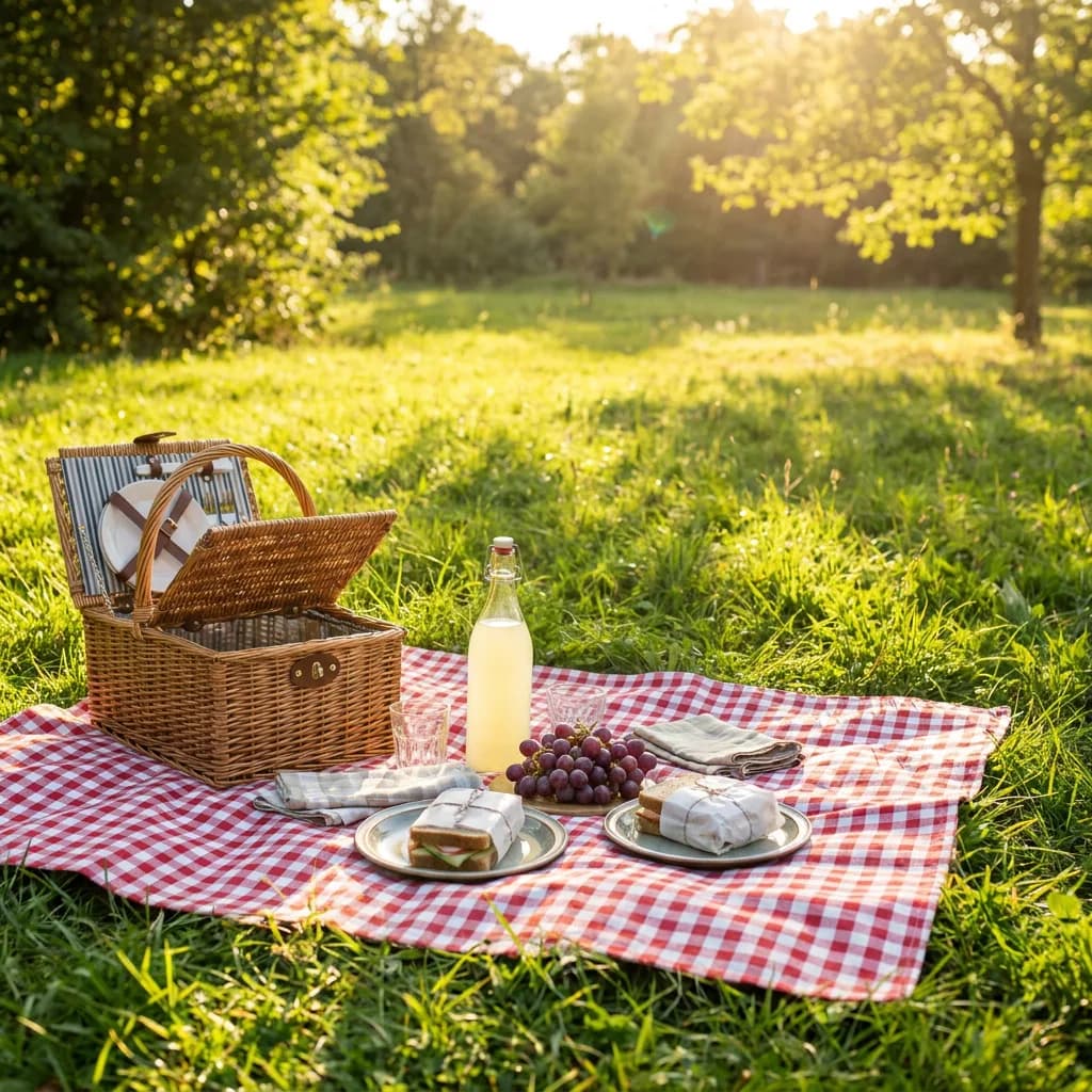
Where Lite dropped points was on the harder multi-person scenes. The cafe friends (#3) and picnic (#6) required natural human interaction with multiple objects, and Lite's compositions felt stiffer than NB2 or Pro. The workspace prompt (#2) was revealing: all three models nailed it, but Lite actually added a "WORK IN PROGRESS" text on the mug and a macOS wallpaper on the laptop screen, detail flourishes that NB2 and Pro skipped.
The kitchen counter (#1), where all three models handled the five objects well:
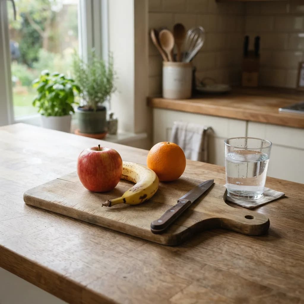
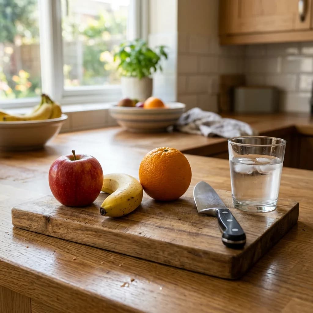
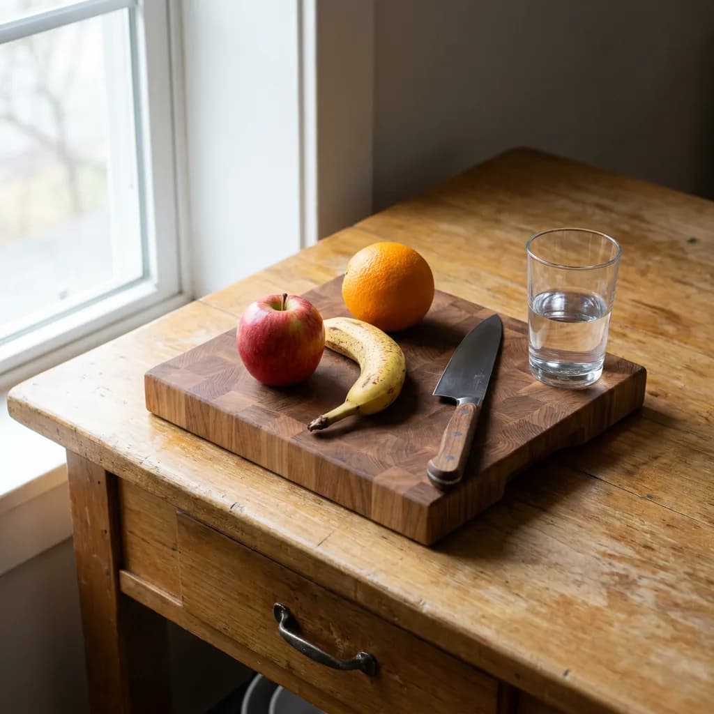
The workspace (#2), where Lite surprised by adding detail flourishes NB2 and Pro skipped:
Here's the farmers market (#4), the prompt I expected Lite to fail on:
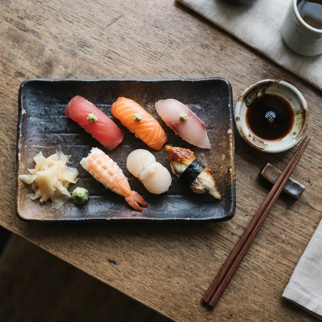
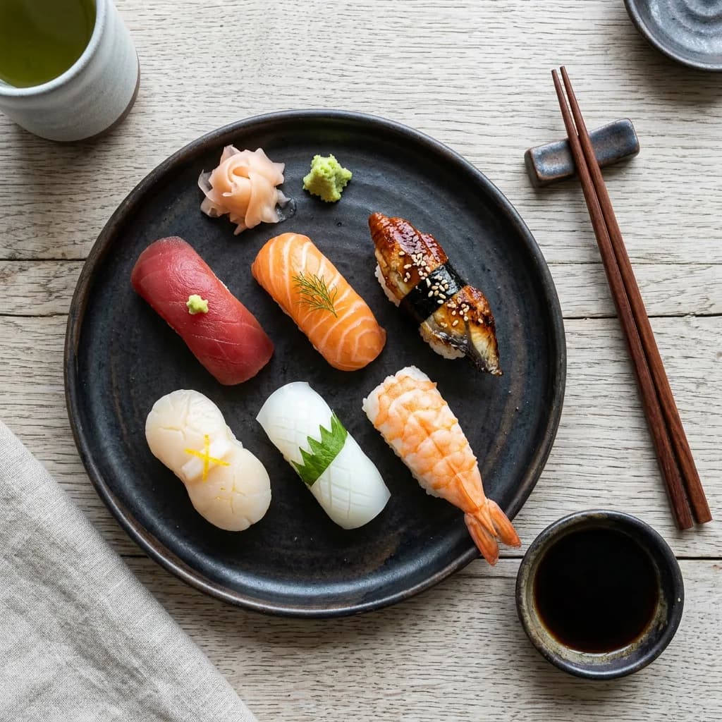
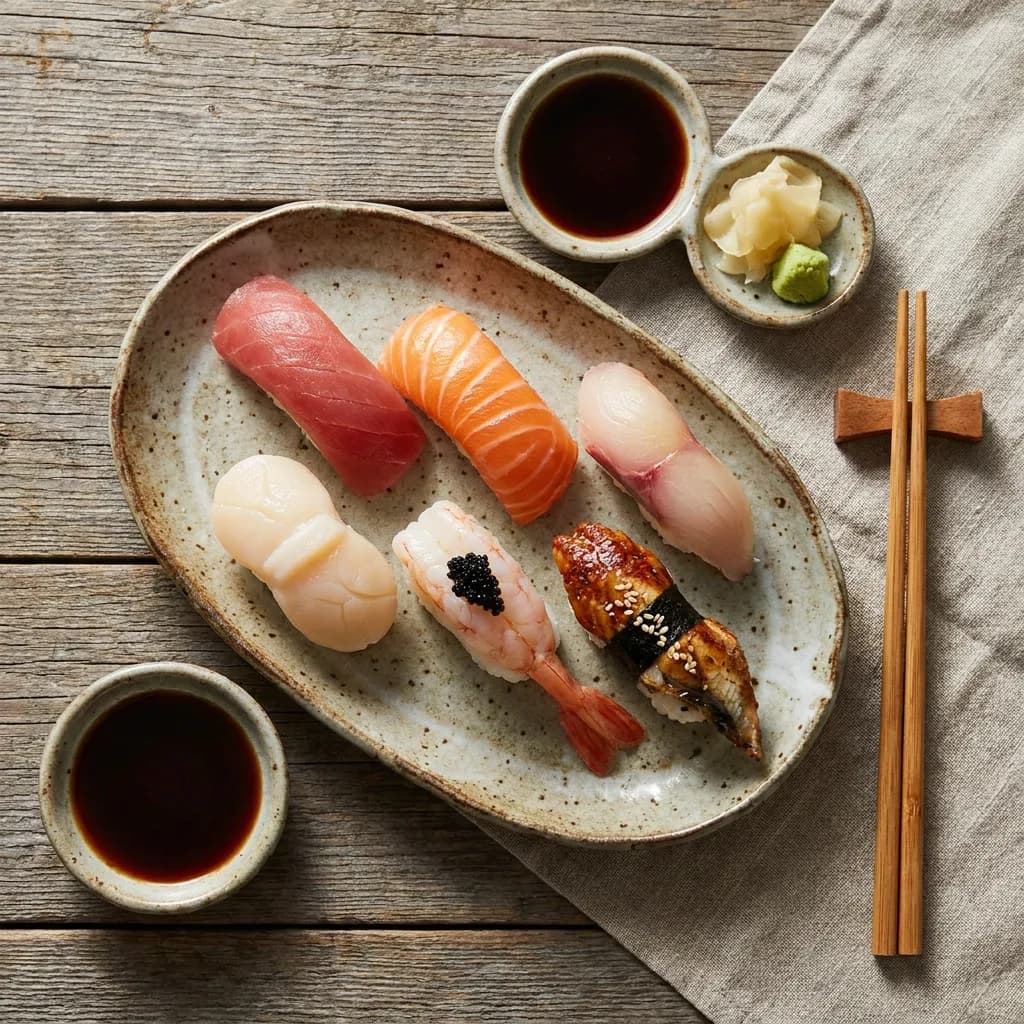
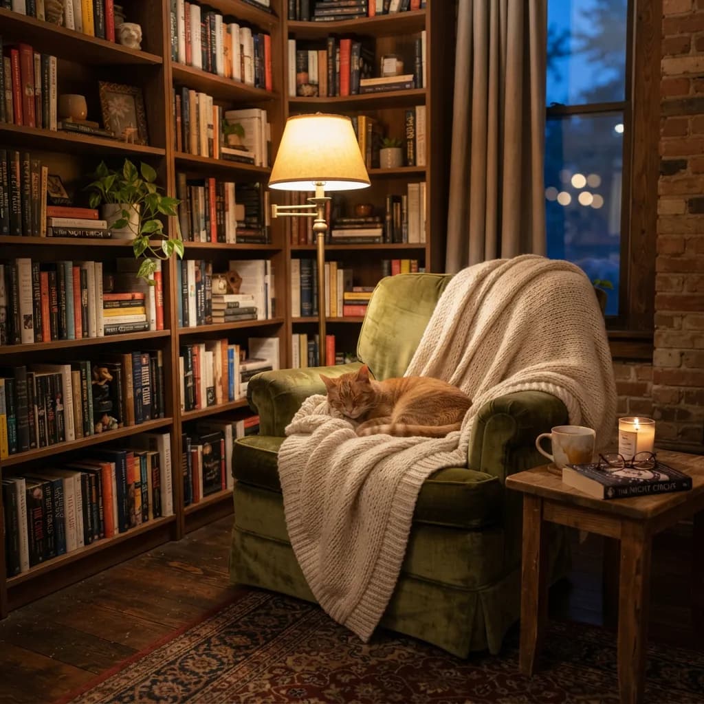
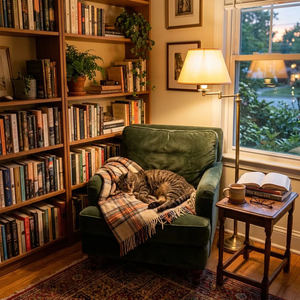
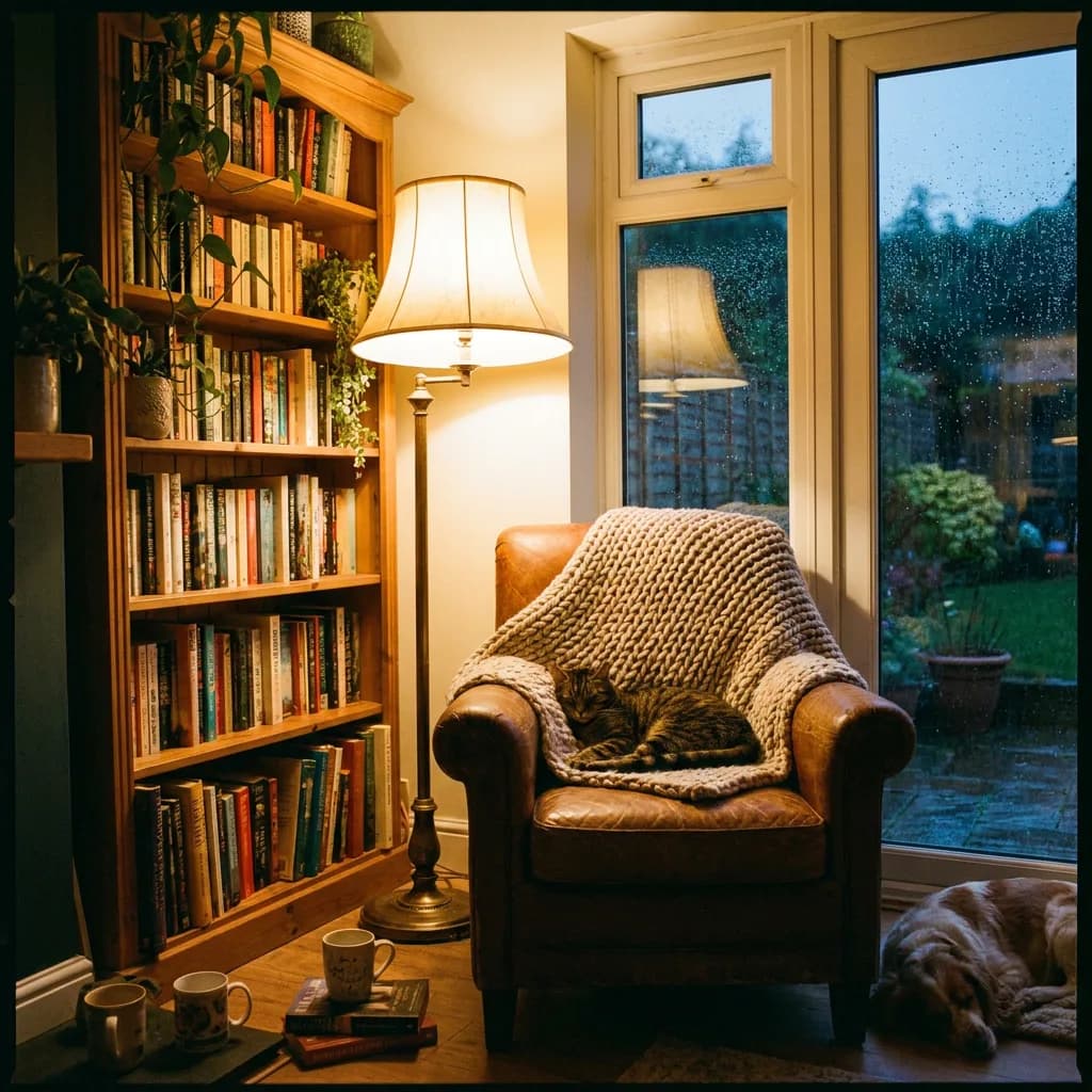
The sushi platter (#9) and reading nook (#10), two more scene complexity tests:
Style transfer: Lite's surprise
This is where the budget model got interesting. Style transfer prompts (watercolor, ukiyo-e, pixel art, film noir) ask for artistic interpretation rather than photographic accuracy. There's no "correct" lighting direction to get wrong, no skin texture to fumble. The scoring shifts toward style fidelity: does it actually look like a woodblock print?
| Model | Adherence | Style Fidelity | Artifacts | Avg. |
|---|---|---|---|---|
| Lite | 3.5 | 3.7 | 3.6 | 3.6 |
| NB2 | 3.6 | 3.7 | 3.7 | 3.7 |
| Pro | 4.0 | 4.2 | 4.1 | 4.1 |
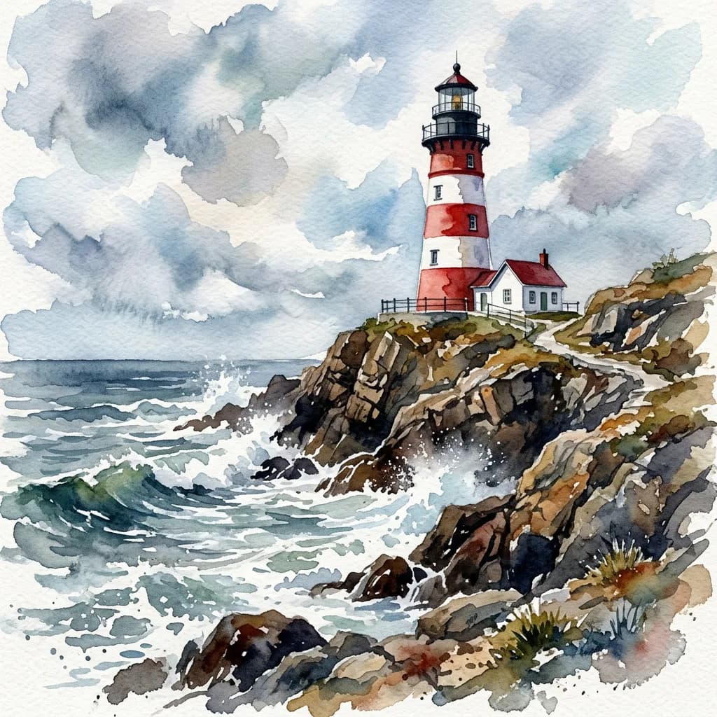
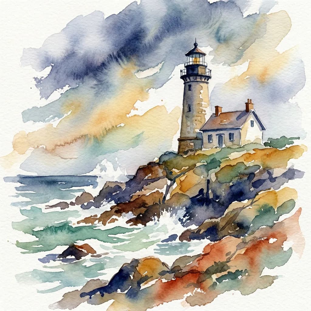
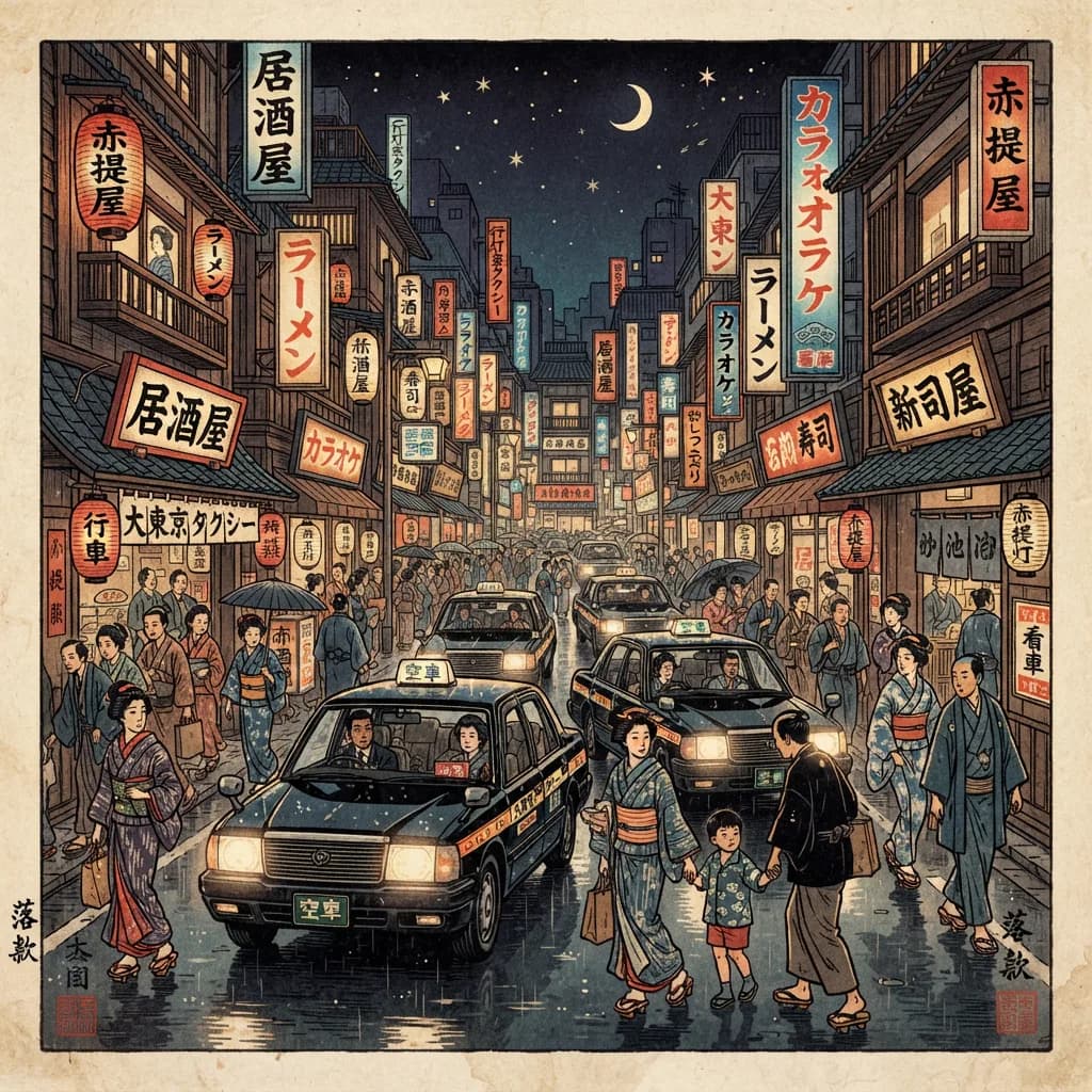
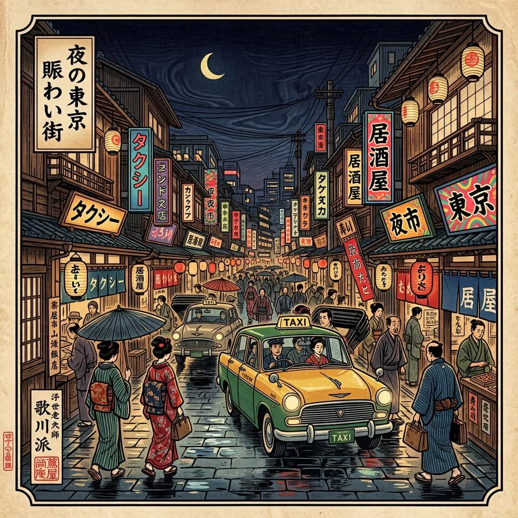
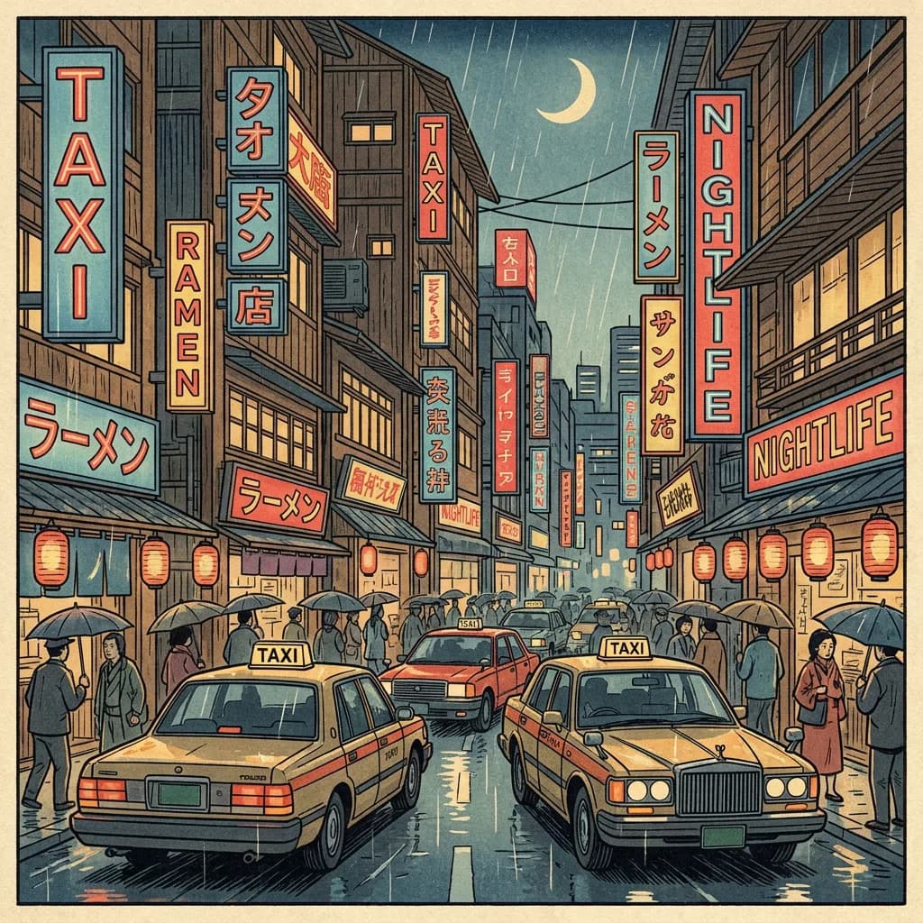
The gap between Lite and NB2 nearly vanishes. Both models understood "watercolor with visible brushstrokes" (#1) and produced convincing results. Lite's ukiyo-e city street (#2) was arguably more stylistically committed than NB2's, which hedged toward photorealism with ukiyo-e elements rather than fully committing to the woodblock aesthetic.
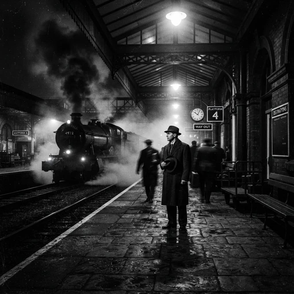
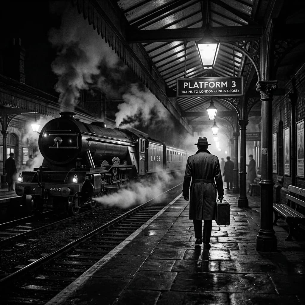
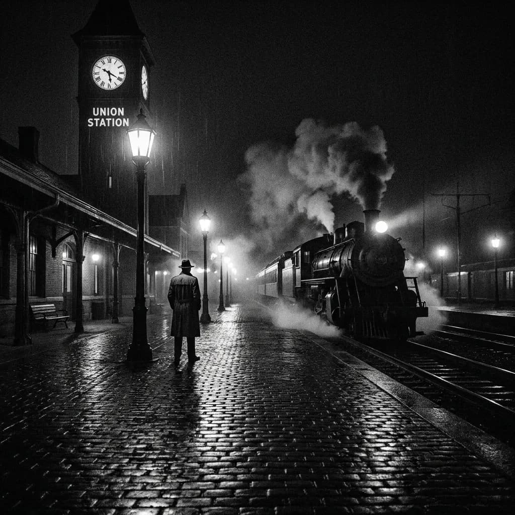
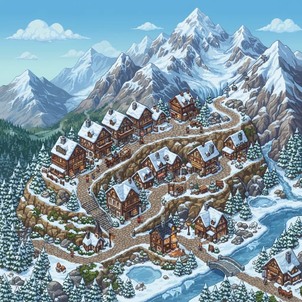
Pro still won on style fidelity. The film noir train station (#8) had proper grain structure and tonal separation. The pixel art mountain village (#6) was geometrically precise. But the margin over Lite was smaller than in any other category.
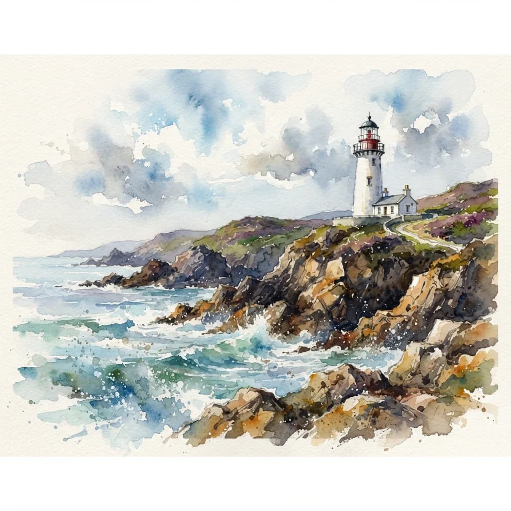
The watercolor lighthouse (#1), where Lite scored within 0.2 points of Pro:
Here's the ukiyo-e city street (#2), where Lite went full traditional and Pro took a modern interpretation:
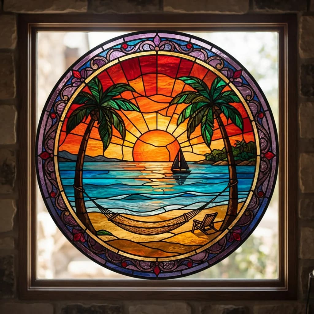
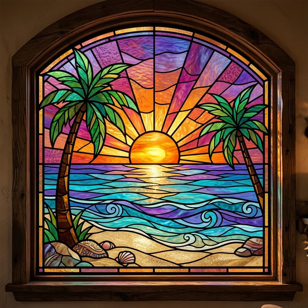
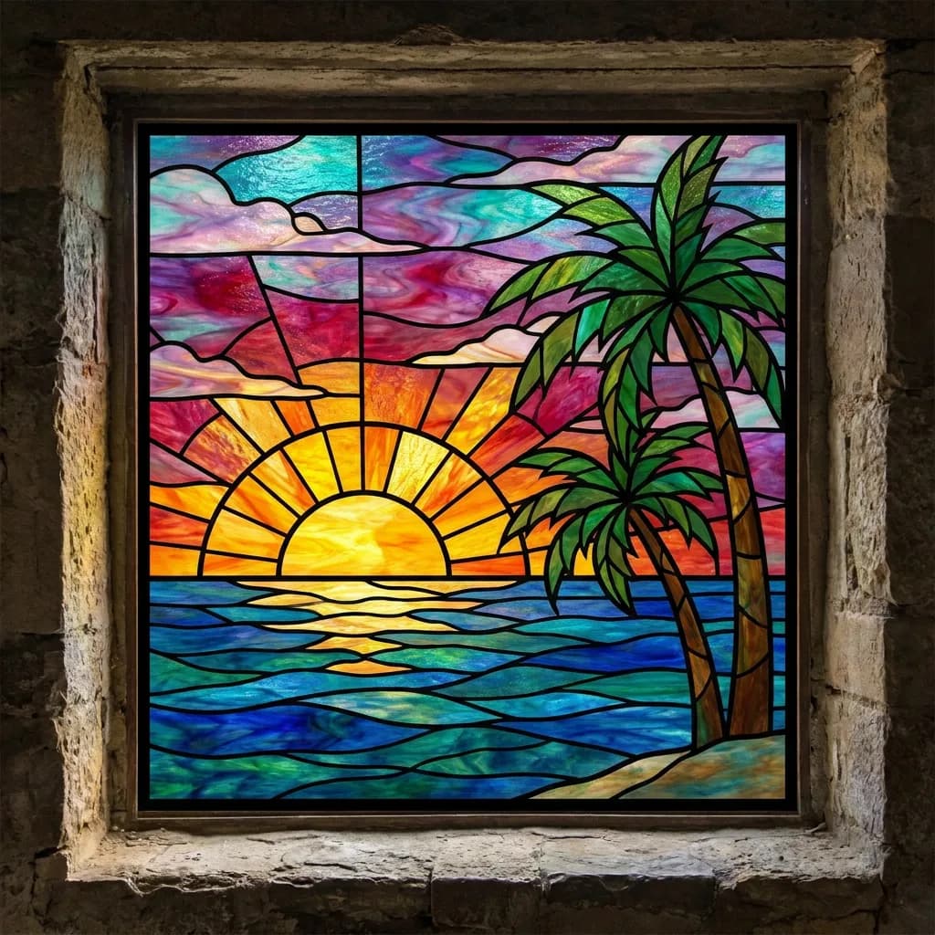
The stained glass sunset (#4), one of the closest scores in the entire benchmark:
The film noir train station (#8), where Pro's grain structure pulled clearly ahead:
The pixel art village (#6) and pop art sunflowers (#7), two more style tests:
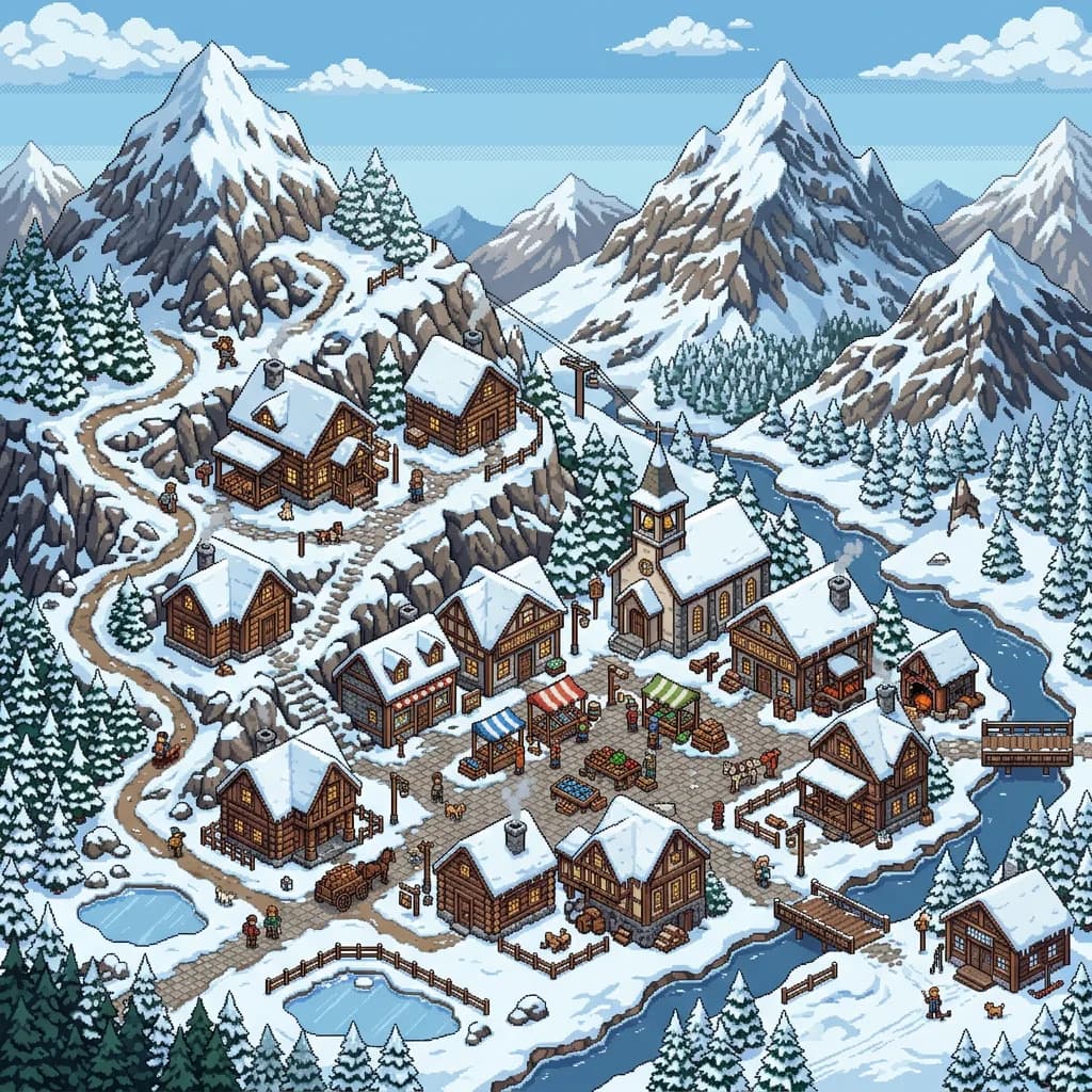
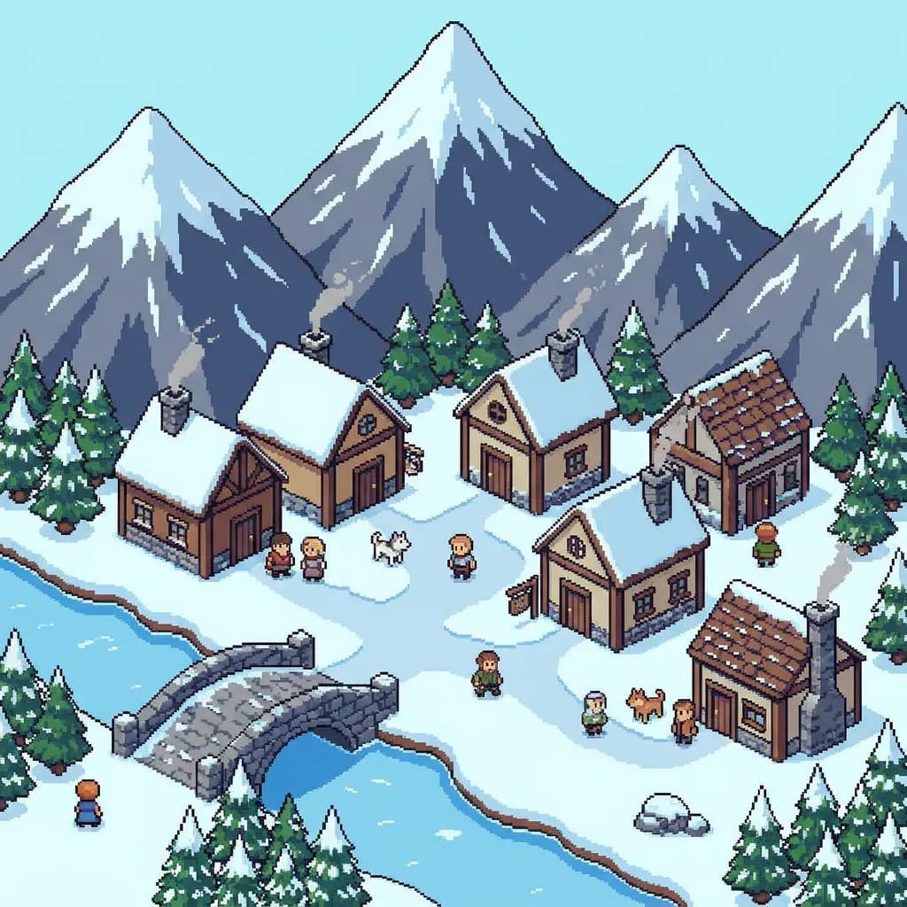
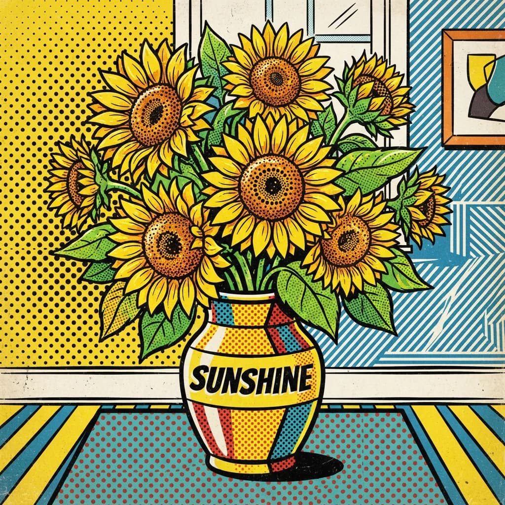
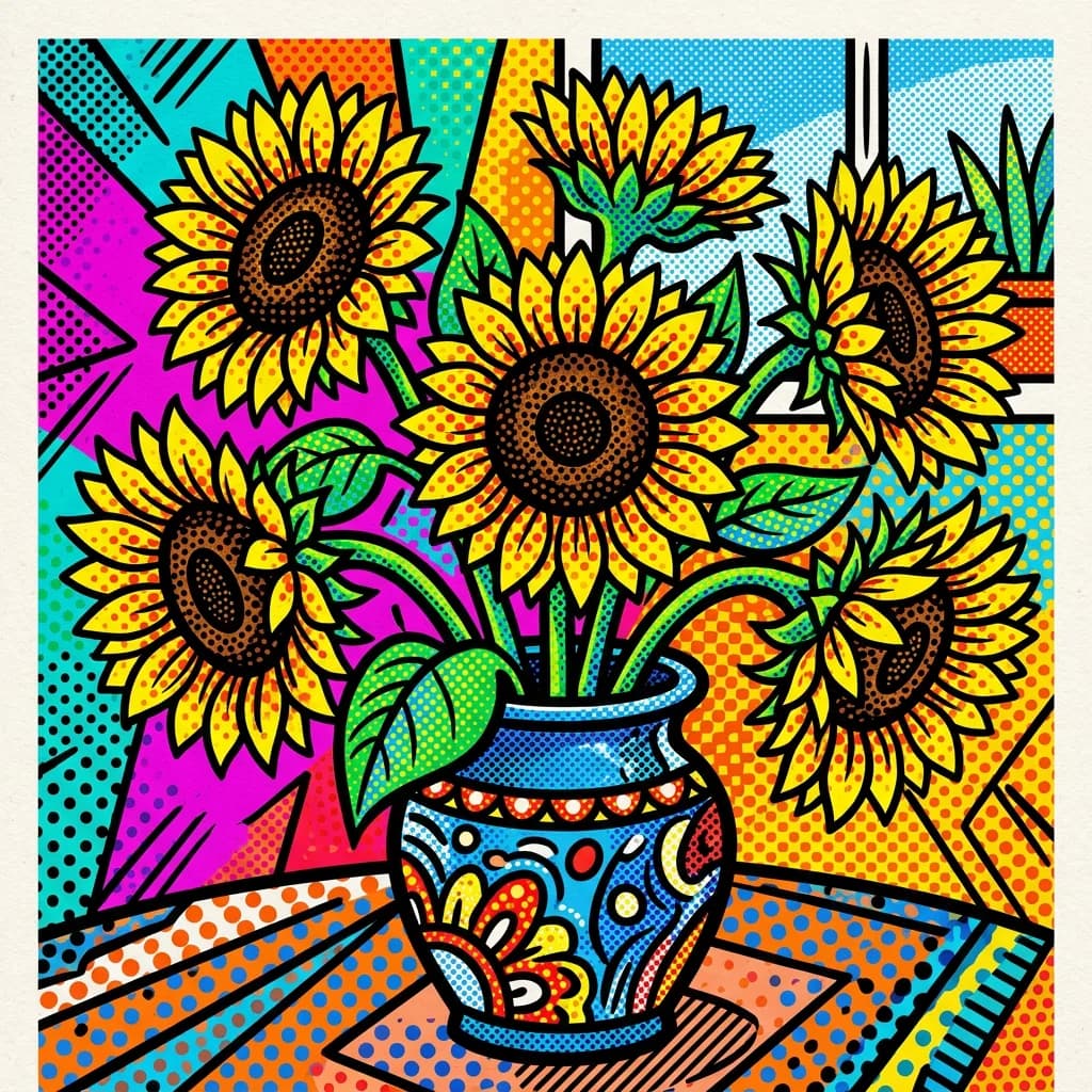
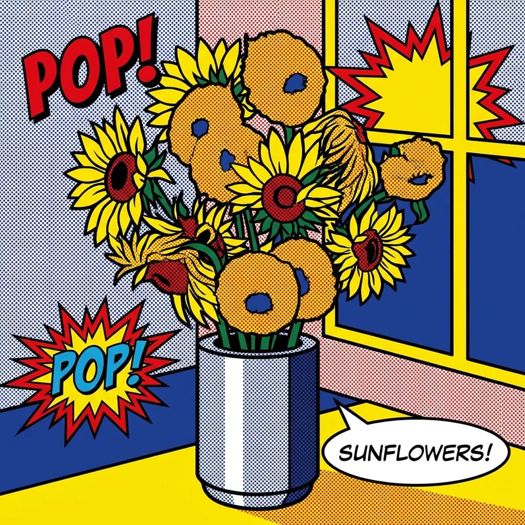
If you're making stylized content (social media graphics, illustration-style blog headers, artistic mood boards), Lite at $0.03 is probably the right call.
Where the cheap model embarrassed the expensive one
Eight out of fifty prompts where Lite scored within 0.3 points of Pro:
- Candles on concrete (product #9): Lite 3.8 vs Pro 4.0. The warm glow masked detail differences.
- Watercolor lighthouse (style #1): Lite 3.9 vs Pro 4.1. Both nailed the bleeding edges.
- Stained glass sunset (style #4): Lite 4.0 vs Pro 4.2. Bold outlines flatten detail advantages.
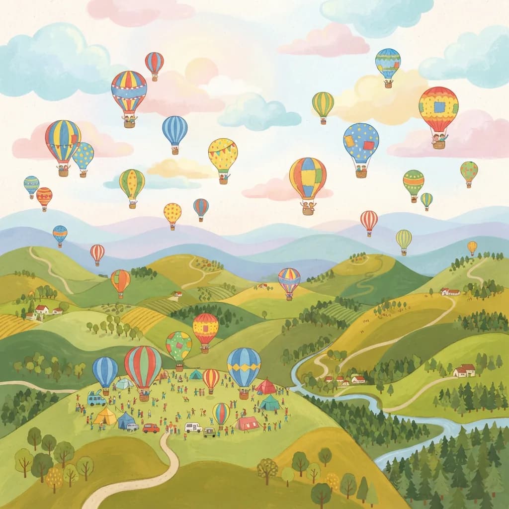
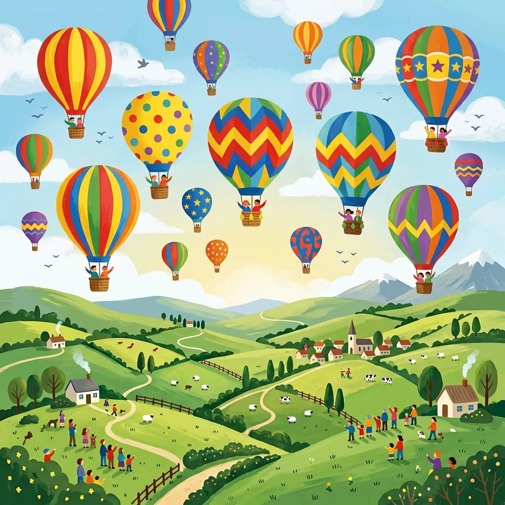
- Children's book balloons (style #10): Lite 3.7 vs Pro 4.0. Flat colors level the field.
- Succulent in pot (product #5): Lite 3.6 vs Pro 3.9. Simple subject, simple win.
- Pop art sunflowers (style #7): Lite 3.8 vs Pro 4.0. Halftone dots hide everything.
- Neon OPEN 24/7 (typography #1): Lite 4.0 vs Pro 4.2. Both perfect text, similar rain reflections.
- Chalkboard menu (typography #2): Lite 3.9 vs Pro 4.0. Lite's calligraphy was arguably more charming.
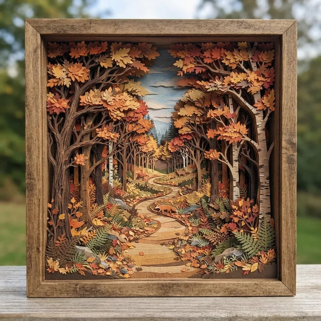
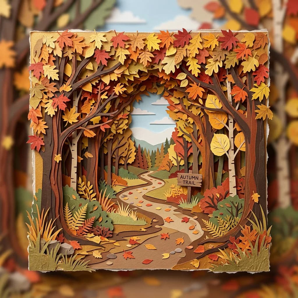
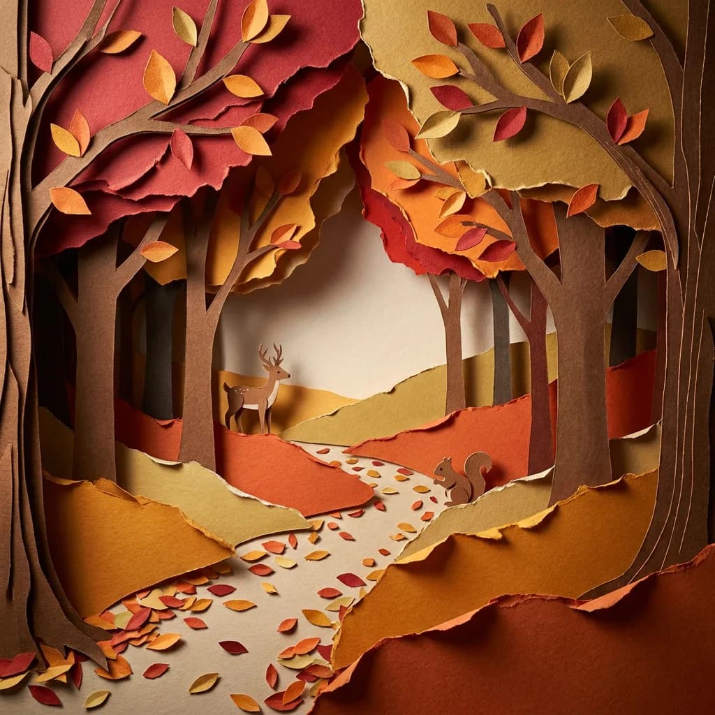
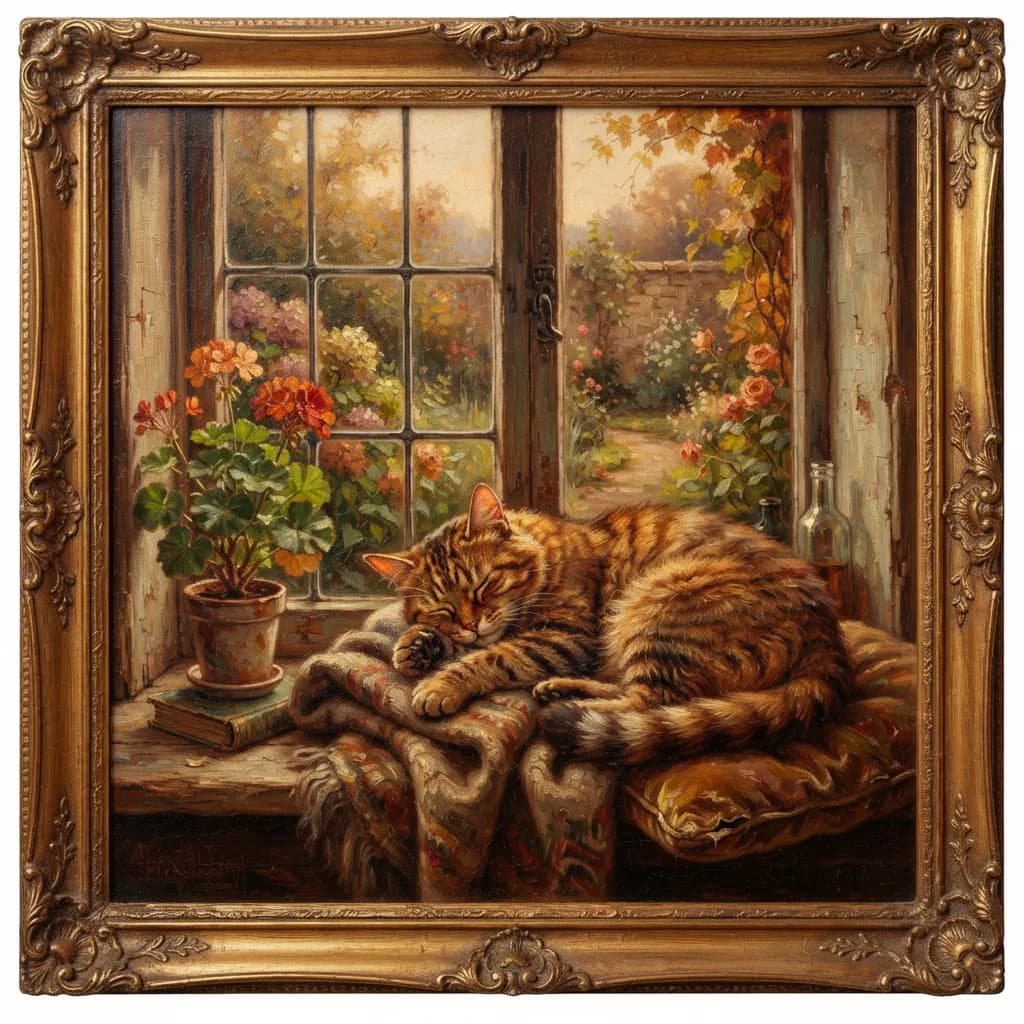
Here are four of those matchups side by side — Lite on the left at $0.03, Pro on the right at $0.11:
Children's book balloons — Lite 3.7 vs Pro 4.0:
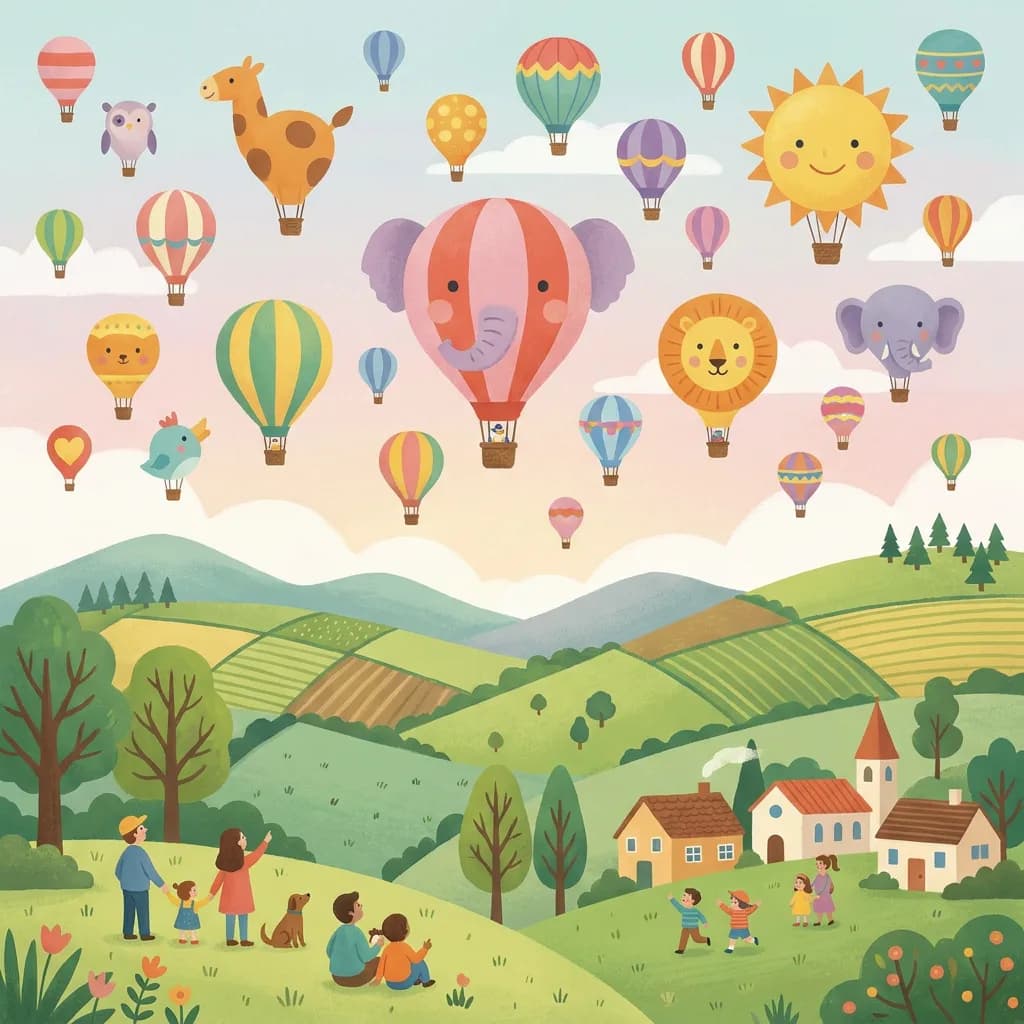
Paper cut autumn forest (style #9) — another close matchup not in the list above:
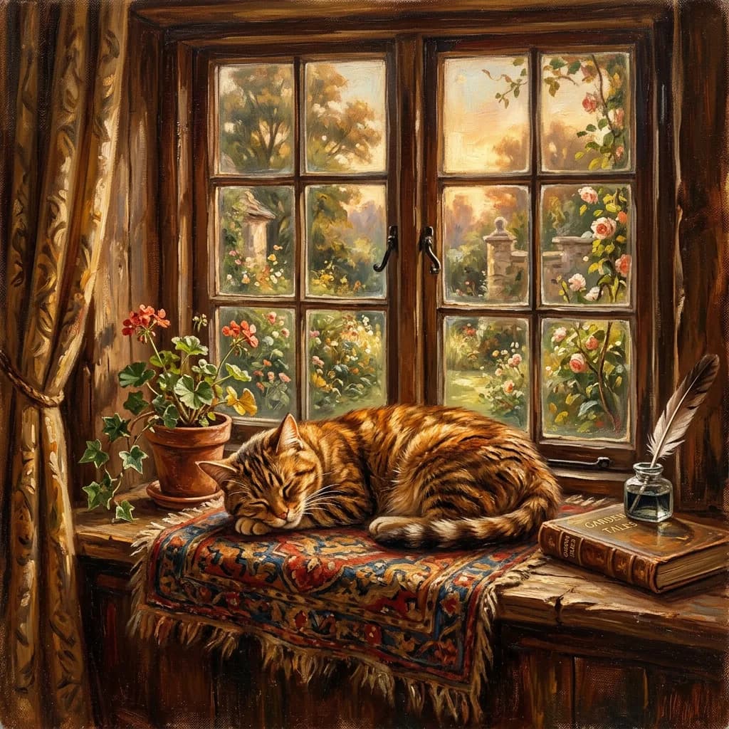
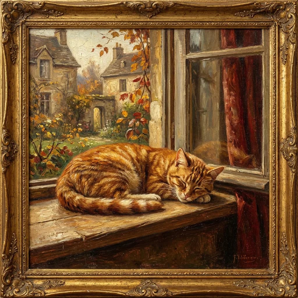
Vintage oil painting cat (style #5) — Lite's warmth vs Pro's brushwork:
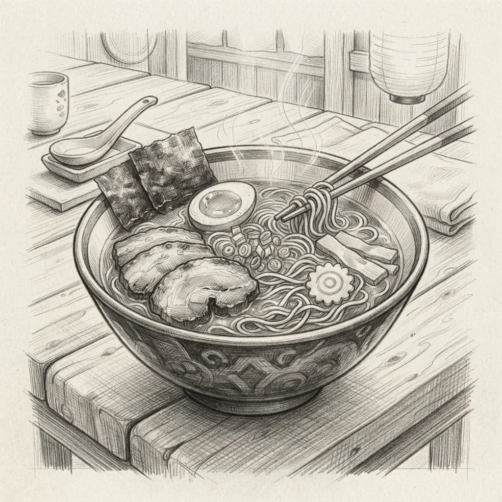
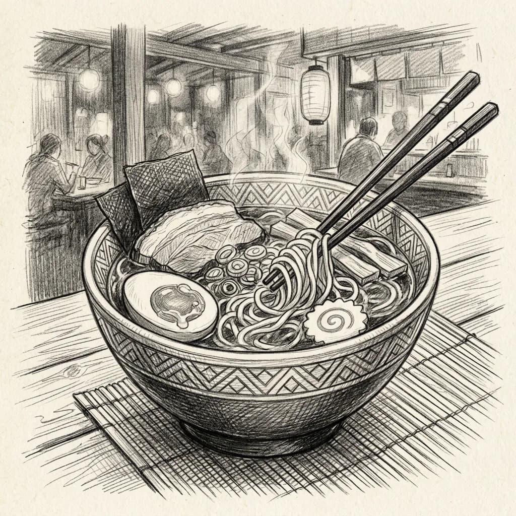
Pencil sketch ramen (style #3) — cross-hatching at budget vs premium:
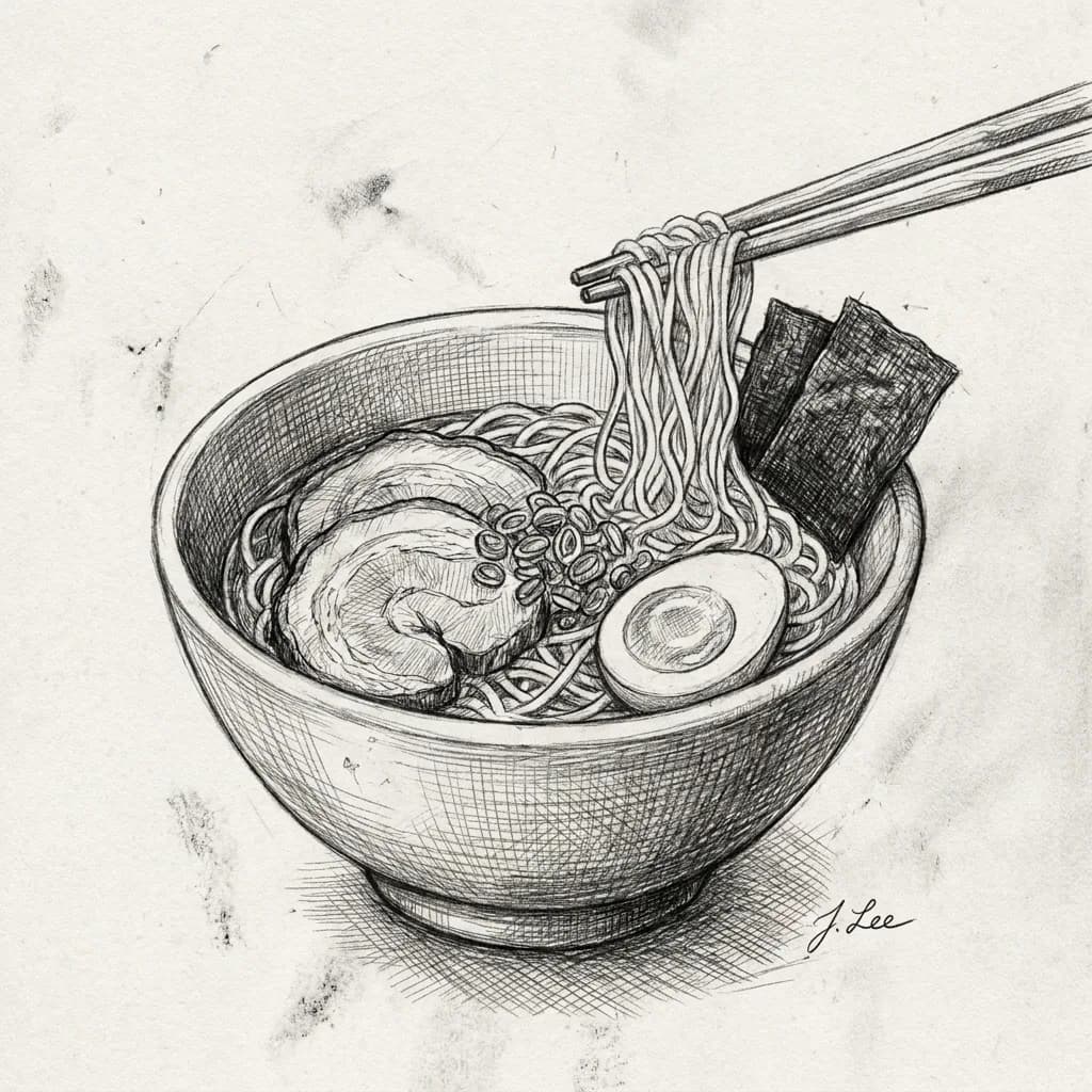
The pattern: whenever the prompt pushes away from photorealism (bold outlines, flat colors, heavy stylization), Lite closes the gap. Its weakness is subtlety, and stylized prompts don't ask for subtlety.
The honest failure gallery
Every model produced at least one image I'd call a failure. Transparency matters more than pretending the models are perfect.
Lite's weak spots (2–3 out of 50):
- Multi-person scenes with natural interaction (cafe friends, picnic) sometimes felt stiff or posed compared to Pro's more organic arrangements.
- A few portraits showed slightly softer skin detail that wouldn't survive large-format printing, though they'd be fine on screens.
NB2's weak spots (2–3 out of 50):
- The twins prompt (#10) produced two people who looked related but not identical.
- Occasionally added unrequested objects to scenes (extra fruit bowls, background items), which helped realism but technically missed the prompt.
Pro's weak spots (1 out of 50):
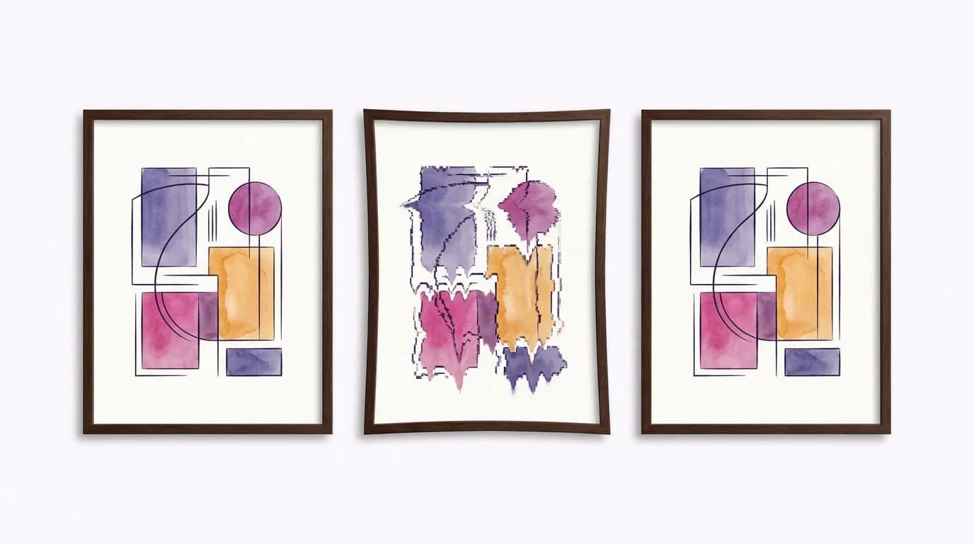
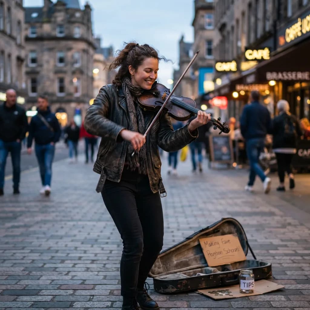
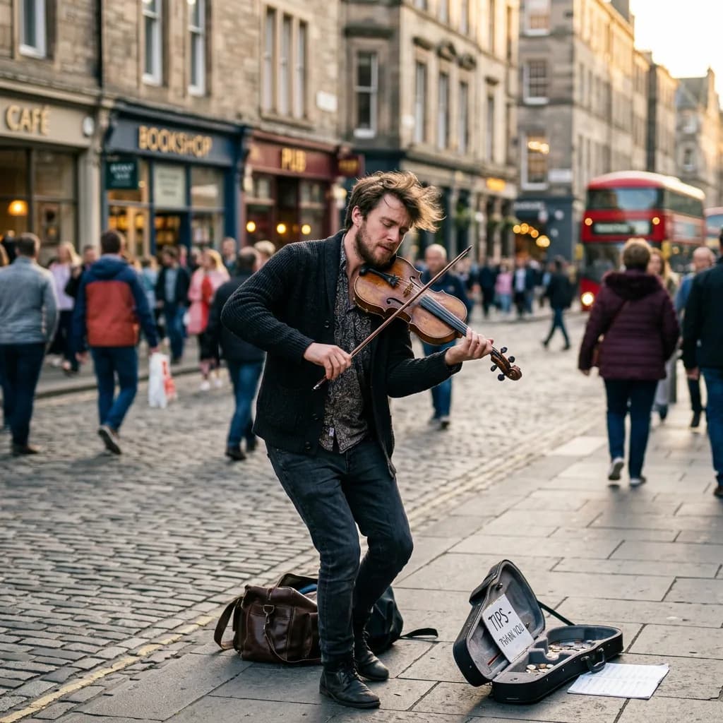
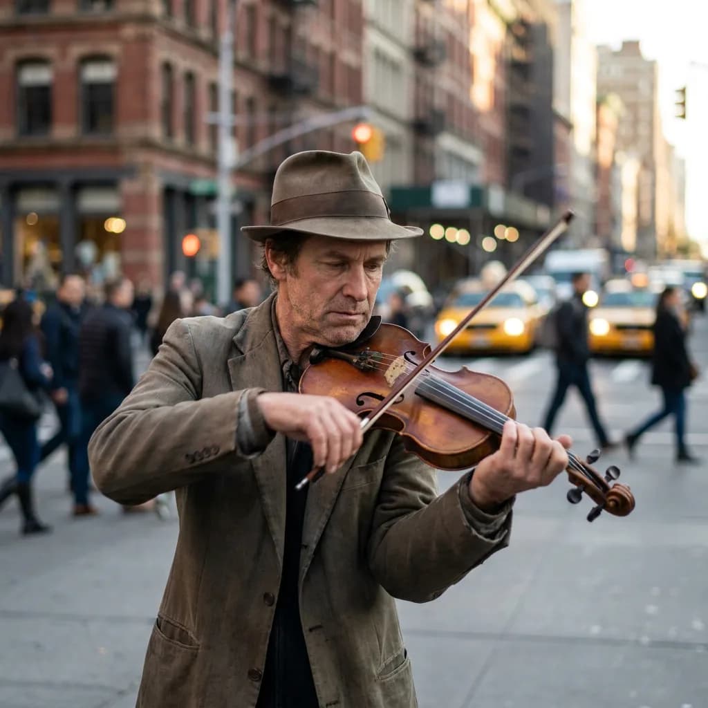
- The street musician (#7) had hand anatomy issues on the bowing fingers. Even the top model isn't immune.
Pro's 98% success rate is real. Lite sits around 94%, which is remarkable at this price. At $0.03 per attempt, regenerating twice still costs less than a single Pro generation.
Who should use which model
| Use case | Recommended | Why |
|---|---|---|
| Social media posts, bulk content | Lite ($0.03) | Quality gap invisible at phone-screen sizes |
| Blog illustrations, presentations | NB2 ($0.06) or Pro ($0.11) | Depends on whether the image carries the section |
| Product photography, hero images | Pro ($0.11) | Lighting accuracy and detail matter here |
| Text in images (signs, labels, menus) | Lite ($0.03) or Pro ($0.11) | Lite handles text well now. Pro for precision kerning. |
| Artistic / stylized content | Lite ($0.03) | Style transfer hides detail differences |
| Multi-person compositions | Pro ($0.11) | More natural posing and interaction |
| Drafts and iteration | Lite ($0.03) | Cheap enough to throw away. Upgrade the final pick to Pro. |
| Budget under $5 | Lite ($0.03) | 166 images vs 45 on Pro |
The draft-then-upgrade workflow is probably the smartest approach I've seen from power users: run your prompt 3–4 times on Lite ($0.09–$0.12 total), pick the composition you like, then run that exact prompt once on Pro ($0.11) for the final version. Total cost: ~$0.22 for a Pro-quality image with composition confidence. Compare that to running Pro 3–4 times blind at $0.33–$0.44.
For prompting tips that work across all three models, check our Nano Banana prompt guide. For the Lite-specific sweet spots, there's a dedicated Nano Banana 2 Lite guide. Full pricing for all models and resolutions lives on the pricing page.
FAQ
How were the images scored?
Each image was rated 1–5 on prompt adherence, realism or style fidelity, text legibility (typography category only), and artifact count. The composite score averages all applicable criteria. Typography scores weight text legibility 2× since that's the point of the category. All scoring was done by the platform team reviewing shuffled, unlabeled images.
Can I run these prompts myself?
Yes. All 50 prompts are in the appendix below, copy-pasteable. Create a free account at BananaBanana (you get $0.20 on signup), top up, and run them in the generator. Prices match what's listed here.
Why not include 4K results?
We wanted a pure model-to-model comparison. Resolution changes the price and adds a variable that isn't about model intelligence, it's about upscaling. A 4K comparison is planned as a follow-up.
Is Nano Banana Pro always worth the premium?
Not always. For stylized content, product shots, and text in images, Lite gets you 80–90% of the way there at a fraction of the cost. Pro's premium buys you sharper fine detail, more accurate lighting direction, and subtler facial nuance. If you're doing professional headshots for print or complex multi-person compositions, Pro is worth every cent. For social media, bulk content, and iteration, the savings compound fast.
What about top-up bonuses?
On crypto deposits, BananaBanana offers a 5% bonus at $50+, 10% at $100+, and an active promo code adds another 10% on any payment method. On a $100 crypto deposit with a code, you'd get $120 in balance — effectively dropping Lite to $0.025/image and Pro to $0.092. That makes Lite's quality-per-dollar even more absurd.
Appendix: all 50 prompts
Every prompt is reproduced exactly as fed to the models. Copy, paste, generate.
Product shots (1–10)
- A single espresso cup on a marble countertop, steam rising, soft morning window light from the left, shallow depth of field, photorealistic
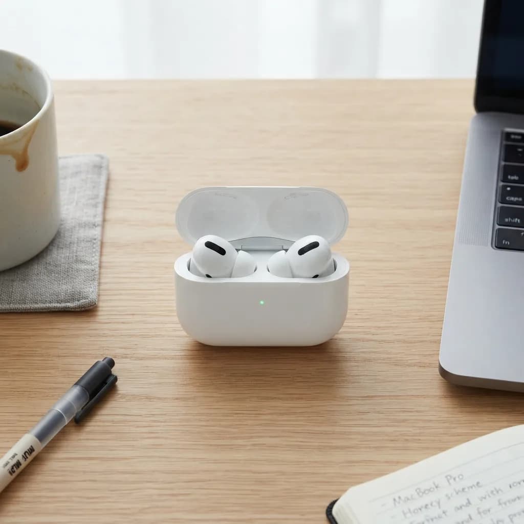
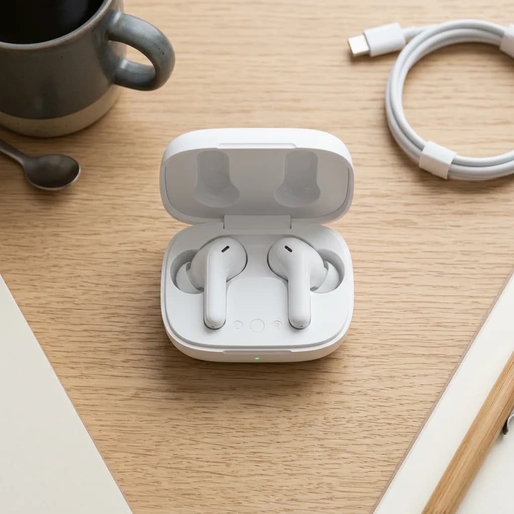
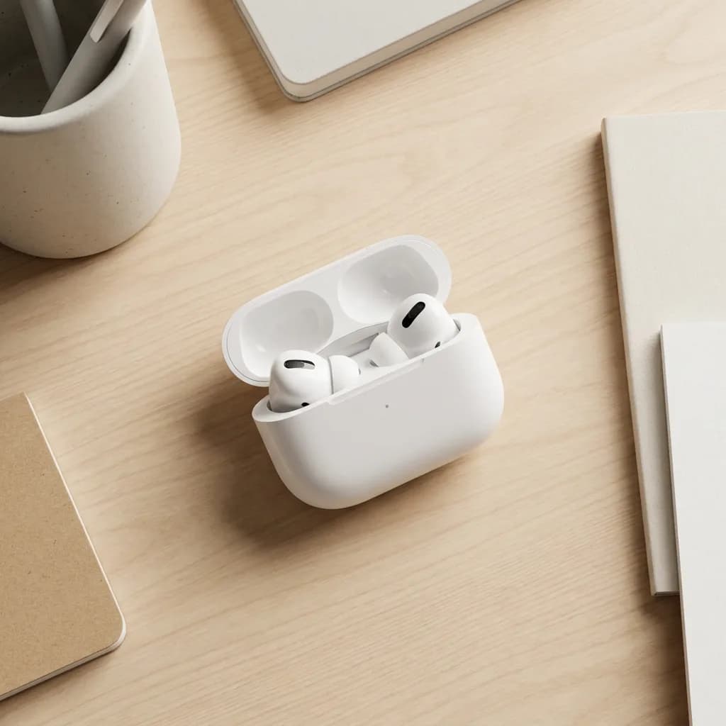
- A pair of white wireless earbuds in an open charging case on a clean desk, overhead shot, soft diffused studio lighting, photorealistic
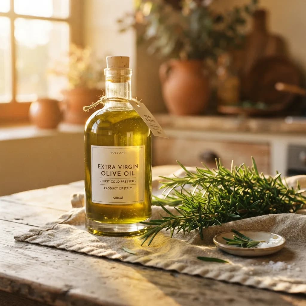
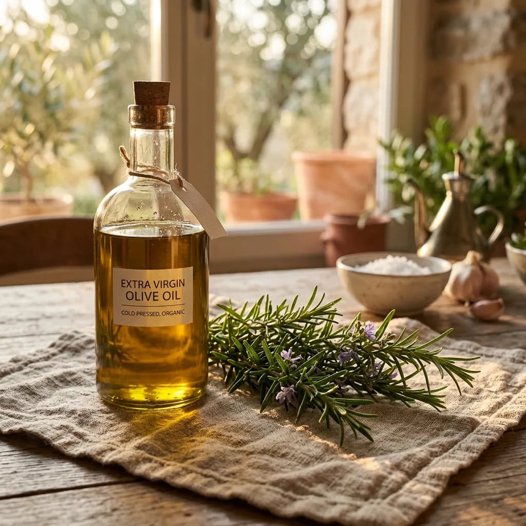
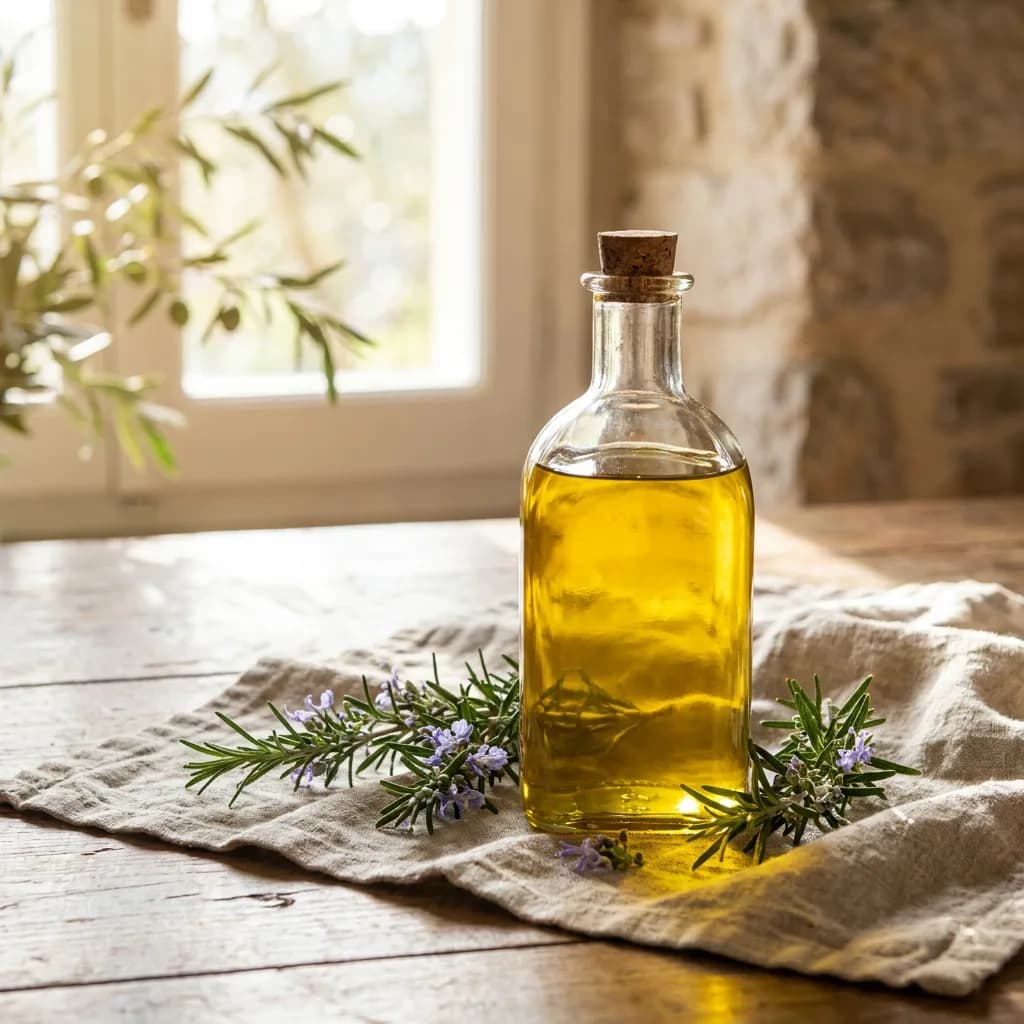
- A clear glass bottle of olive oil beside fresh rosemary sprigs on a linen cloth, warm golden hour backlight, photorealistic
- A vintage leather watch on a dark slate surface, close-up, dramatic side lighting with sharp shadows, photorealistic
- A potted succulent in a terracotta pot on a wooden shelf, natural daylight, slightly elevated angle, photorealistic
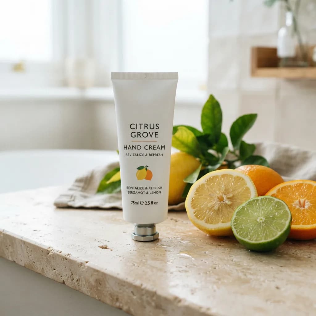
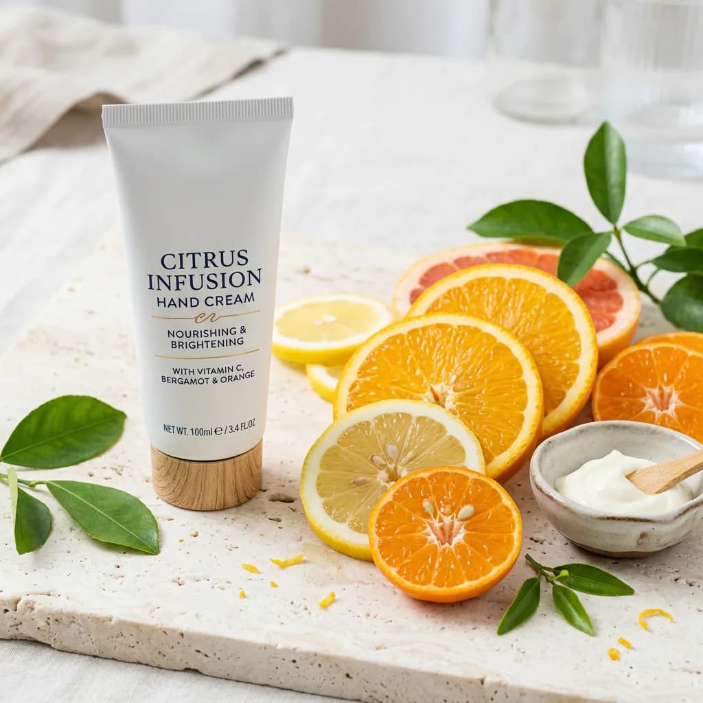
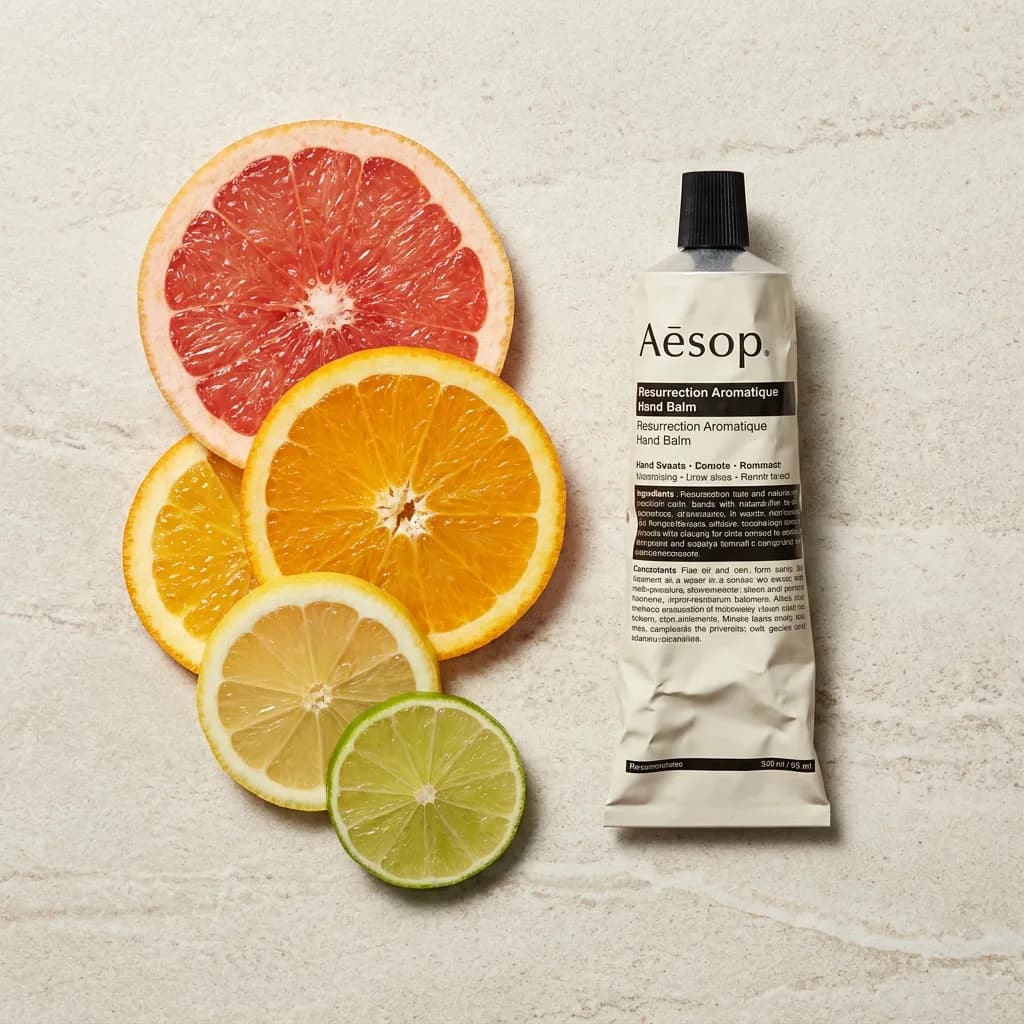
- A tube of hand cream next to sliced citrus fruits on a light stone surface, bright even studio lighting, photorealistic
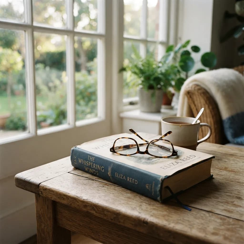
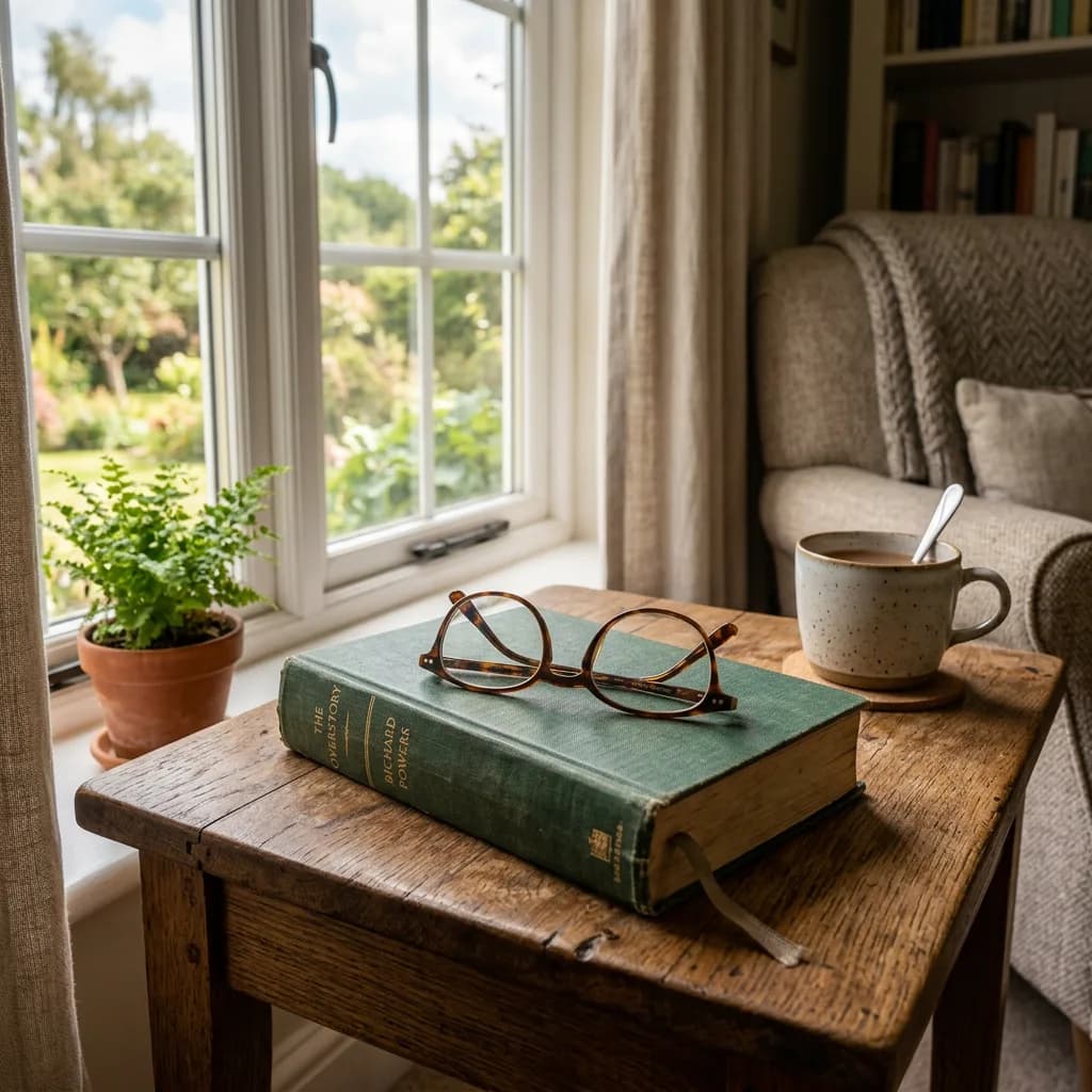
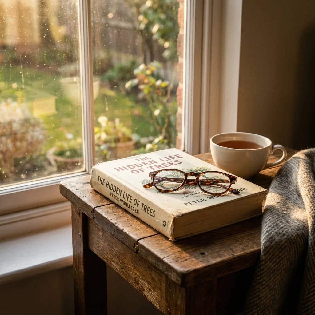
- A hardcover book with reading glasses resting on top, on a wooden side table near a window, soft afternoon light, photorealistic
- A ceramic pour-over coffee dripper with fresh grounds, steam visible, close-up macro shot, photorealistic
- A set of three small candles in glass jars on a concrete tray, warm amber glow, dark background, photorealistic
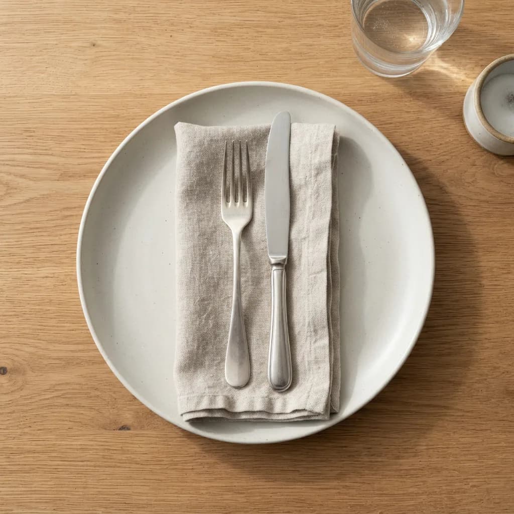
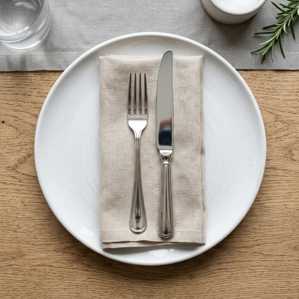
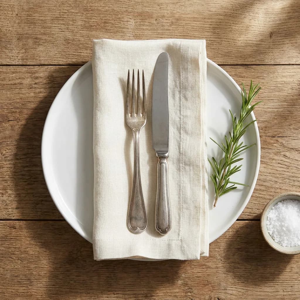
- A folded linen napkin with a silver fork and knife on a white plate, overhead flat lay, soft shadow, photorealistic
Portraits (11–20)
- Portrait of an elderly man with deep wrinkles and kind eyes, warm studio lighting, dark background, medium close-up, photorealistic
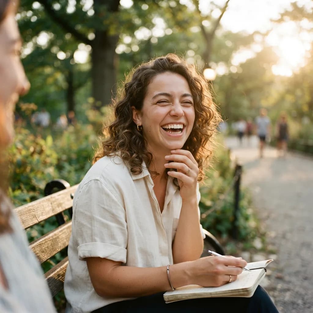
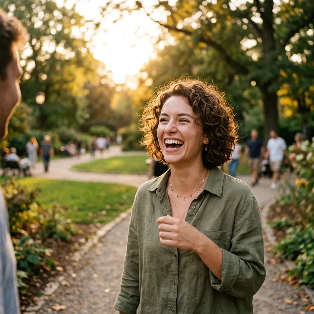
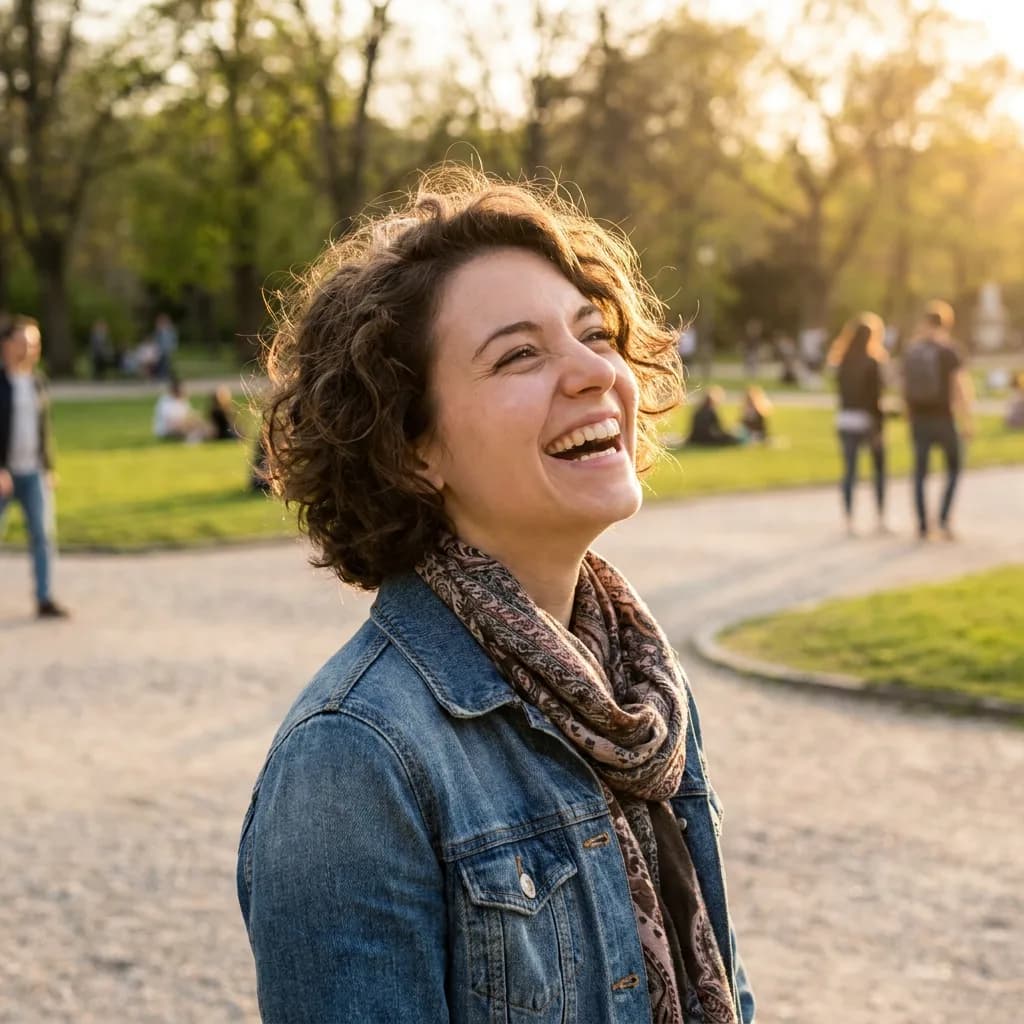
- A young woman with short curly hair laughing naturally, outdoor park setting, golden hour light, candid feel, photorealistic
- Close-up portrait of a child with paint-stained cheeks, bright playful expression, soft window light, photorealistic
- A middle-aged woman in a business blazer, confident half-smile, clean white background, corporate headshot style, photorealistic
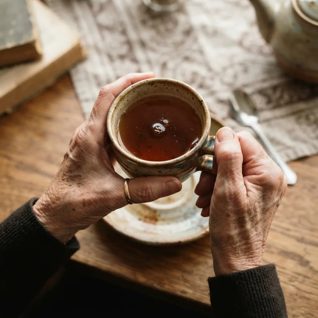
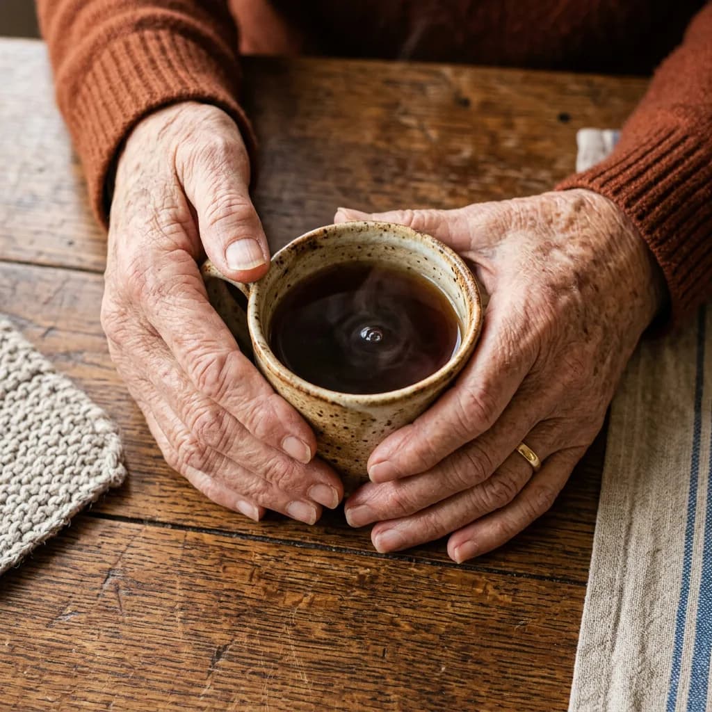
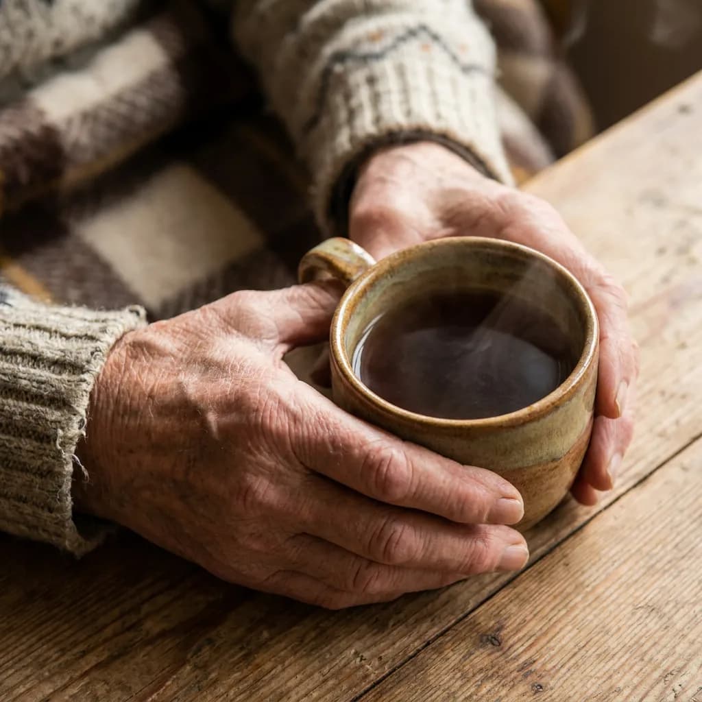
- An elderly woman's weathered hands holding a ceramic tea cup, overhead close-up, warm tones, photorealistic
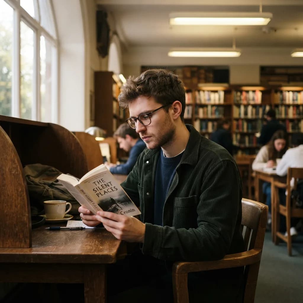
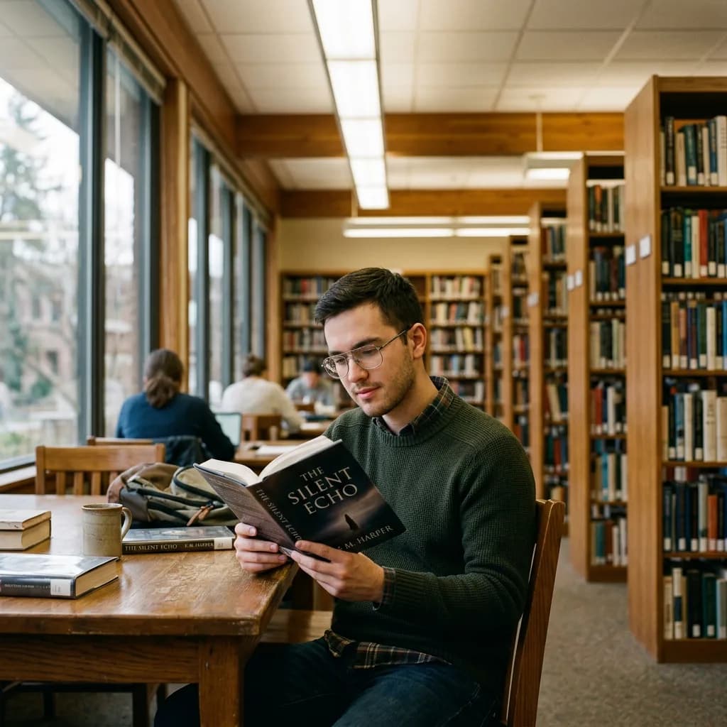
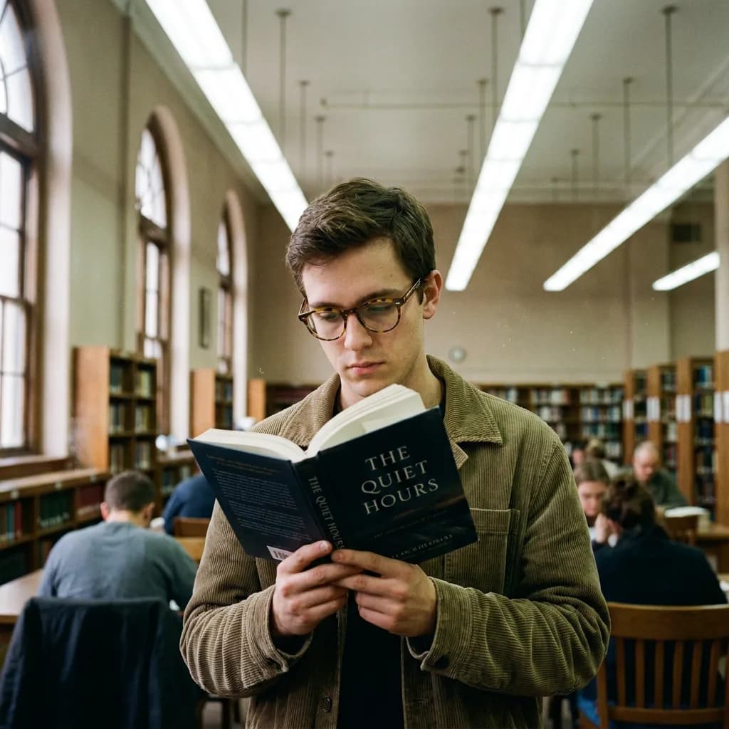
- Portrait of a young man with glasses reading a book in a library, natural overhead fluorescent mixed with window light, photorealistic
- A street musician playing violin, captured mid-motion, shallow depth of field blurring the city behind, photorealistic
- Profile portrait of a person with dramatic rim lighting against a dark background, high contrast, photorealistic
- A chef in a white coat tasting from a wooden spoon, kitchen background slightly blurred, warm tungsten light, photorealistic
- Portrait of two twins sitting back to back, matching outfits, clean studio backdrop, even lighting, photorealistic
Typography (21–30)
- A neon sign reading OPEN 24/7 glowing pink against a dark brick wall, slight rain reflection on the ground, photorealistic
- A chalkboard menu in a cafe reading Todays Special Matcha Latte 4.50, handwritten style, rustic wooden frame, photorealistic
- A birthday cake with Happy Birthday Sam written in white icing on chocolate frosting, close-up, photorealistic
- A street sign at an intersection showing Maple St and 5th Avenue, blue sky background, American style, photorealistic
- A vintage typewriter with a sheet of paper showing the typed words Chapter One The Beginning, photorealistic
- A white t-shirt flat lay with bold black text CREATE MORE printed on the chest, minimal background, photorealistic
- An old wooden door with a brass number plate reading 42, close-up, peeling paint details, photorealistic
- A storefront window with gold leaf lettering EST 1987 Fine Goods, warm interior light behind, photorealistic
- A motivational poster on a wall reading KEEP GOING in large sans-serif letters, minimal clean design, photorealistic
- A coffee cup seen from above with latte art, and GOOD MORNING spelled in small letter tiles beside it, photorealistic
Multi-subject scenes (31–40)
- A kitchen counter with a cutting board, three fruits apple banana and orange, a knife, and a glass of water, soft daylight, photorealistic
- A workspace with a laptop, a potted plant, a coffee mug, scattered pencils, and a notebook open to a blank page, overhead view, photorealistic
- Three friends sitting at an outdoor cafe table with drinks and a plate of pastries, afternoon sunlight, photorealistic
- A farmers market stall with crates of tomatoes, peppers, herbs, and a weighing scale, warm morning light, photorealistic
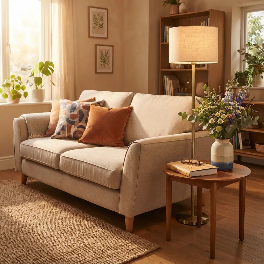
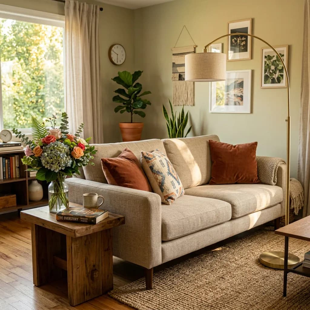
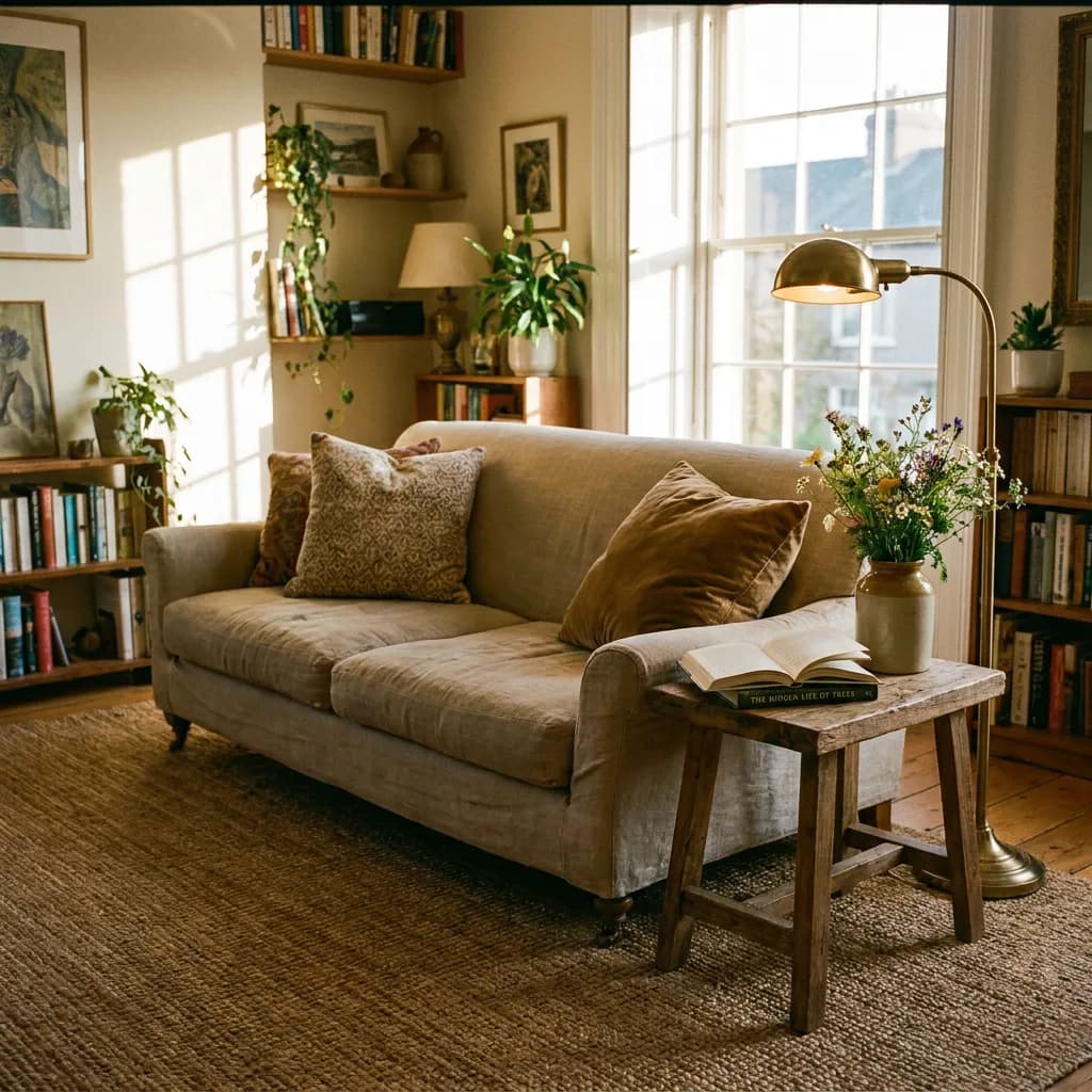
- A living room scene with a sofa and two cushions, a floor lamp, a side table with a book and a vase of flowers, warm afternoon light, photorealistic
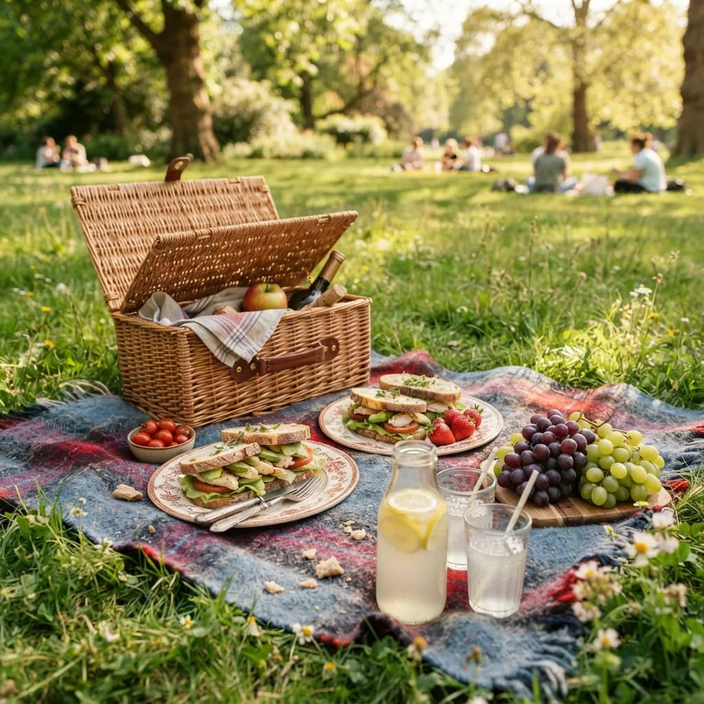
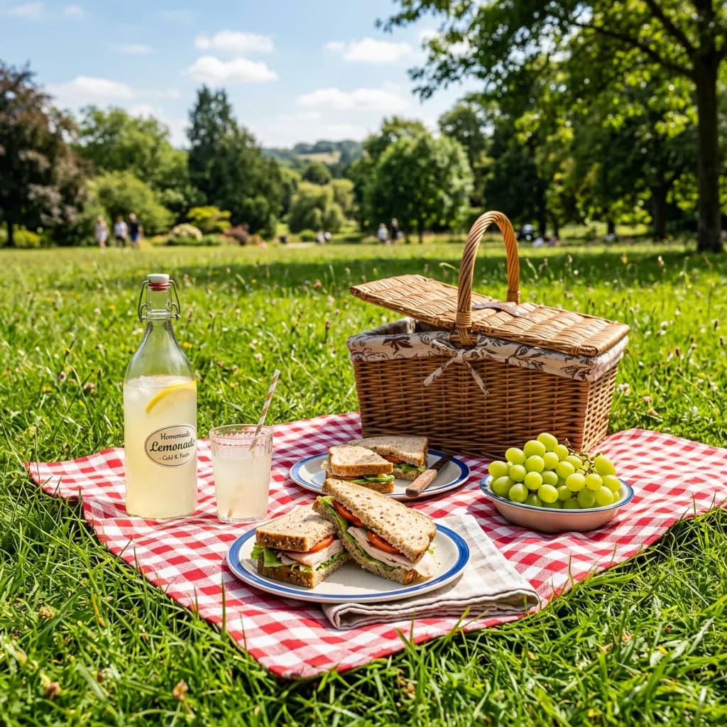
- A picnic blanket on grass with a wicker basket, two plates, sandwiches, grapes, and a bottle of lemonade, sunny day, photorealistic
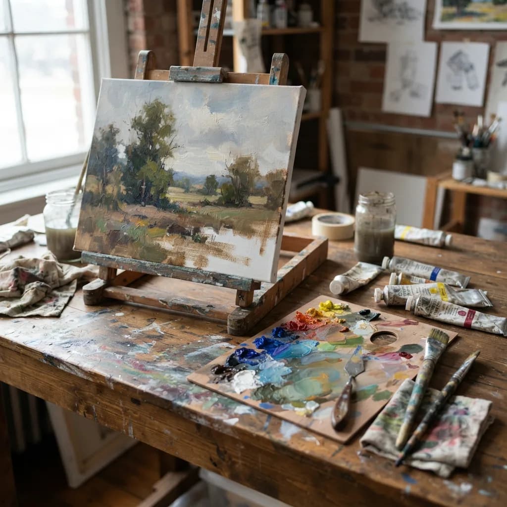
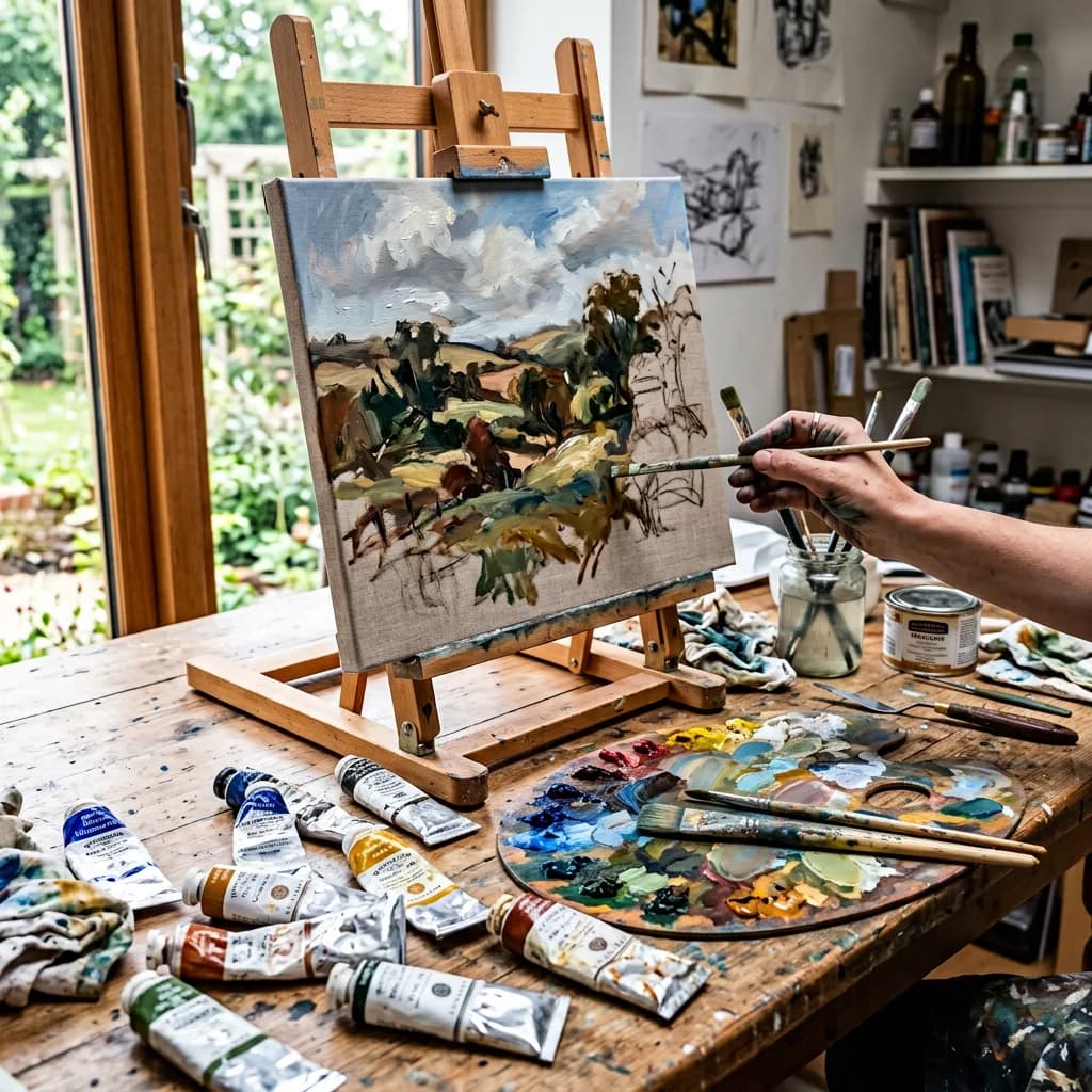
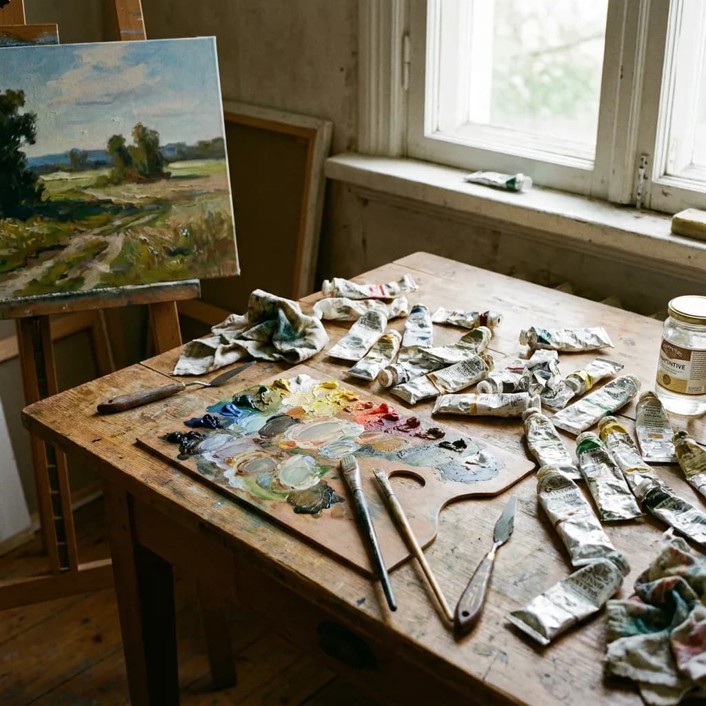
- An artists table with paint tubes, two brushes, a palette with mixed colors, and a half-finished canvas, natural studio light, photorealistic
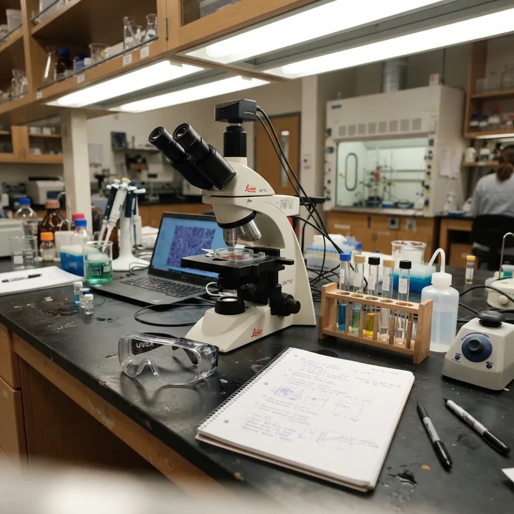
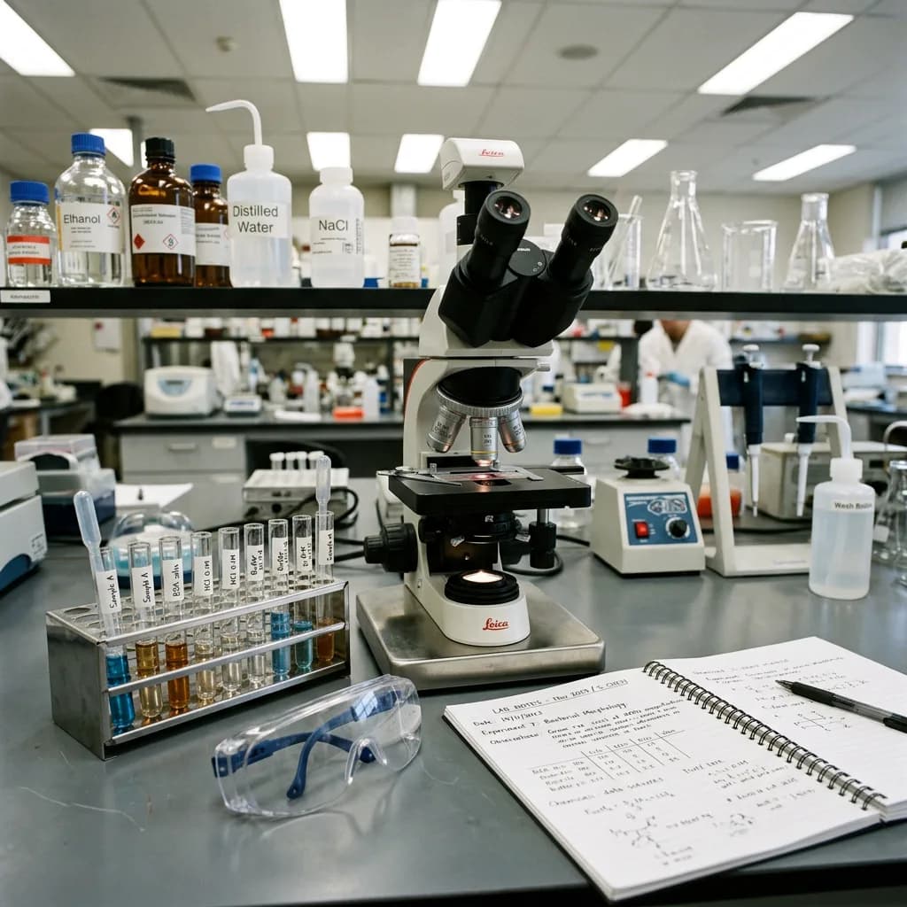
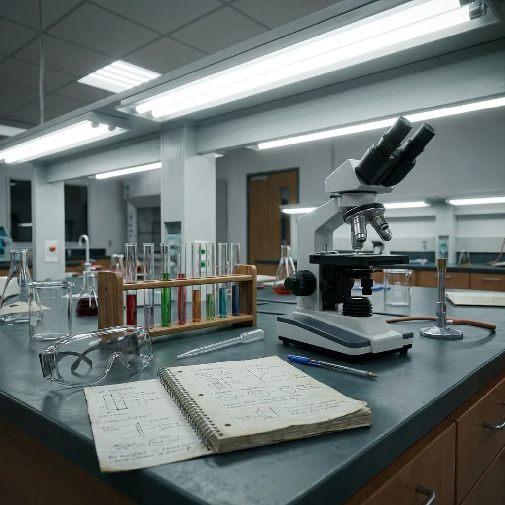
- A science lab bench with a microscope, test tubes in a rack, safety goggles, and a notebook, bright fluorescent light, photorealistic
- A sushi platter with six different pieces of nigiri, chopsticks, a small dish of soy sauce, and pickled ginger, overhead shot, photorealistic
- A cozy reading nook with an armchair, a tall bookshelf, a reading lamp, and a cat sleeping on a blanket, warm evening light, photorealistic
Style transfer (41–50)
- A lighthouse on a rocky coast, watercolor painting style with visible brushstrokes and soft color bleeding
- A city street at night with taxis and neon signs, rendered as a Japanese ukiyo-e woodblock print
- A bowl of ramen with chopsticks, in the style of a detailed pencil sketch with cross-hatching
- A tropical beach sunset, rendered as a stained glass window design with bold black outlines and vivid colors
- A cat lounging on a windowsill, painted in the style of a vintage oil painting with rich warm tones
- A mountain village with snow-capped peaks, rendered as an isometric pixel art scene
- A bouquet of sunflowers in a vase, in the style of a bold pop art illustration with halftone dots
- An old train station platform, rendered in the style of a moody film noir photograph, high contrast black and white
- A forest path in autumn, rendered as a paper cut art layered composition with visible paper edges
- A hot air balloon festival over rolling hills, in the style of a children's book illustration with flat colors and soft edges
Full image gallery
The sections above feature the most discussed prompts. Here's every remaining prompt — Lite, NB2, and Pro side by side, unedited. Prompt text is in the appendix above.
Product shots — remaining
#2: Wireless earbuds in charging case
#3: Olive oil bottle with rosemary
#6: Hand cream with citrus
#7: Book with reading glasses
#10: Linen napkin flat lay
Portraits — remaining
#2: Young woman laughing in park
#3: Child with paint-stained cheeks
#4: Corporate headshot

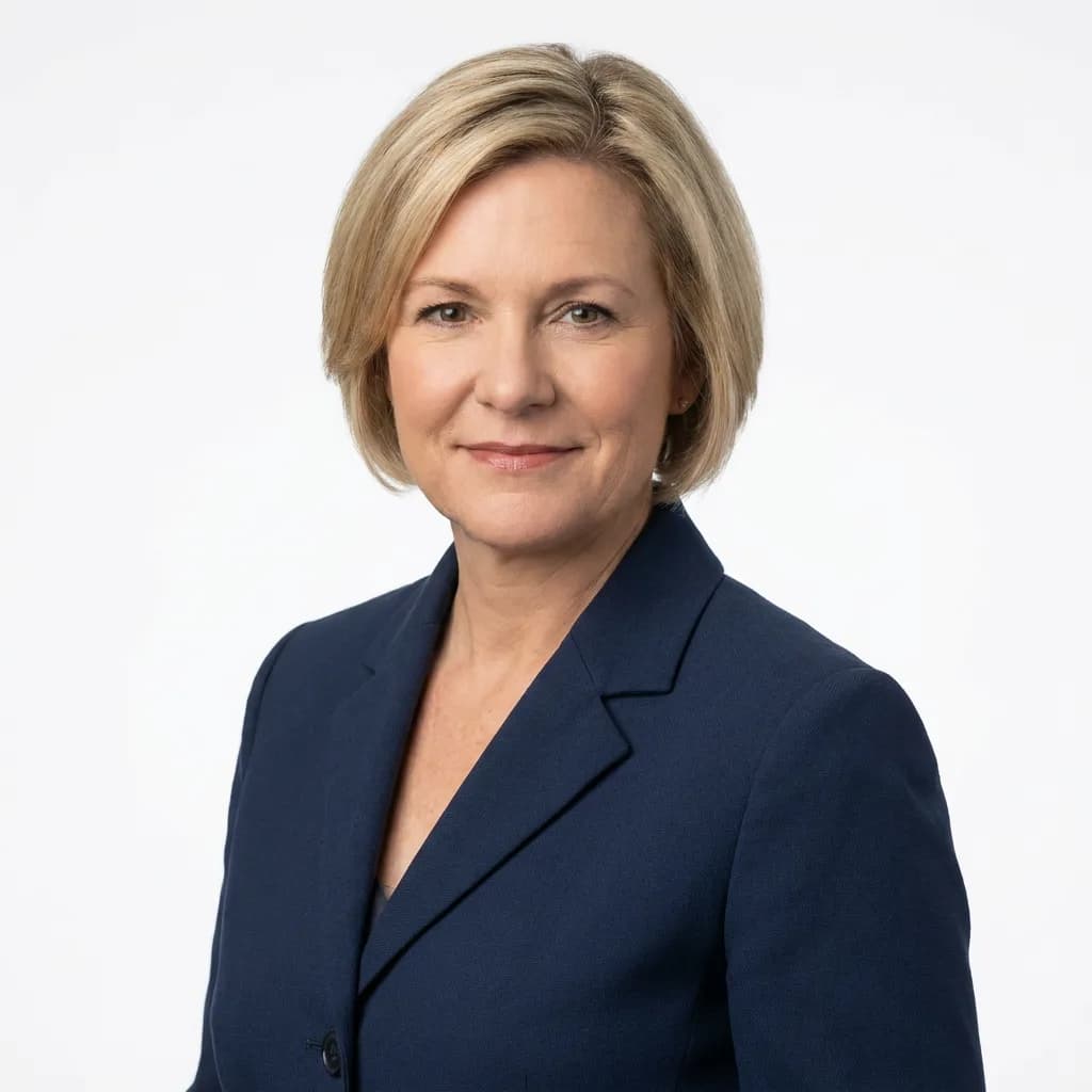
#5: Weathered hands holding tea cup
#6: Man reading in library
#7: Street musician with violin
Typography — remaining
#4: Street sign intersection
#5: Vintage typewriter
#6: CREATE MORE t-shirt
#7: Brass door number 42
#9: KEEP GOING poster
#10: GOOD MORNING letter tiles
Multi-subject scenes — remaining
#3: Friends at outdoor cafe
#5: Living room scene
#6: Picnic on grass
#7: Artist's table
#8: Science lab bench