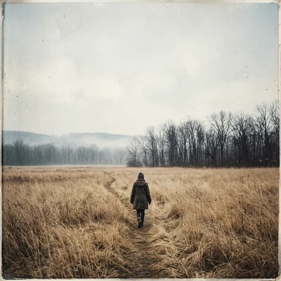
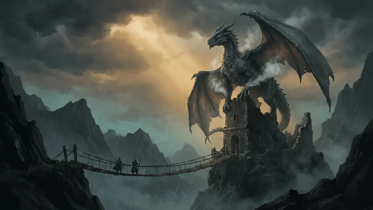
Prompt the artwork and set the type yourself. A model asked for “an album cover with the artist name and title” returns broken lettering every time — a doubled letter, a phantom ligature, kerning nobody would ship — and on a cover that is the one thing people look at. So describe the image and reserve the space: “a lone figure walking through a wide field of dry grass towards bare trees, grainy analogue photograph look, faded warm-grey palette, heavy negative space in the upper half for typography, no text, letters or numbers anywhere”. Then set the name in a real font.
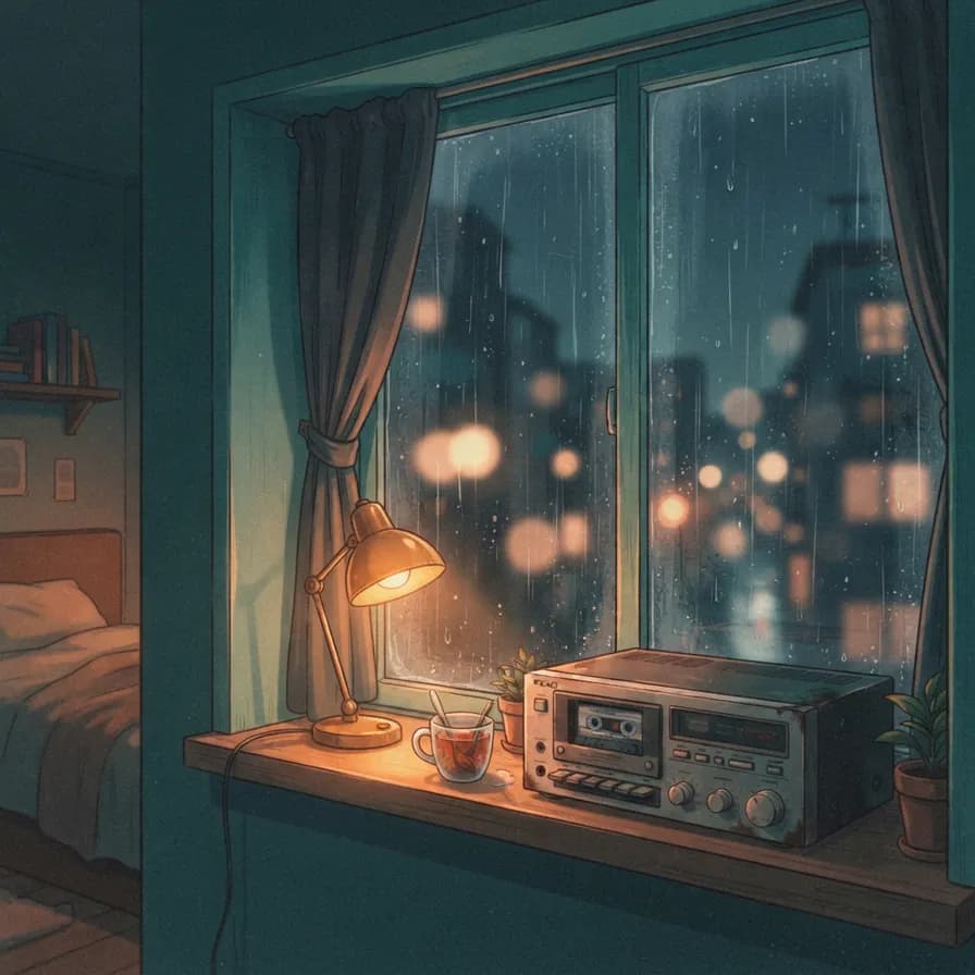
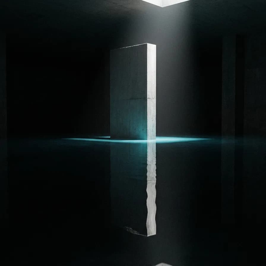
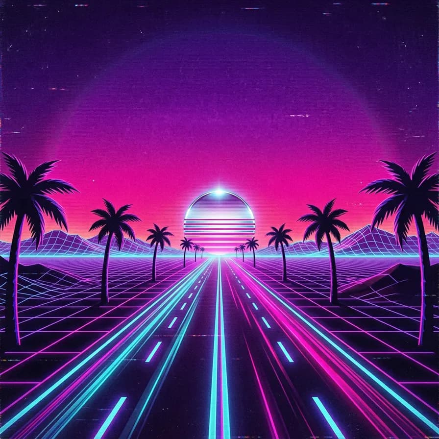
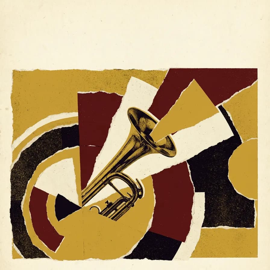
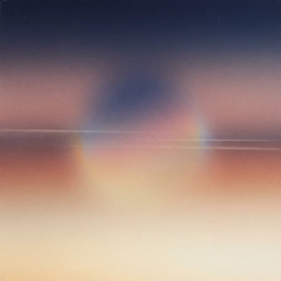
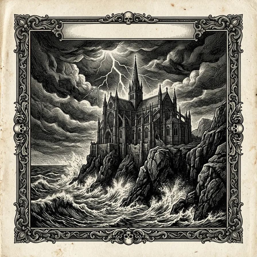
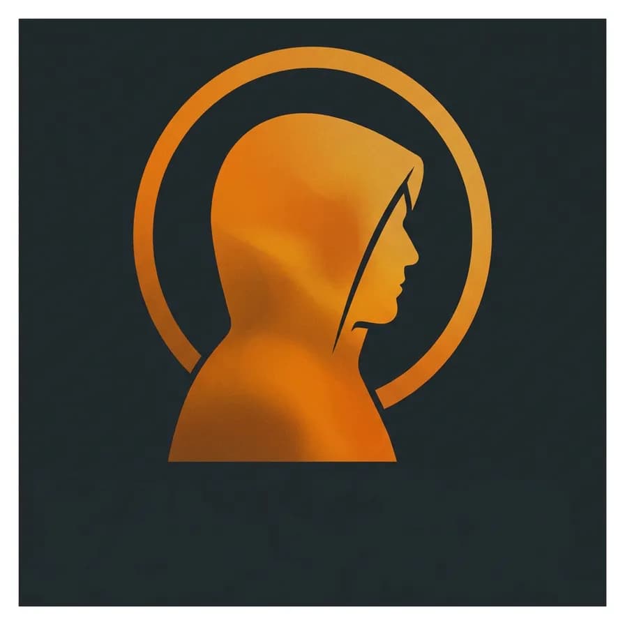
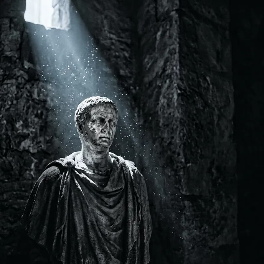
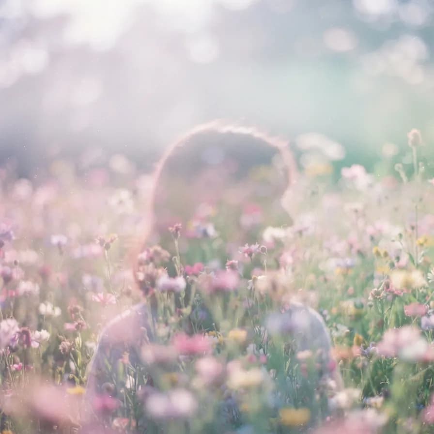
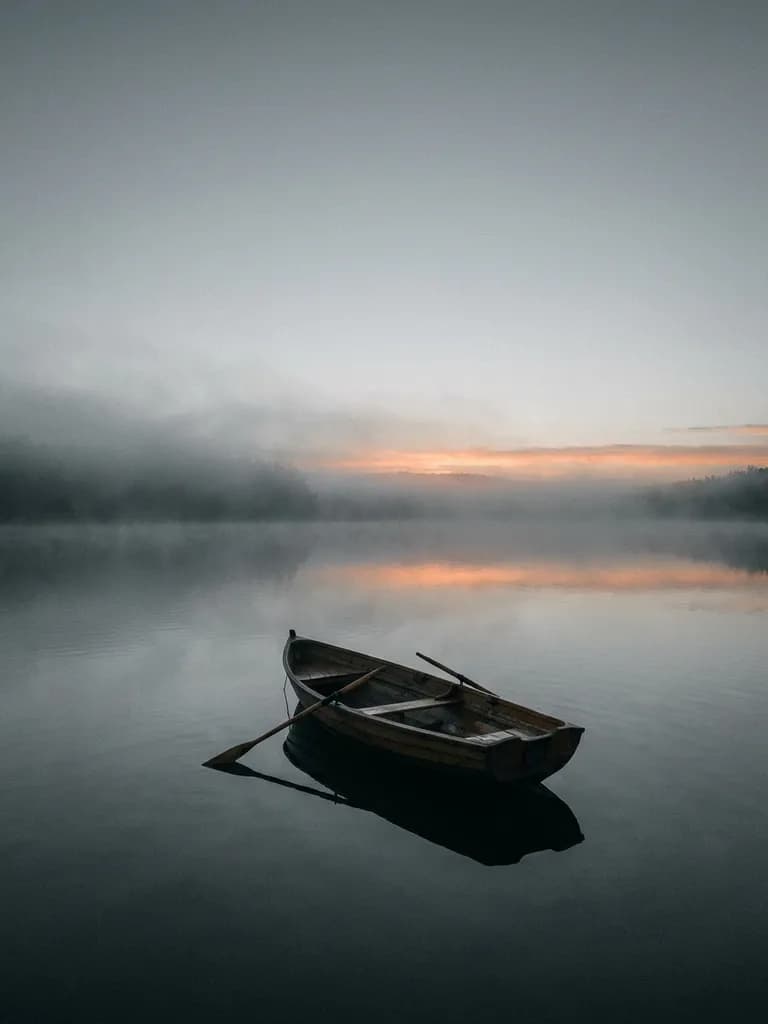
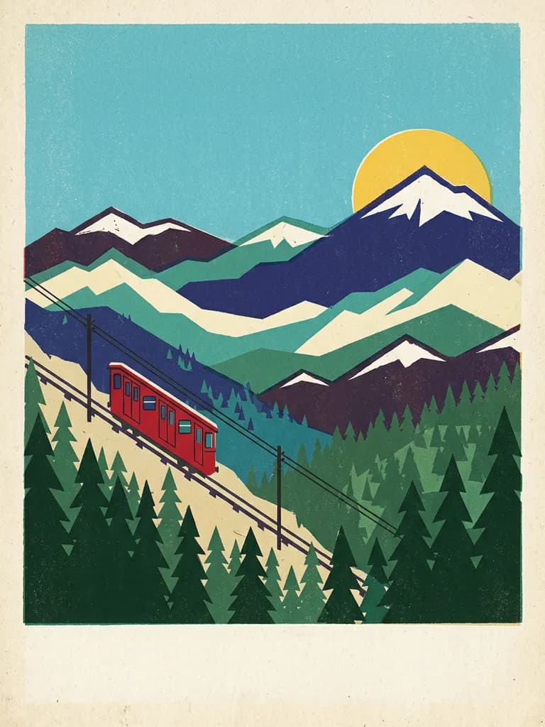
Genre here is a treatment, not a subject. Minimal techno is one object, hard light and crushed black. Lo-fi is warm interior light, rain and grain. Jazz is torn paper, flat shapes and ink texture in the Blue Note tradition. Synthwave is a horizon, a chrome sun and scan lines. Say the treatment out loud and the composition arrives with it. The other rule is scale: a cover is first seen as a 200-pixel square in a streaming grid, so one silhouette and one dominant colour beats a detailed scene every time. All ten below are unedited first outputs generated on BananaBanana.