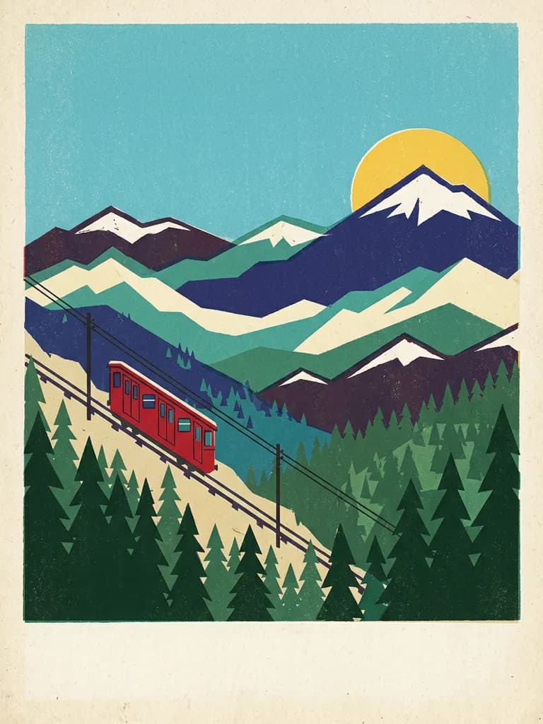
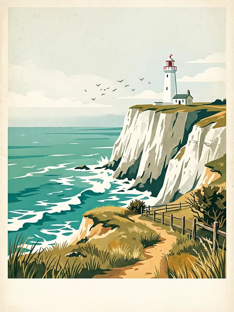
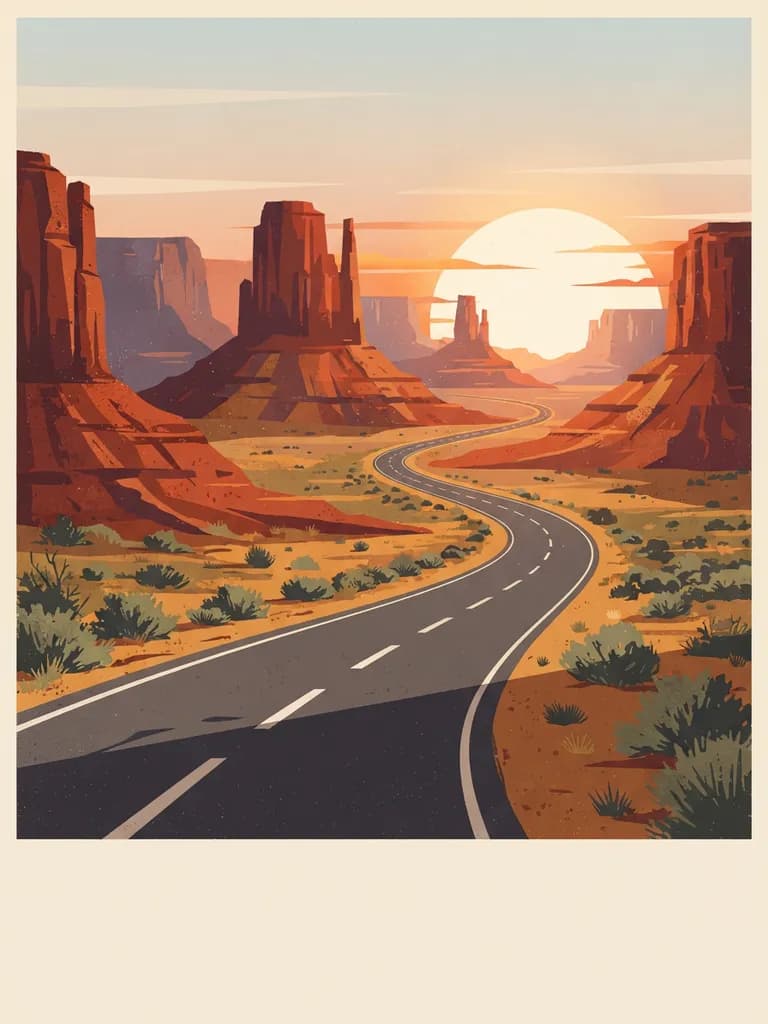
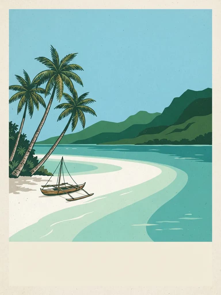
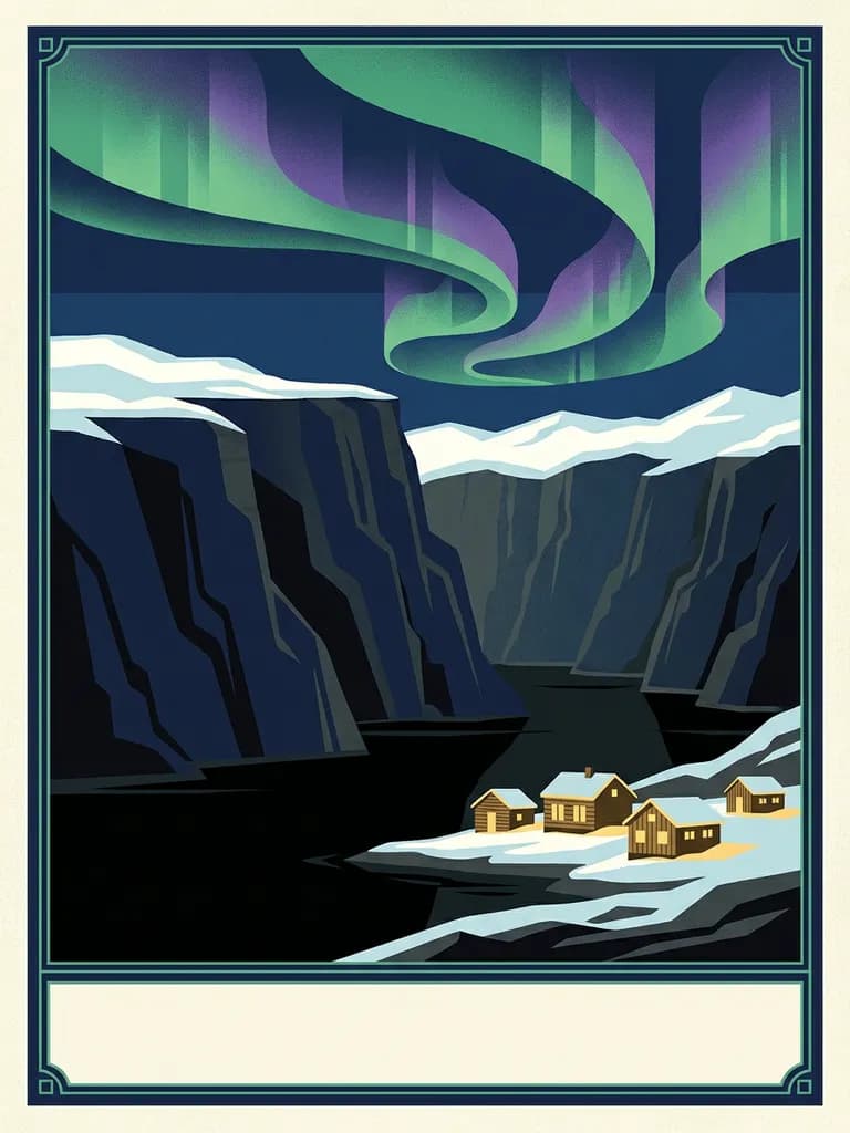
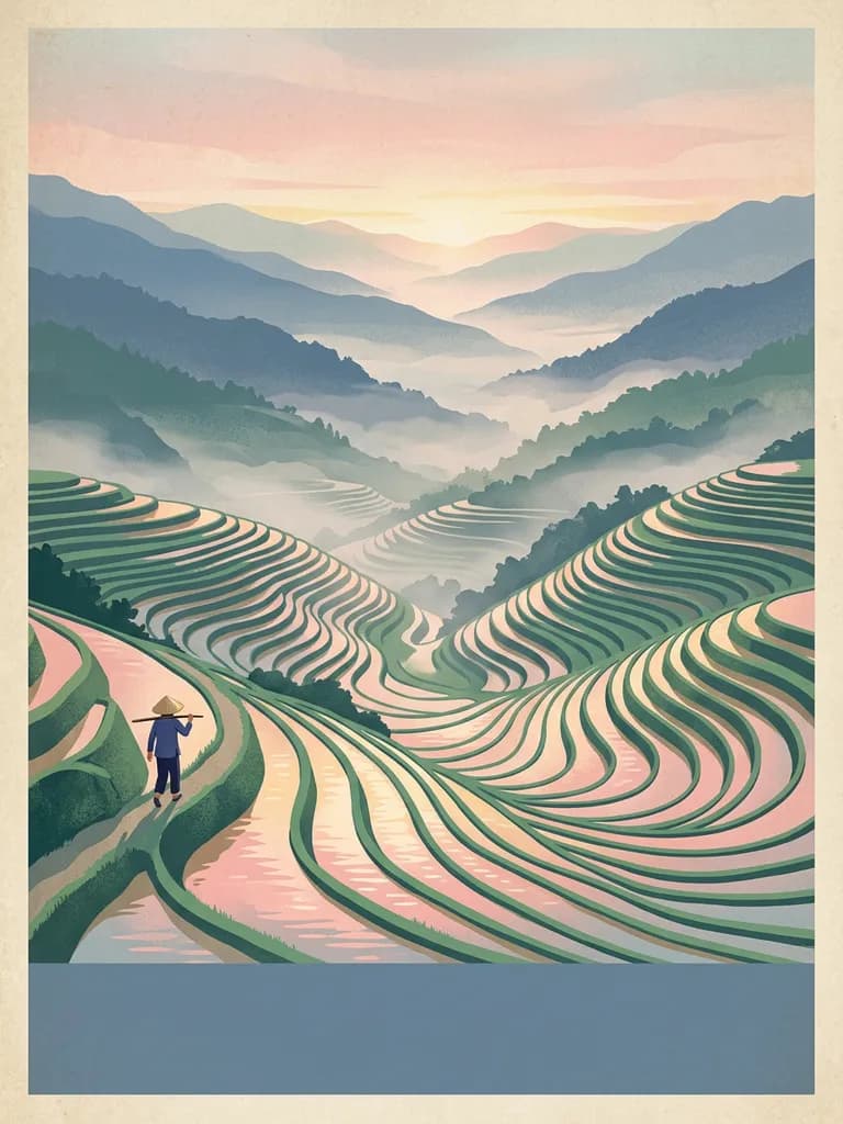
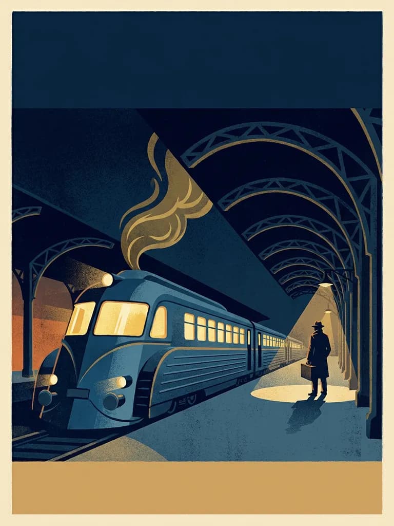
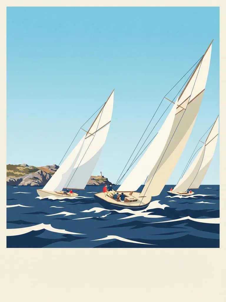
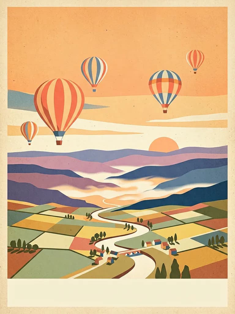
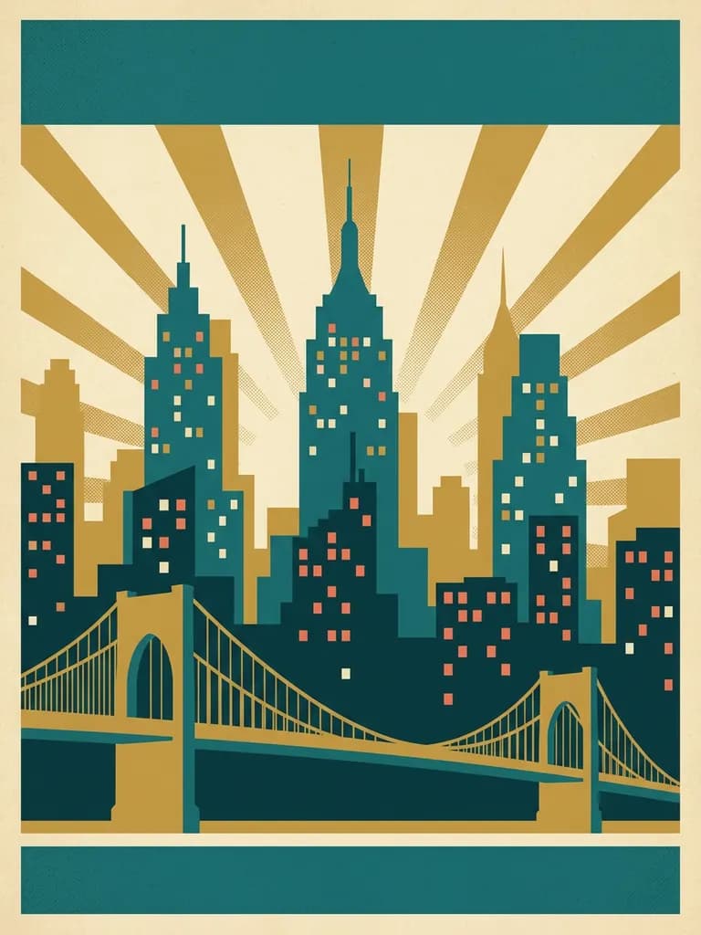
Three ingredients, then the scene. First the tradition: “mid-century screen-print travel poster”, “1930s railway poster”, “WPA national-park poster”, “1920s art deco poster” are four distinct visual languages, and naming one gets you its shapes, its stylisation and its printing artefacts. Second the palette, capped and listed: “limited palette of rust, ochre, dusty violet and cream”. Third the texture: “flat gouache colour blocks, subtle halftone grain, visible paper grain” is what makes it look printed rather than rendered. Only then describe the place — “a red funicular carriage climbing a steep alpine slope, snow peaks layered behind in flat bands, pine forest in the foreground”.
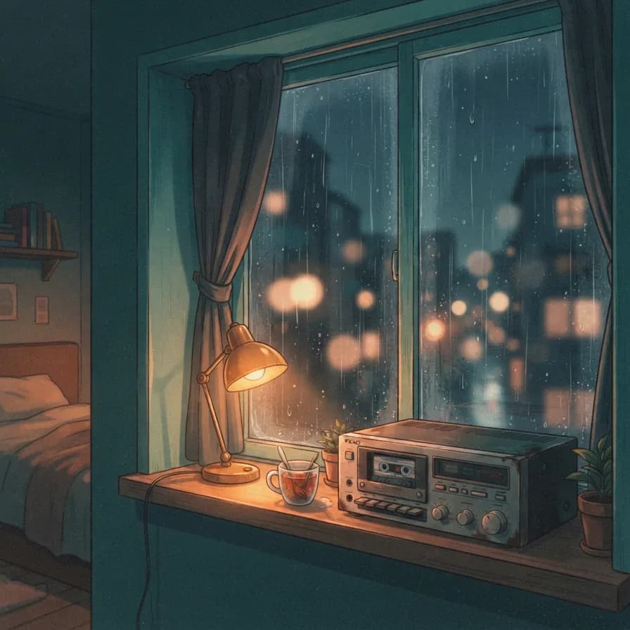
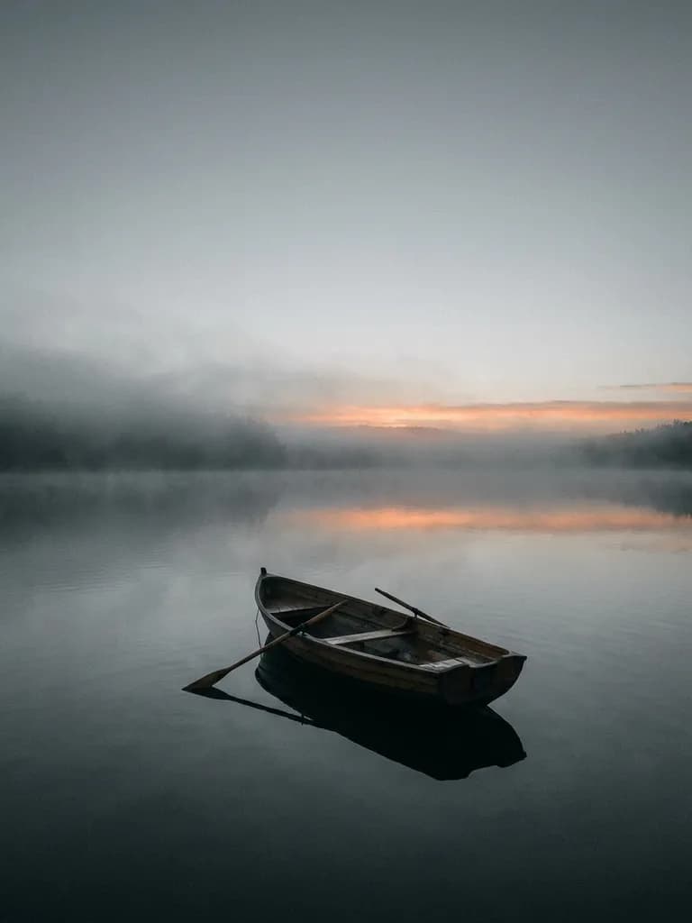
The fourth clause is the one people forget: reserve the type space. Every prompt here ends with “open sky band at the top and a clear strip at the bottom for typography” plus an explicit “no text, letters or numbers anywhere in the image”. Ask a model for the destination name and you get warped pseudo-lettering that no amount of squinting fixes; ask it to leave the space and you get artwork you can set real type on in five minutes. All ten below are unedited first outputs generated on BananaBanana, and four of them cost three cents each.